Designs
156 designs.
One that's yours.
Every Plot site can wear any of these looks — light or dark, calm or bold. Click any one to see it live, then build your own.
Every design works with every feature — booking, menus, galleries, team. See it all in a full demo: Restaurant, Salon, Shop, Clinic or Consultant.
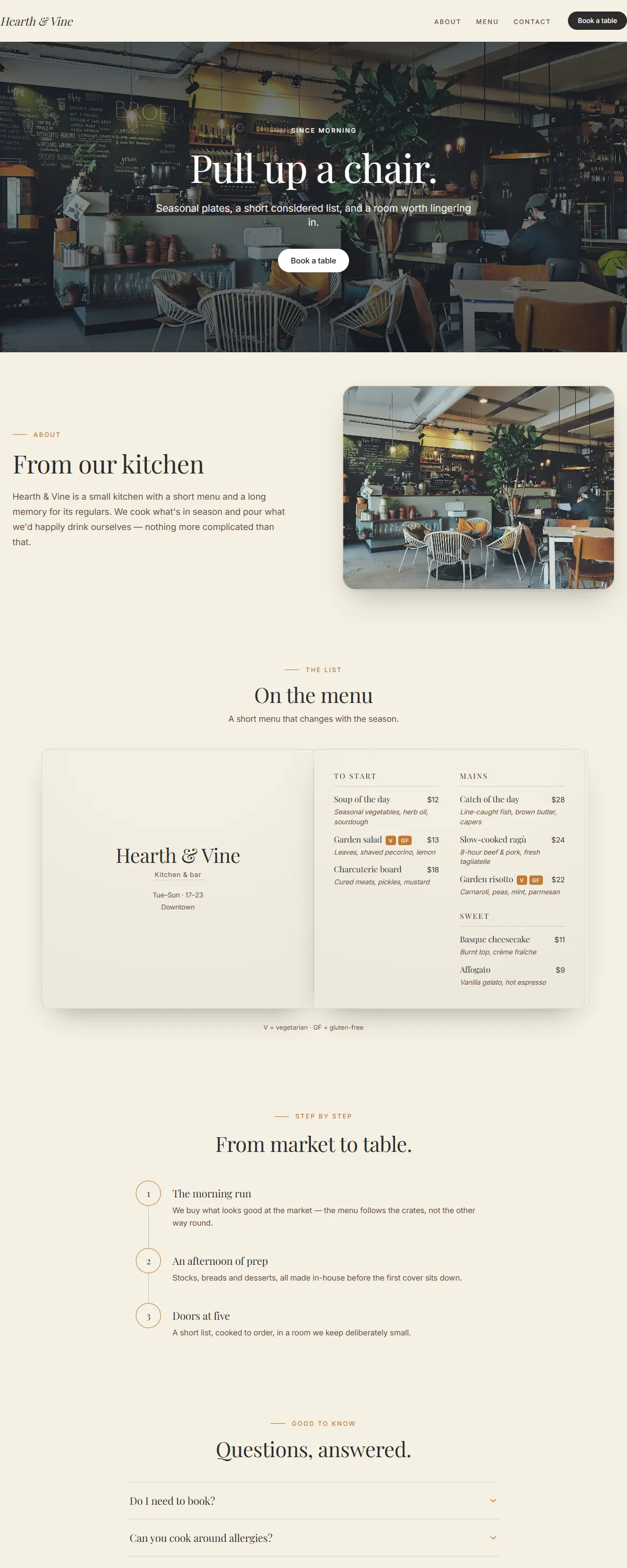
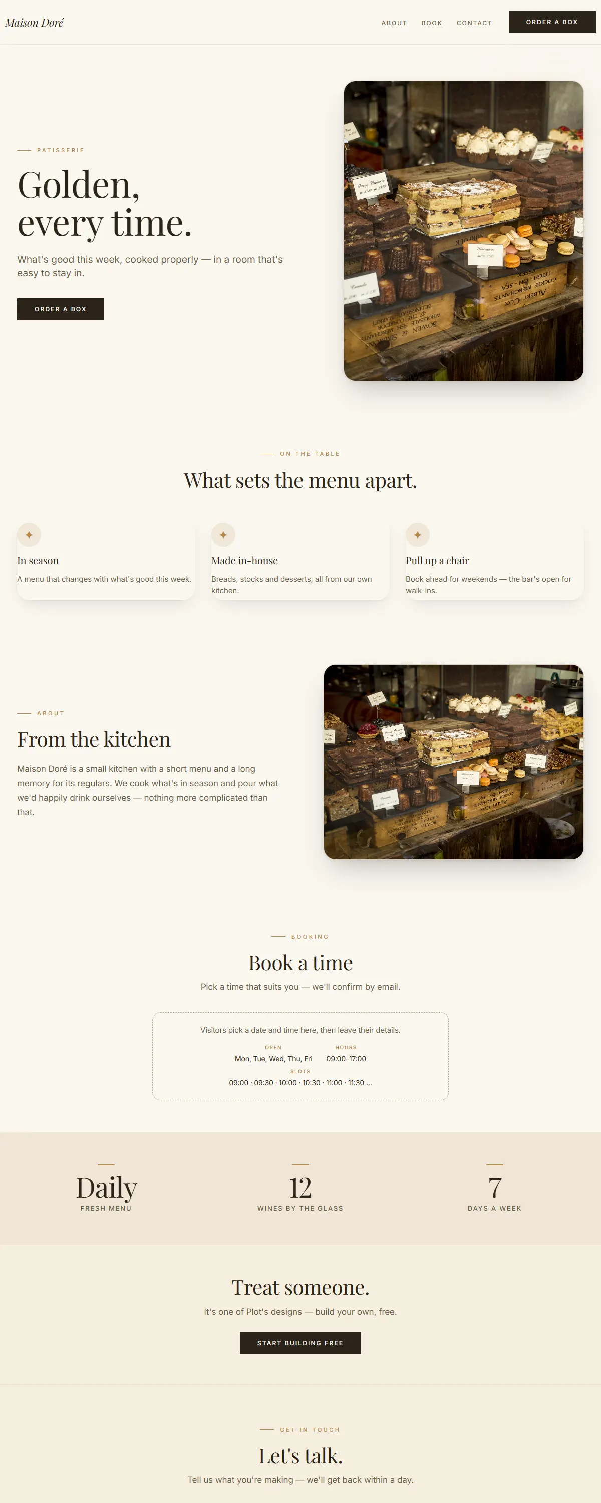
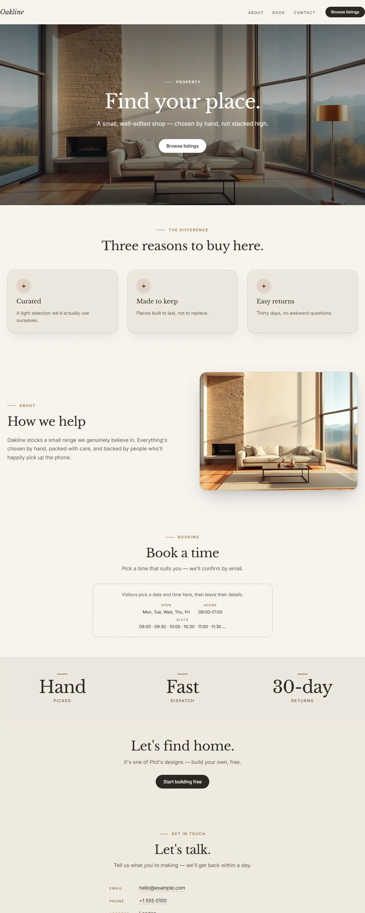
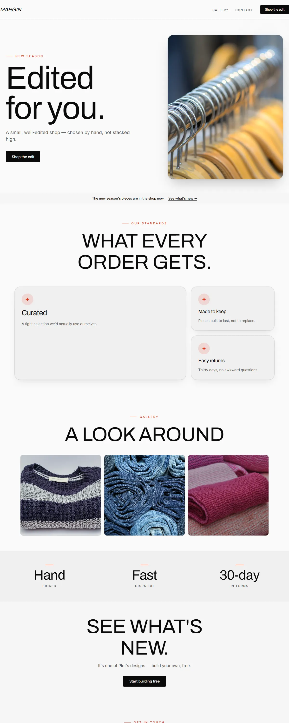
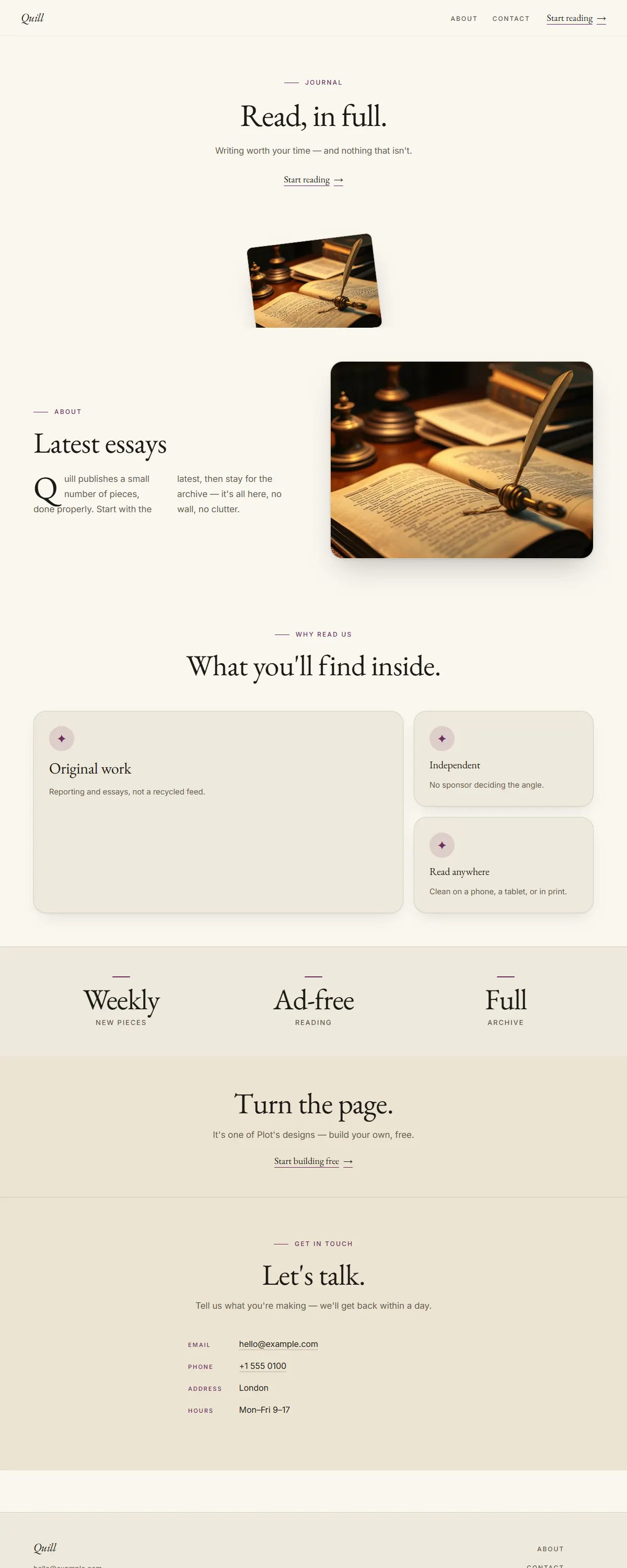
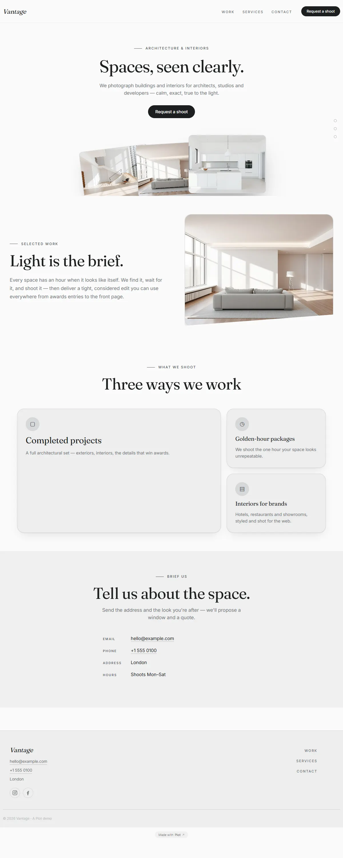
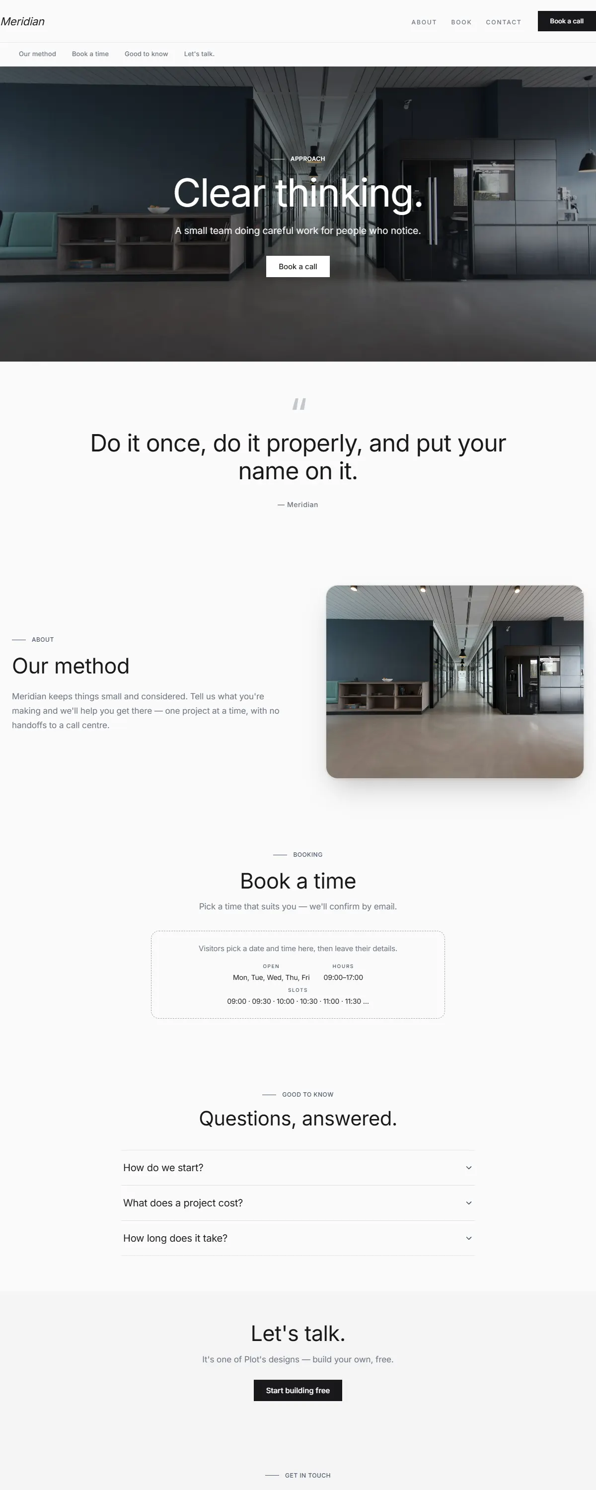
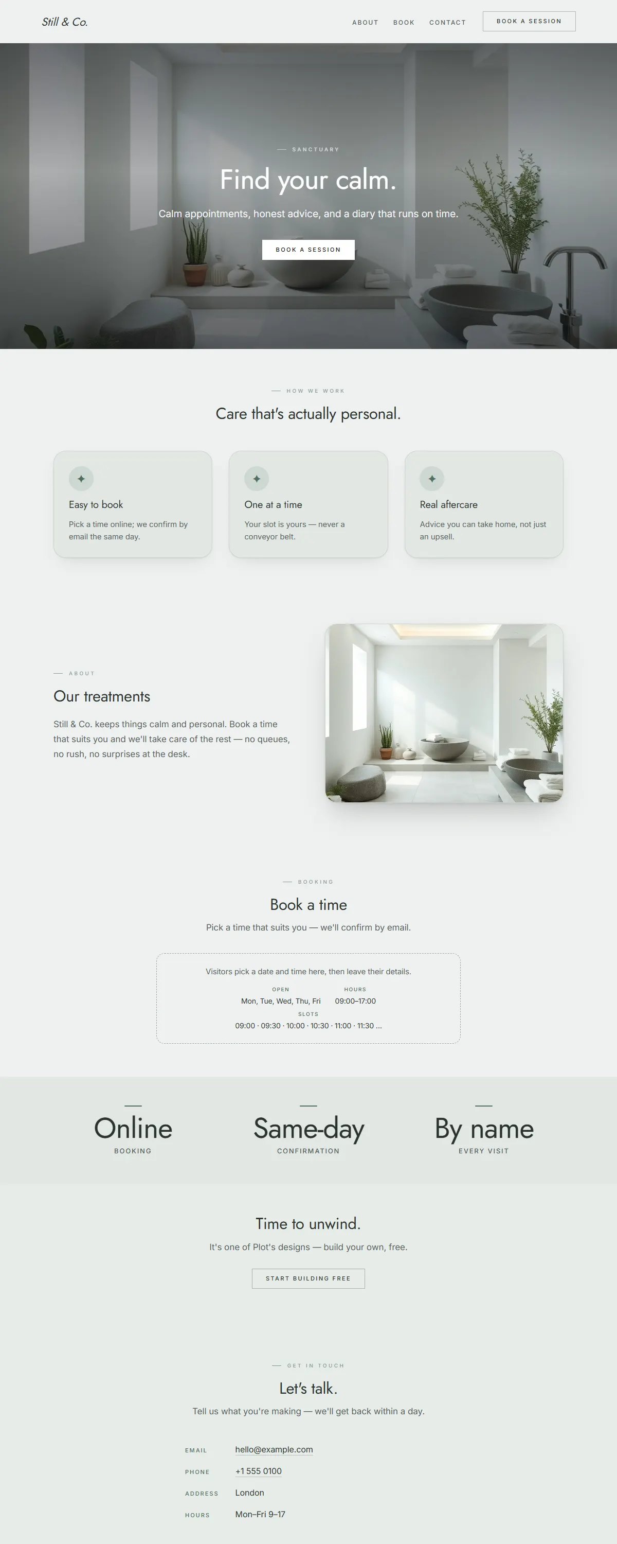
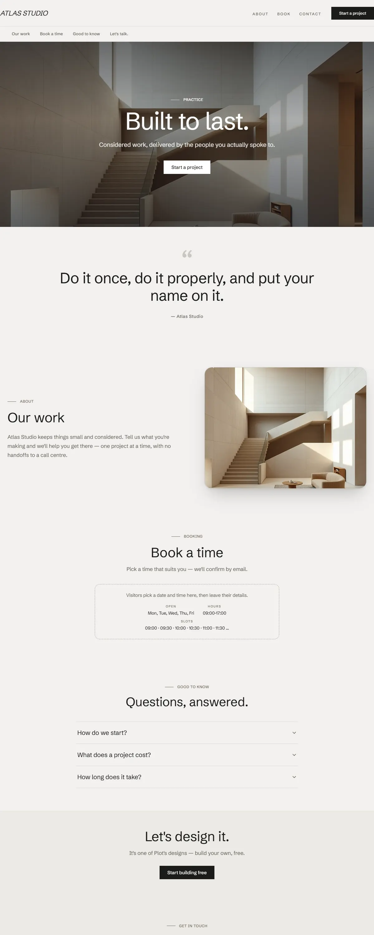
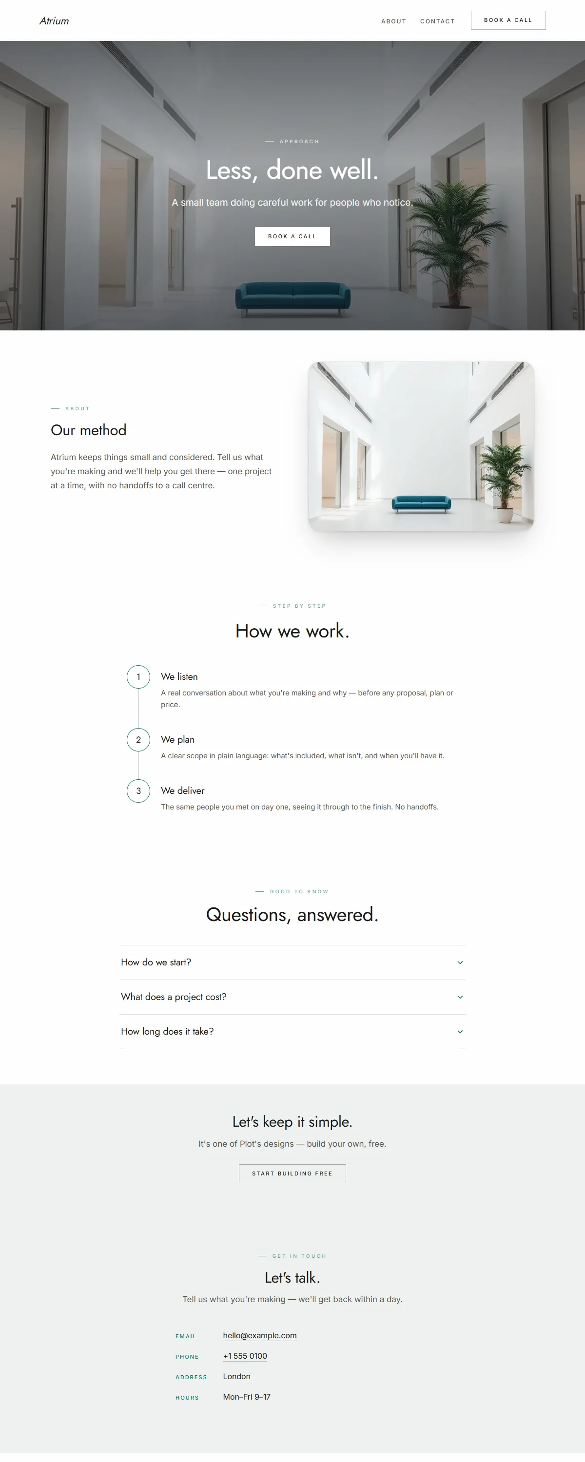
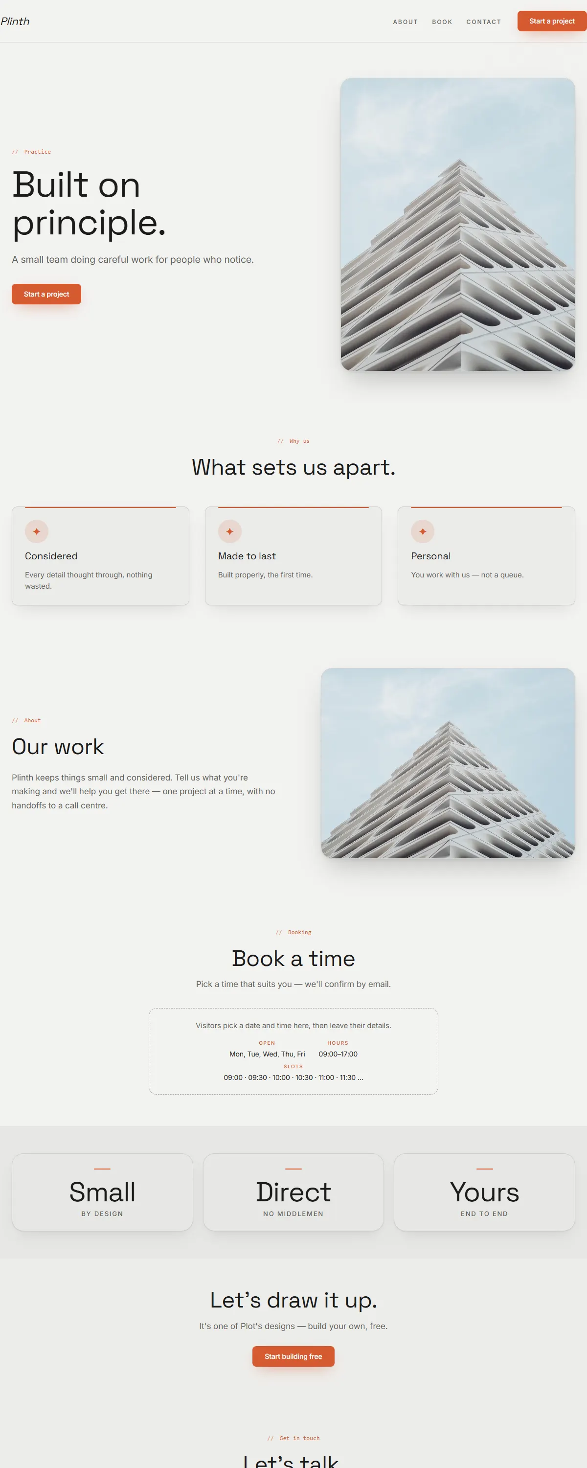
Warm, hospitable feel with classic serif headlines for businesses where atmosphere matters.
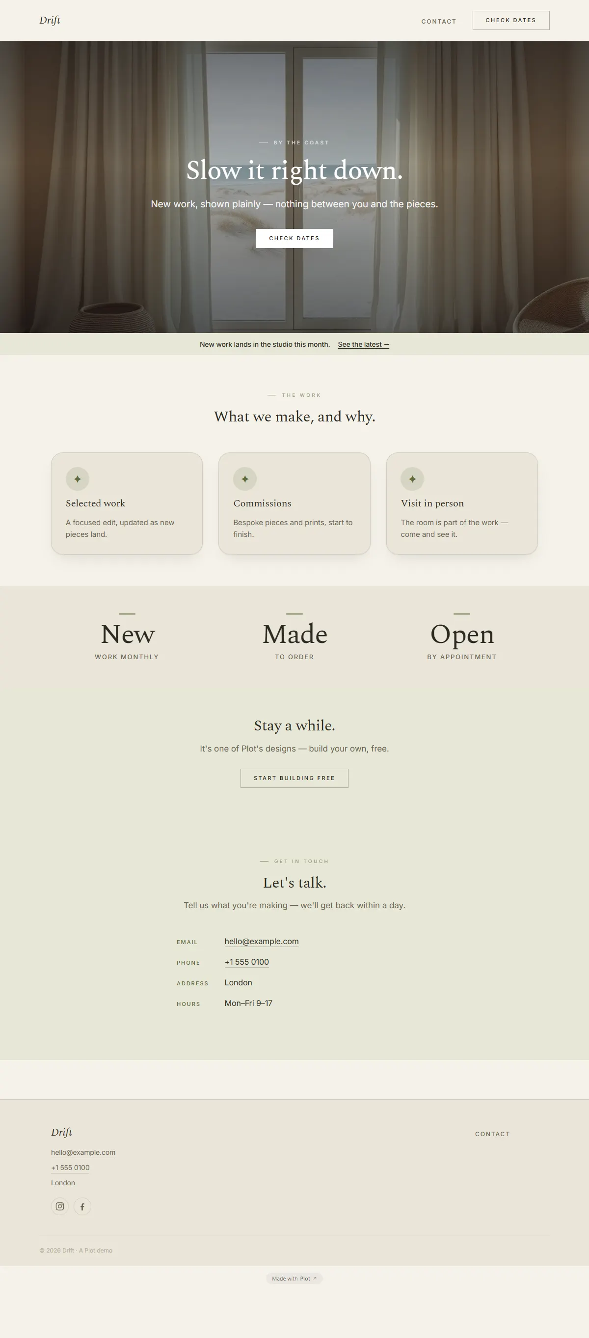
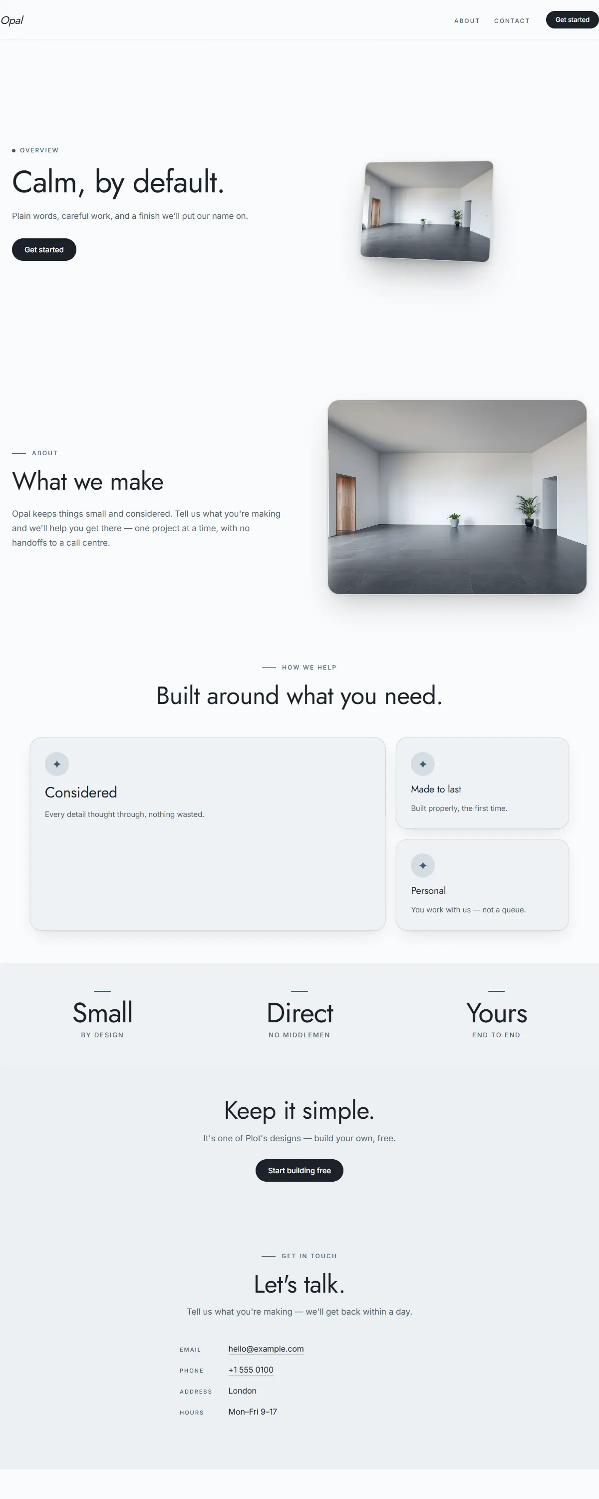
Warm earthy sanctuary — umber, terracotta, ochre. Grounded and mature, not feminine pastel.
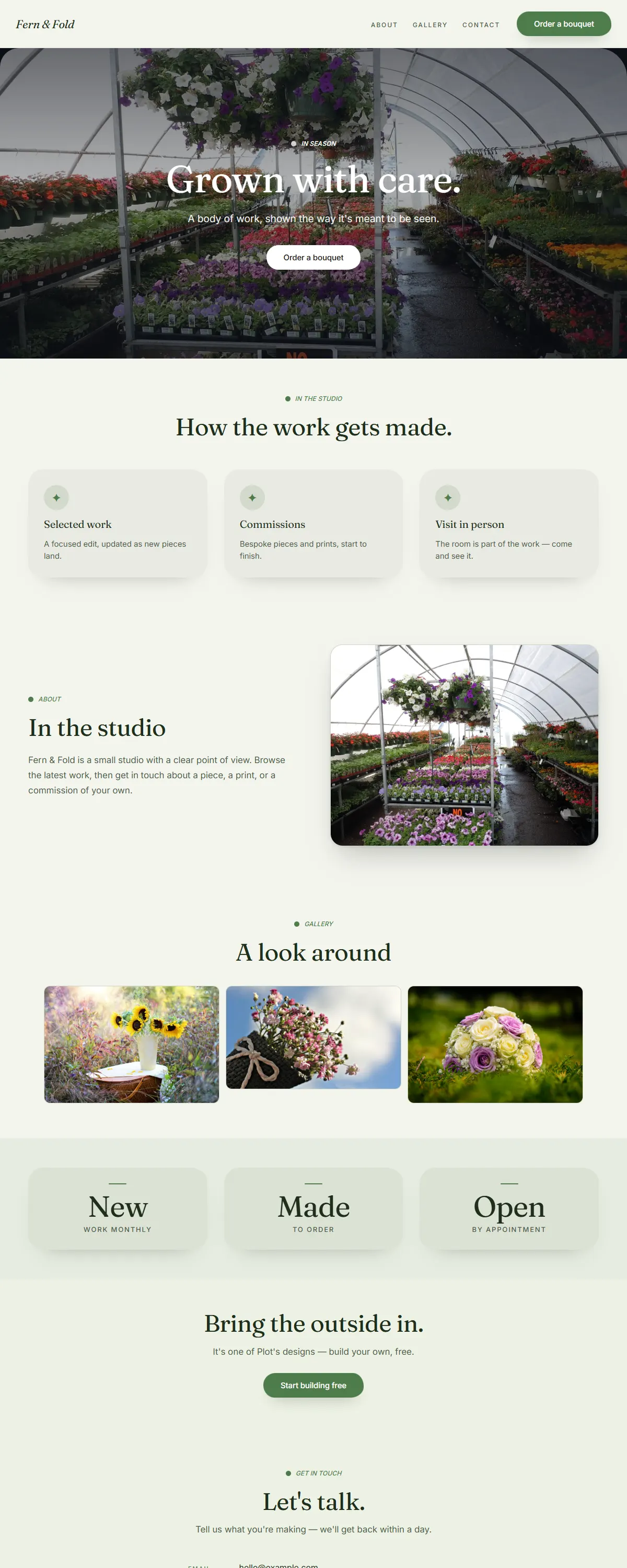
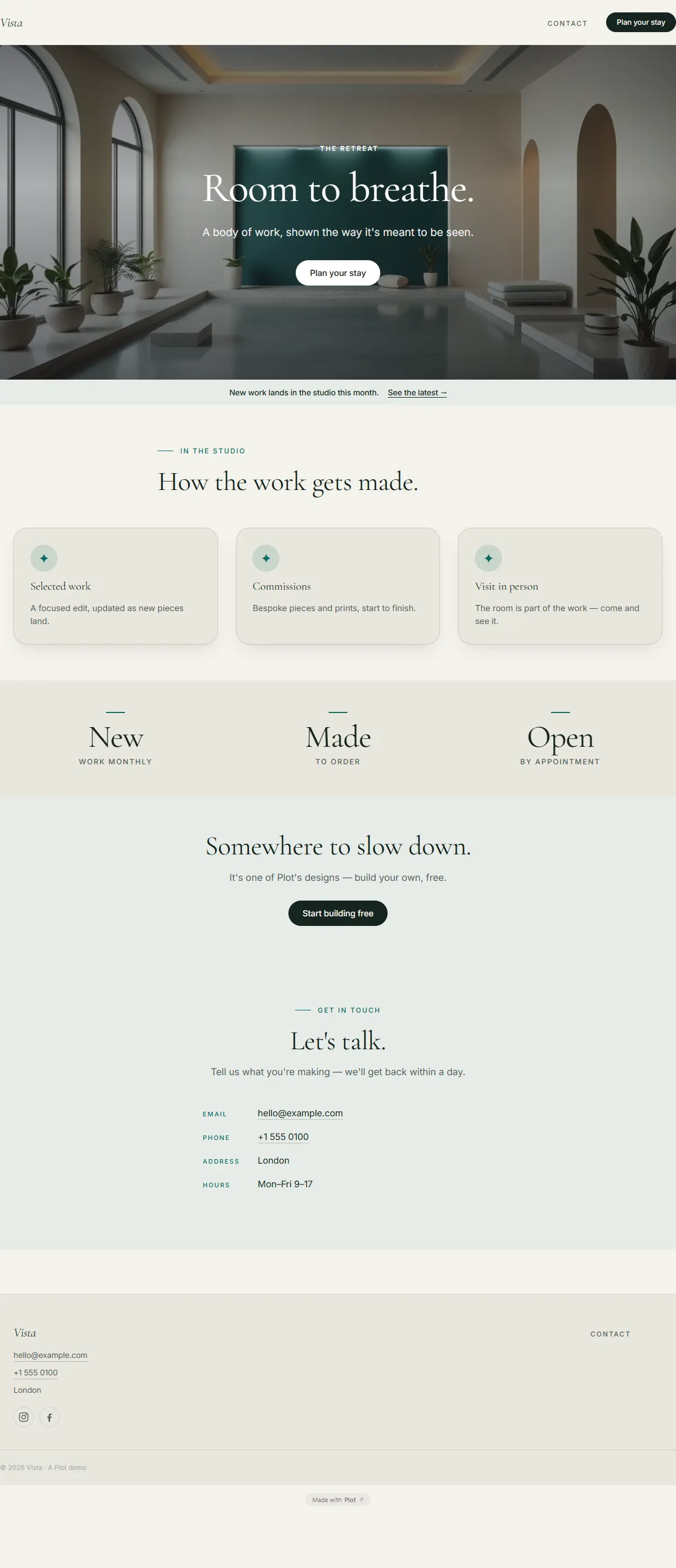
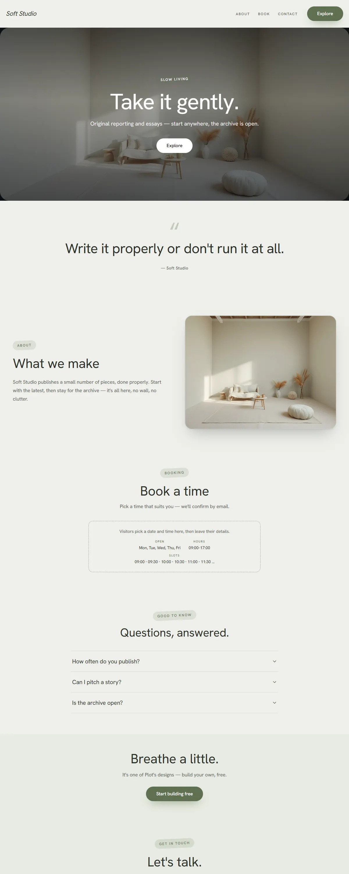
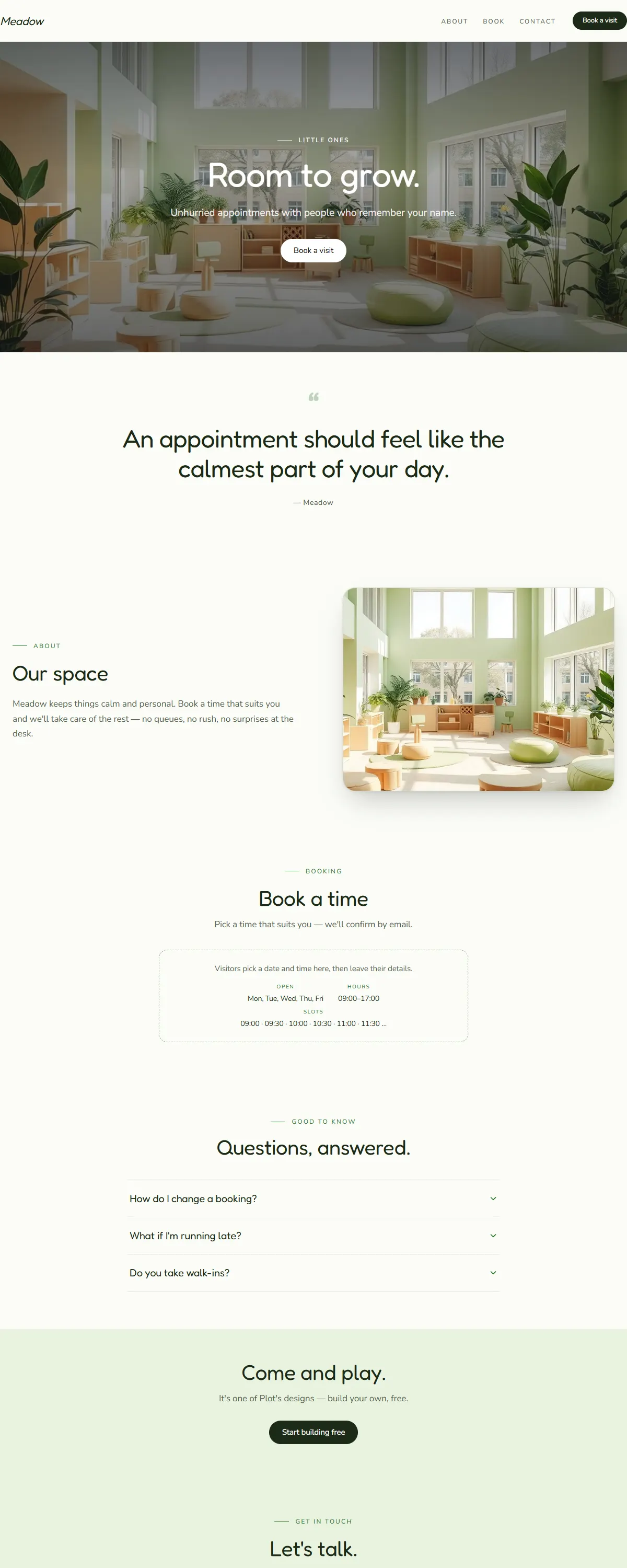
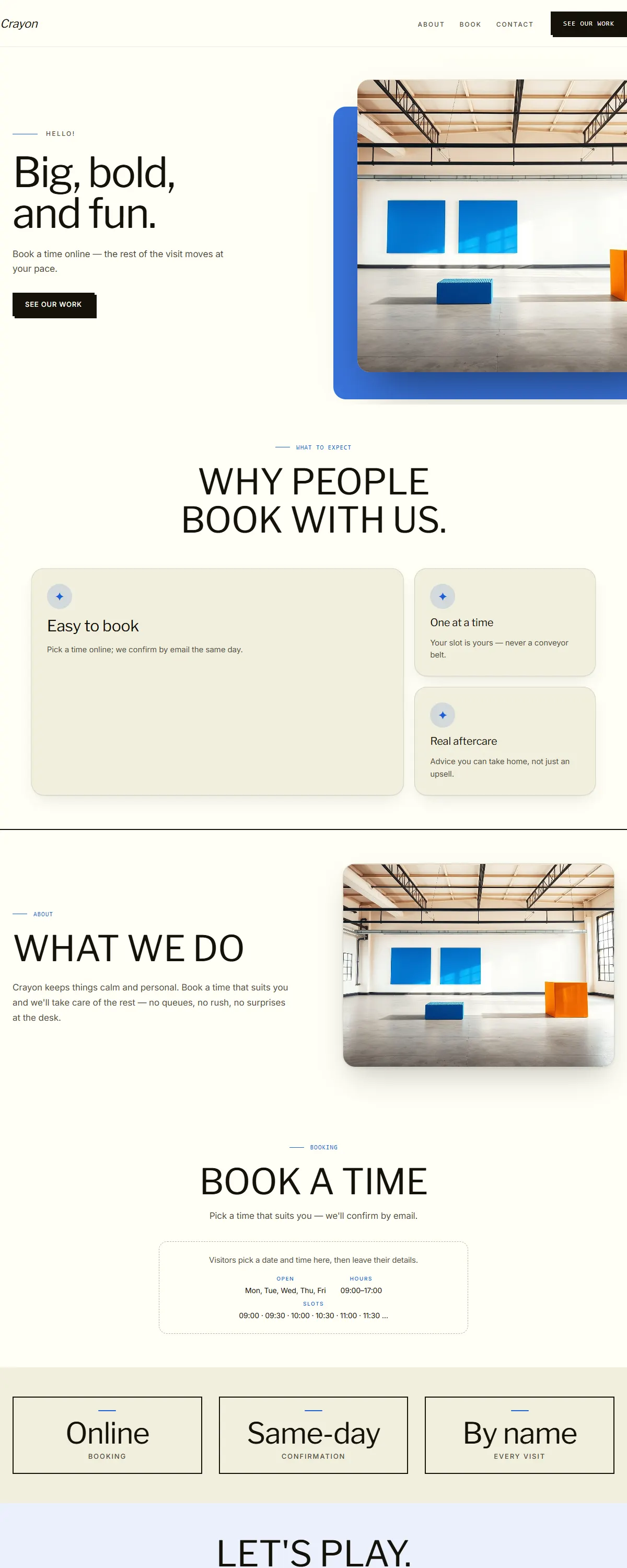
Fresh, leafy calm with an organic serif — green and growing.
Warm ochre and brown — a farmhouse, hand-made feel.
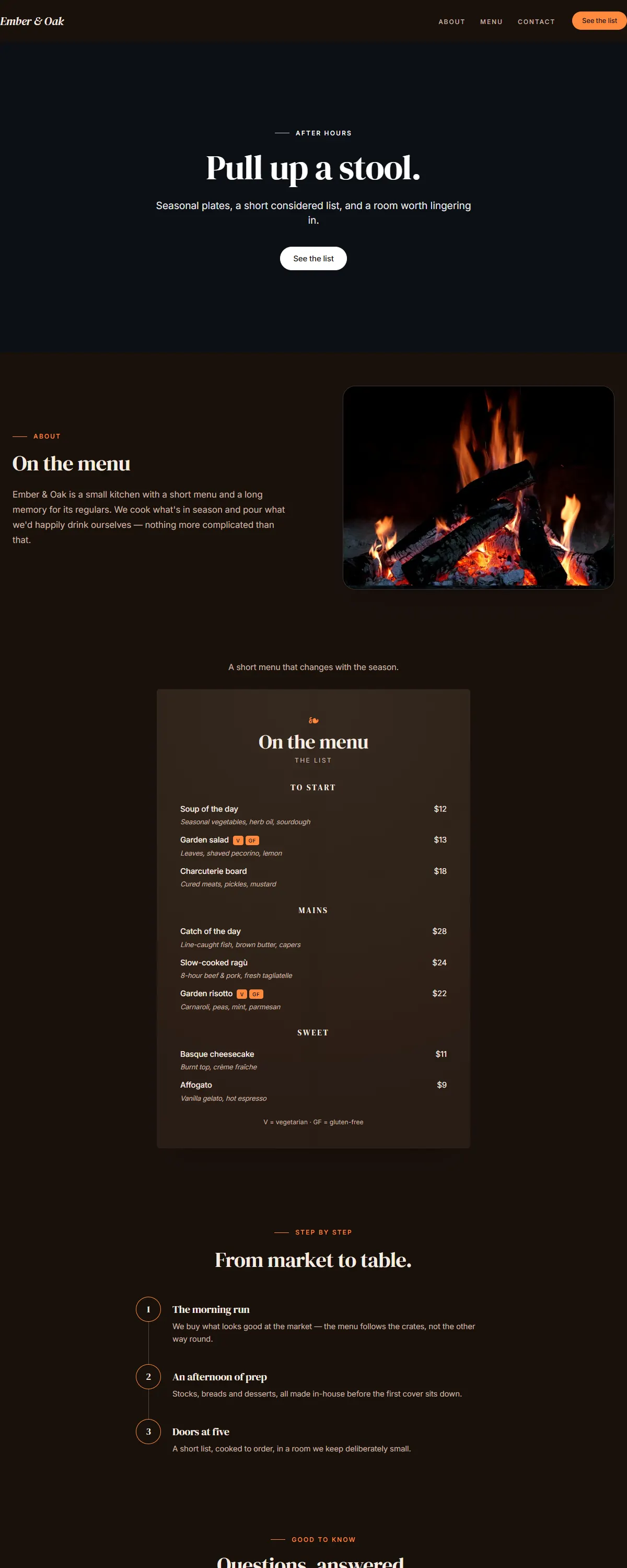
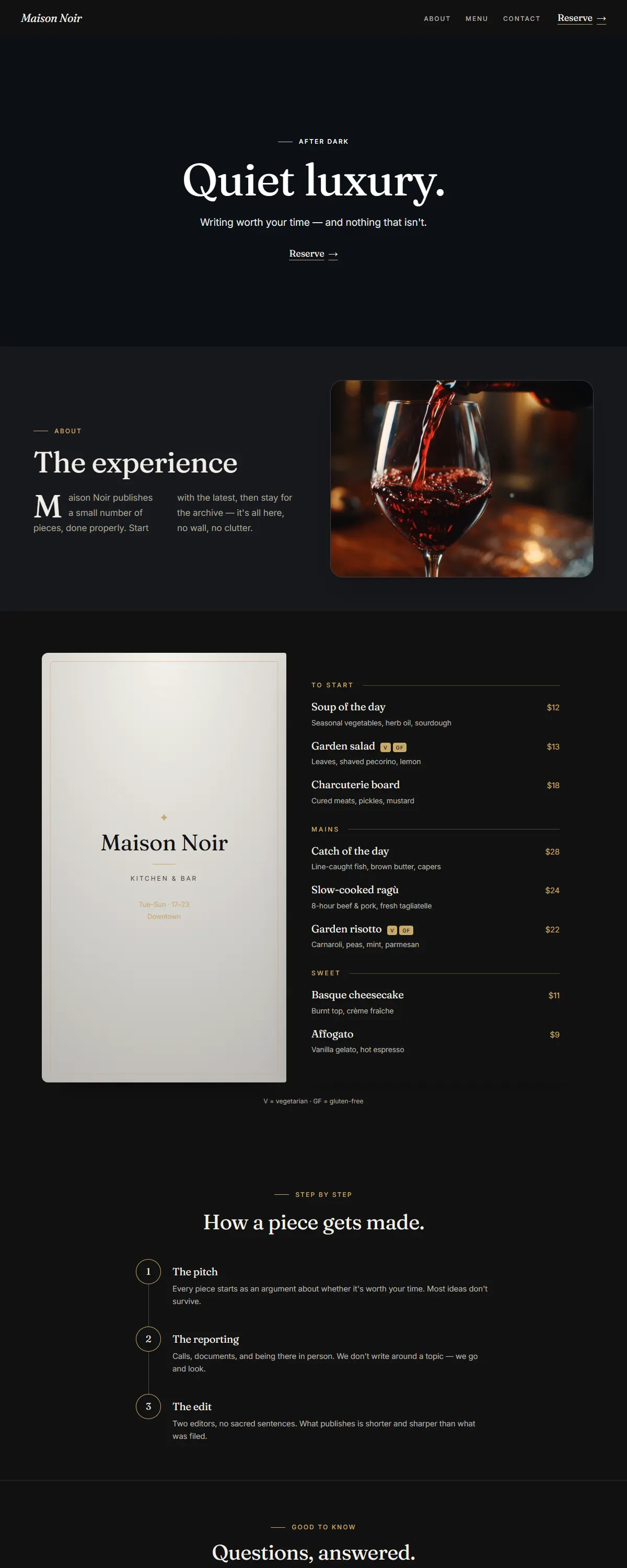
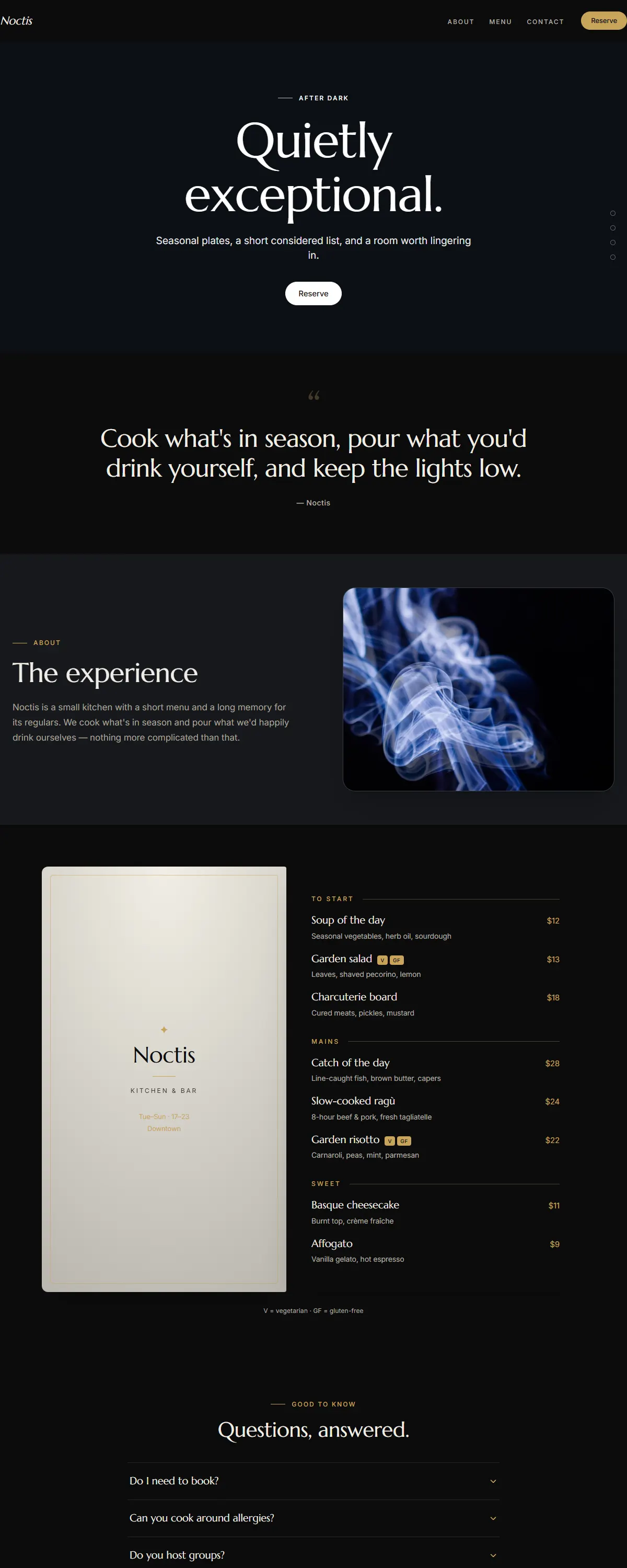
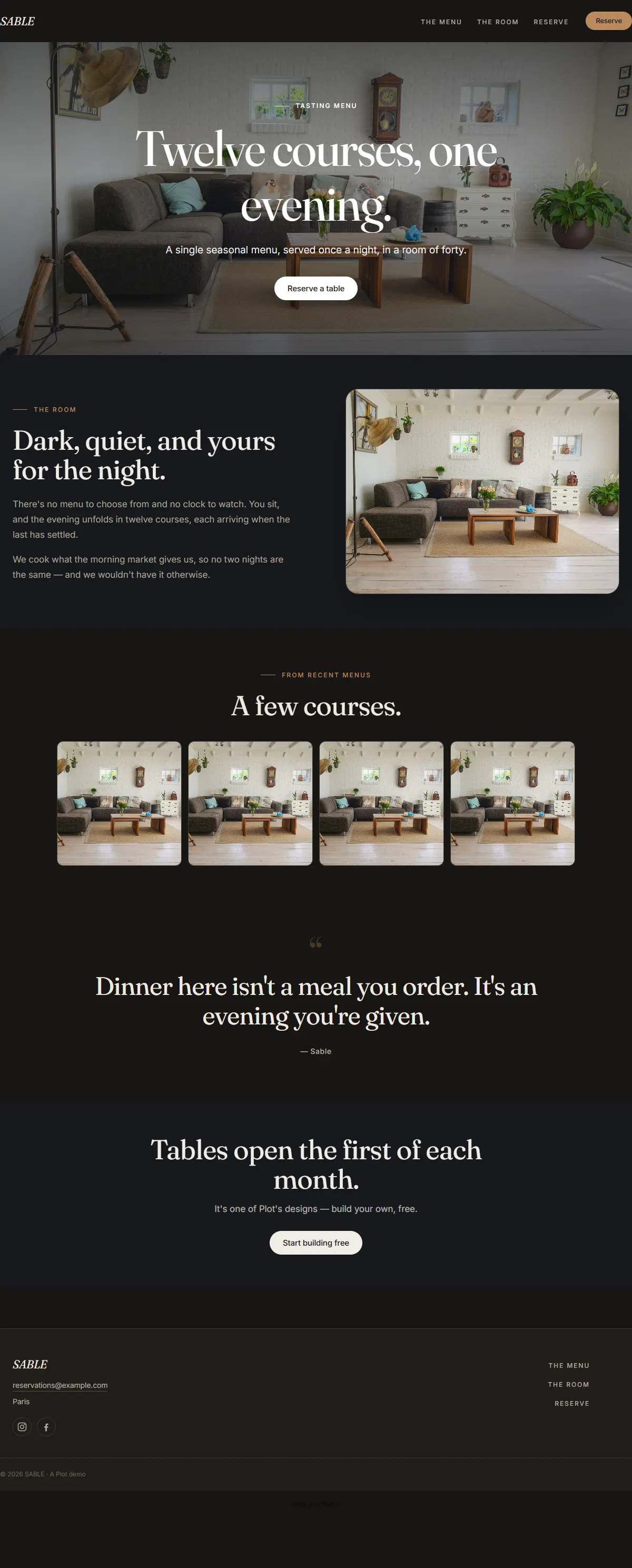
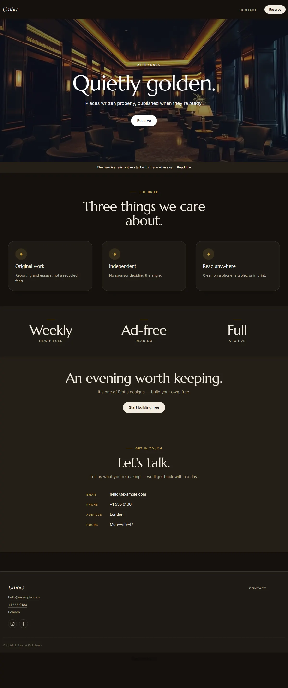
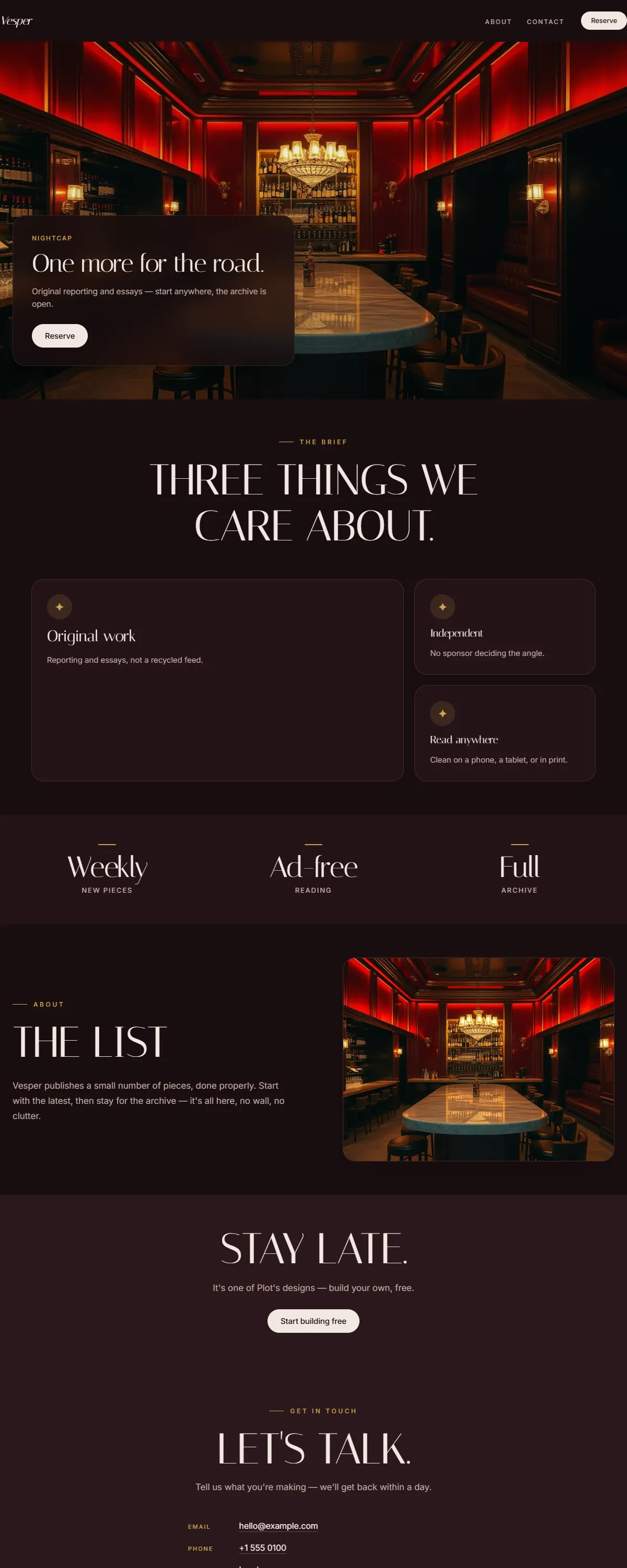
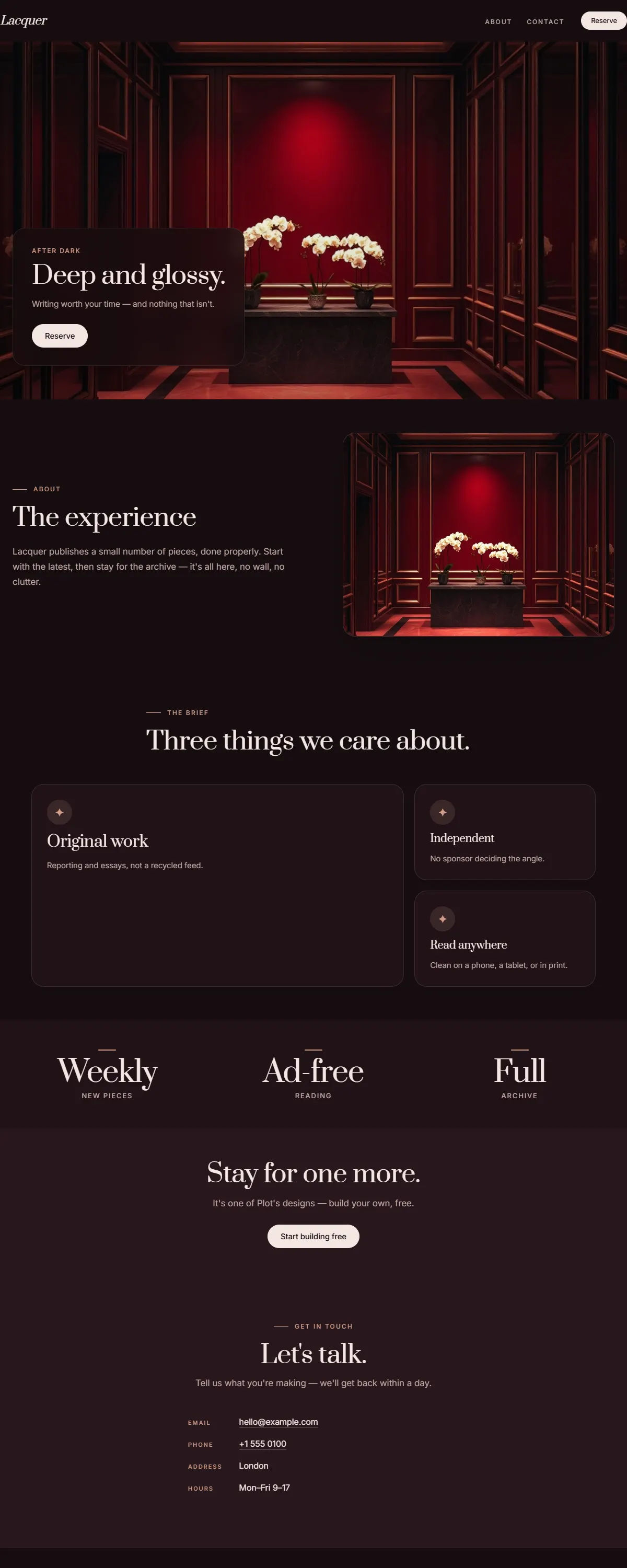
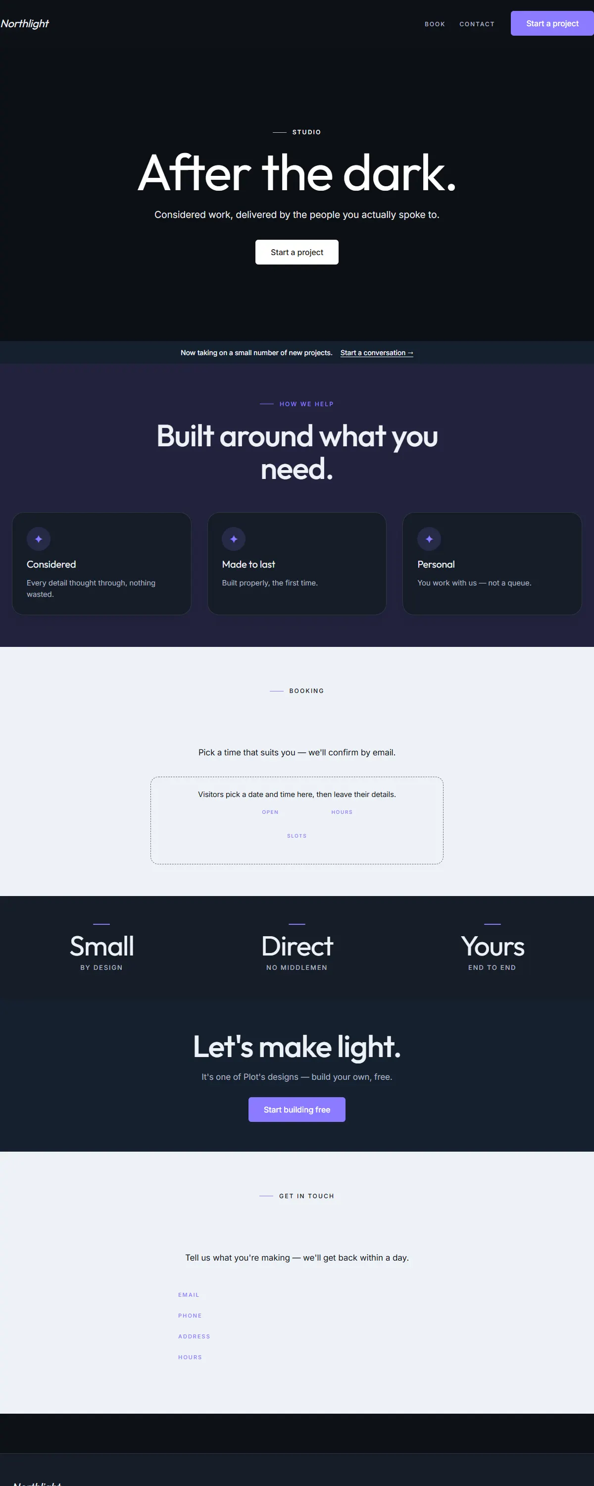
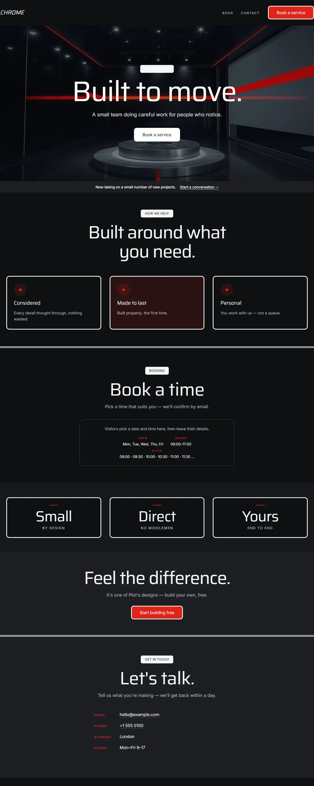
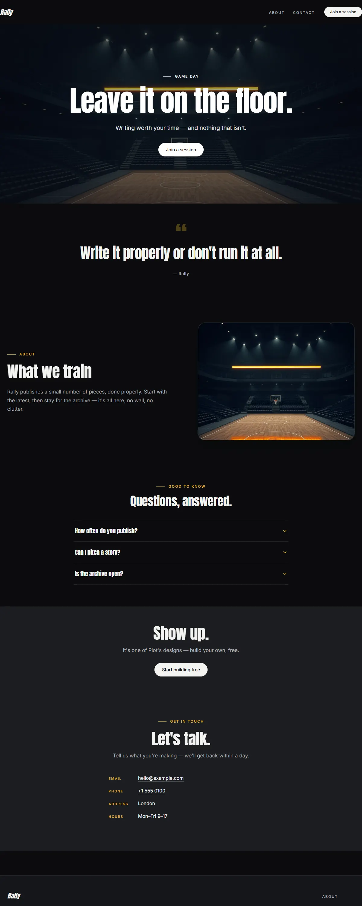
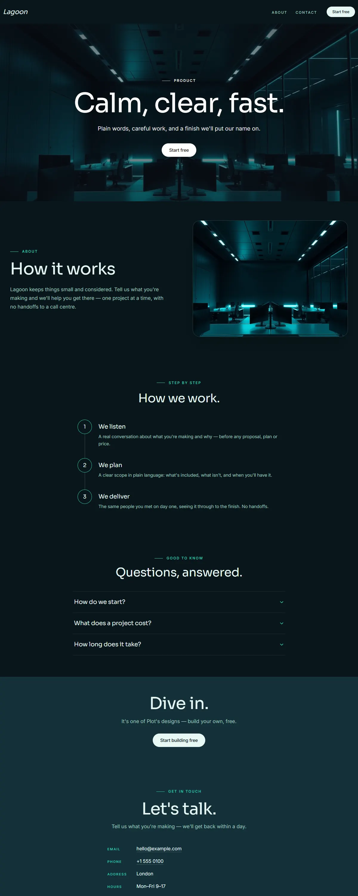
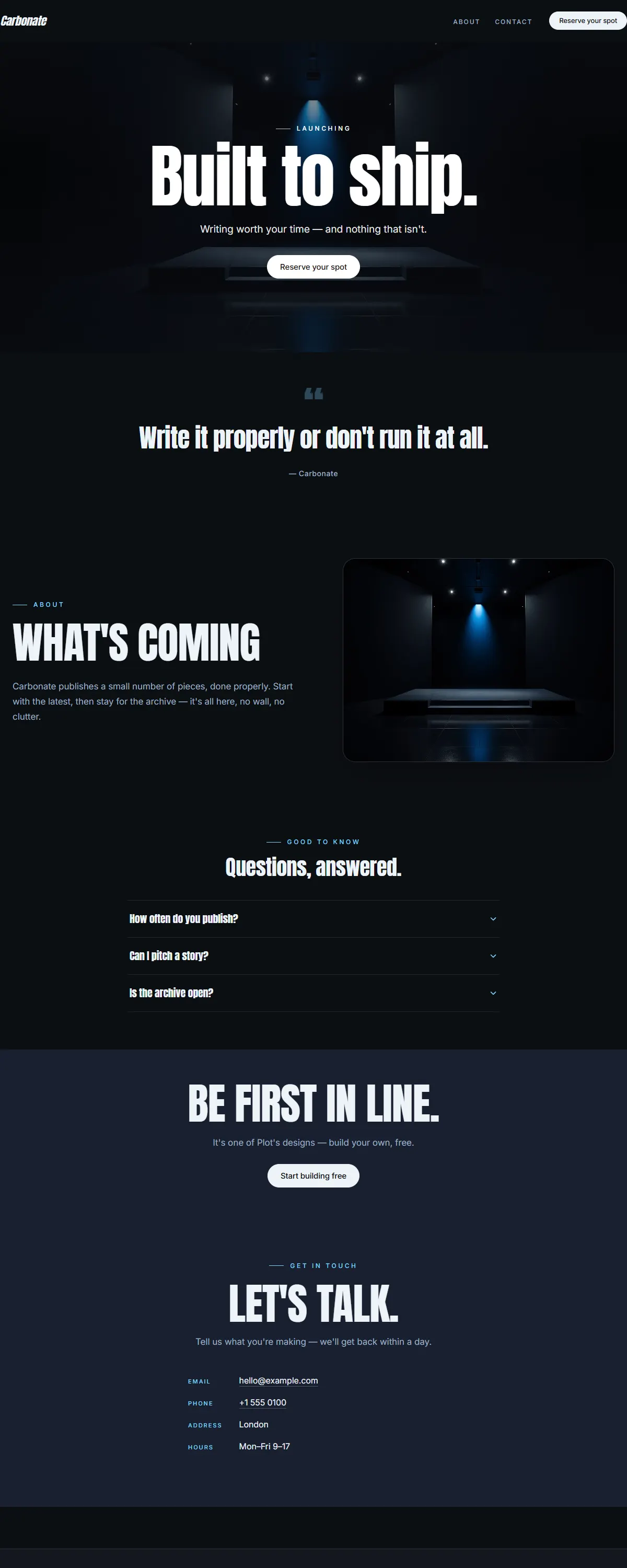
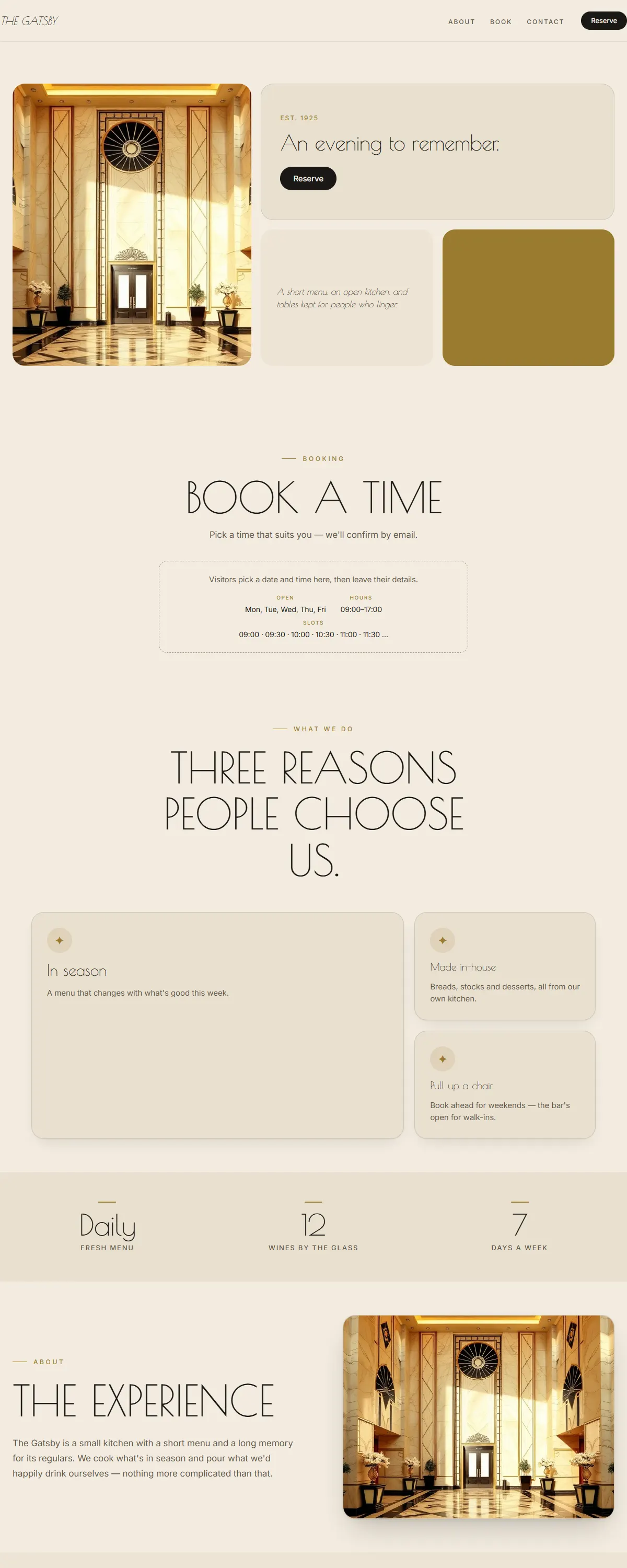
Dark espresso and warm amber with a display serif. Cosy, after-dark warmth.
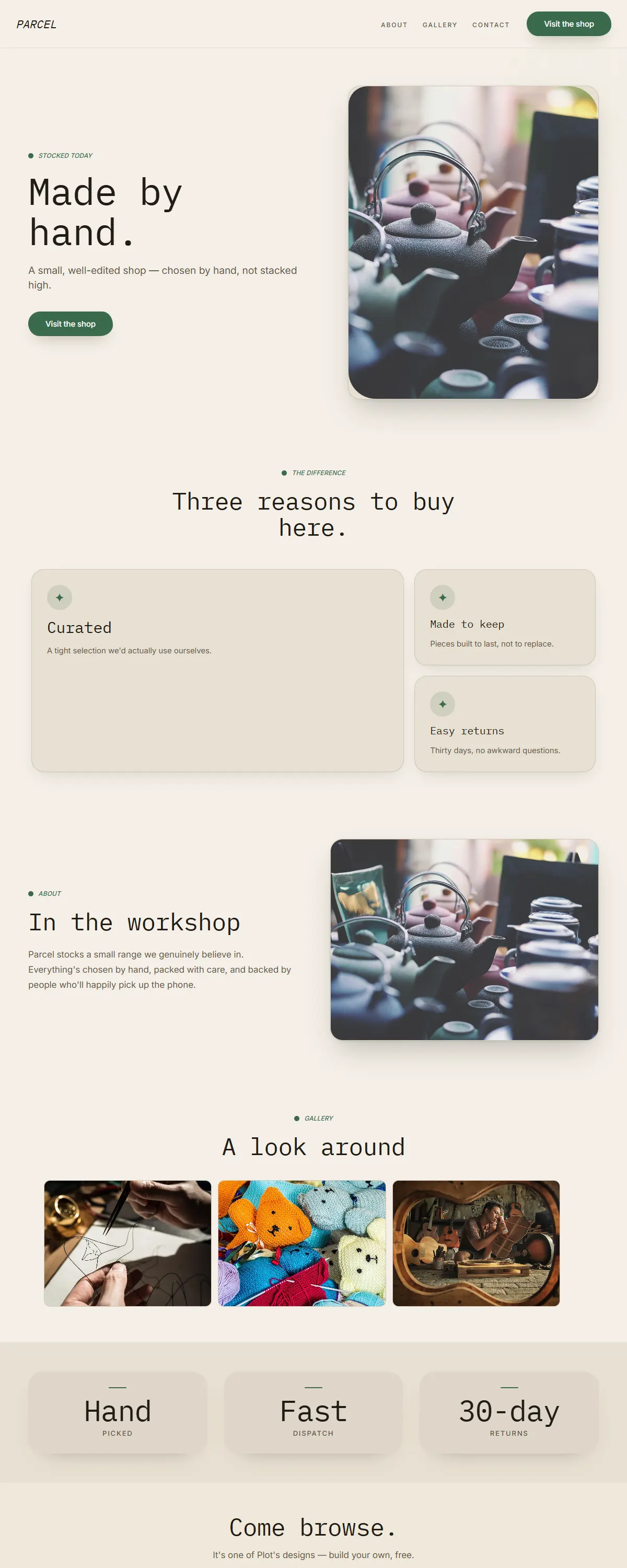
Kraft tan and forest green with monospaced labels. Honest, hand-made retail.
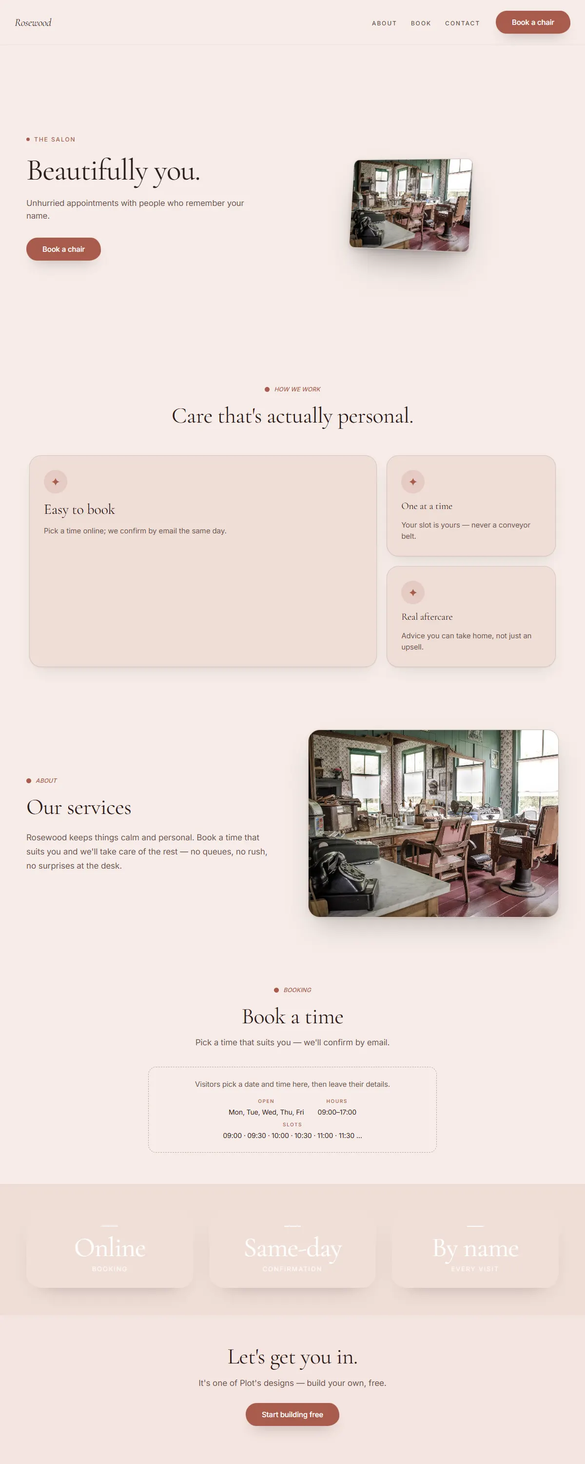
Dusty rose and deep brown with a soft serif. Warm, mature, never sugary.
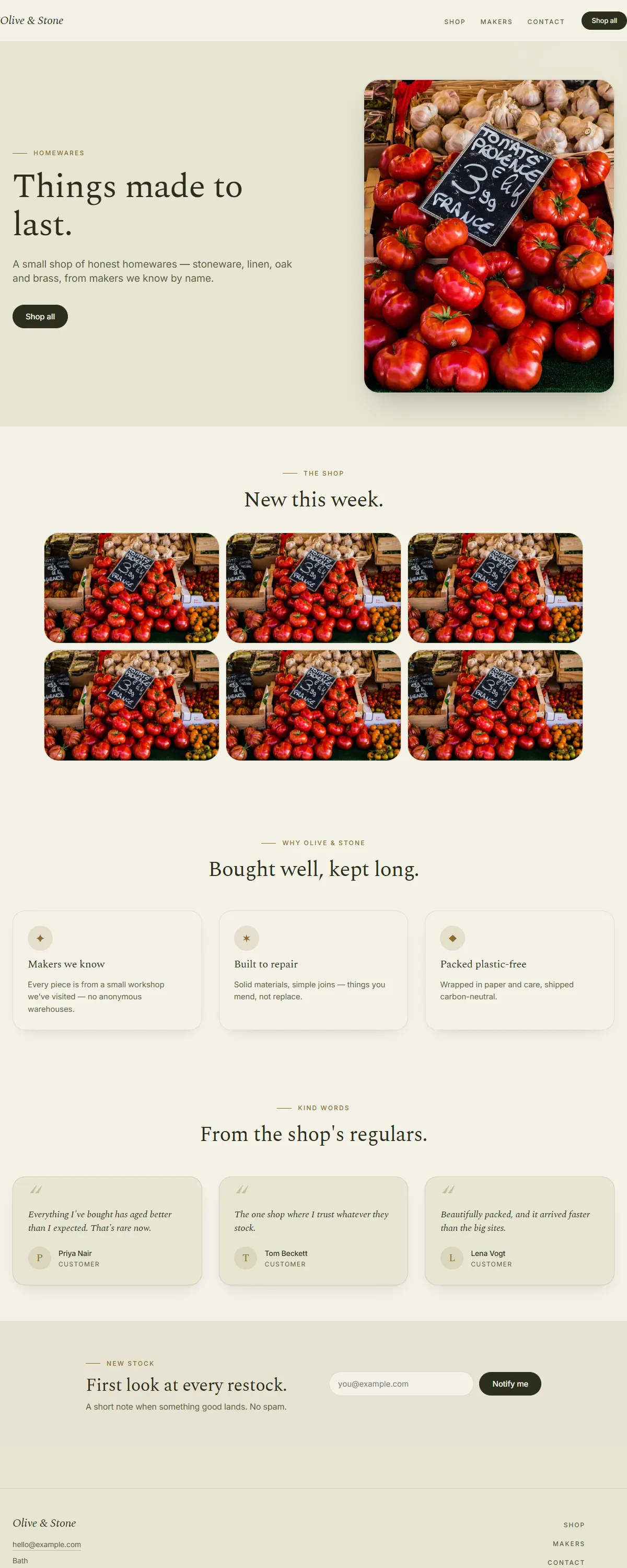
Olive and cream with a mustard accent and a Spectral serif. Farmhouse-fresh.
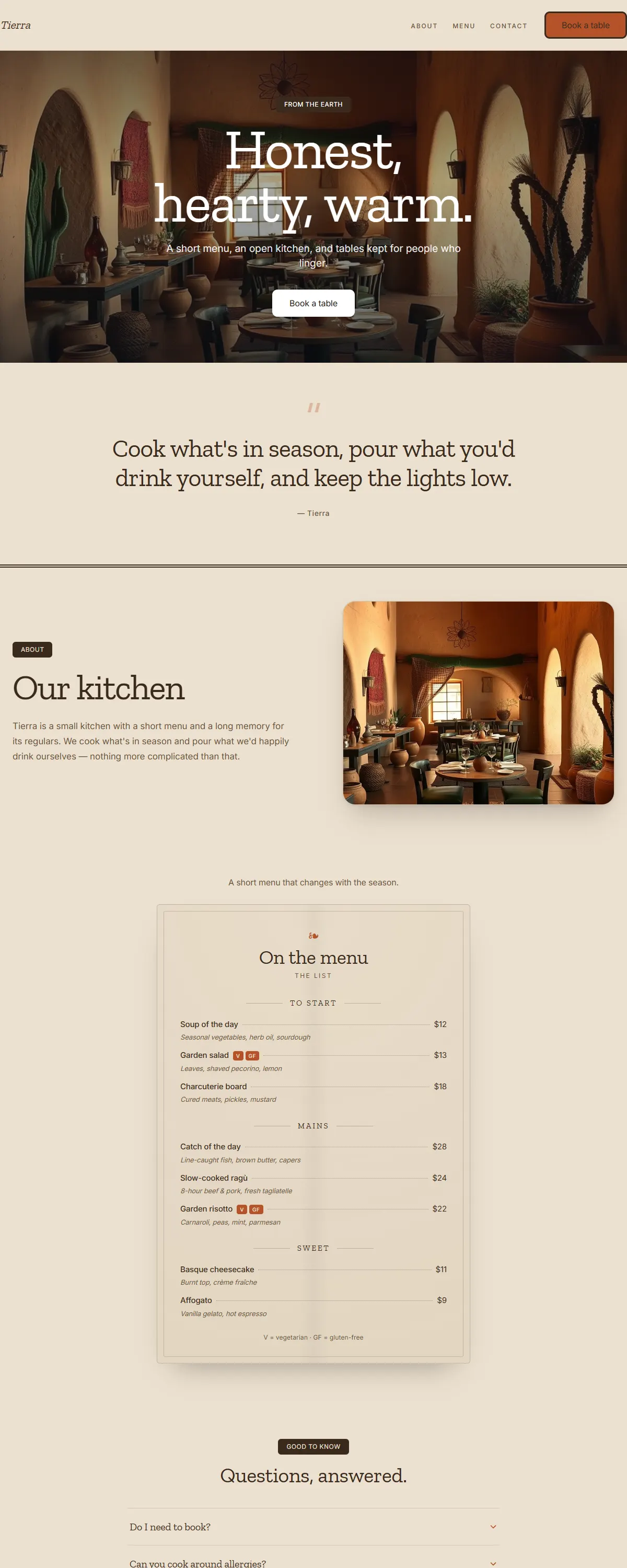
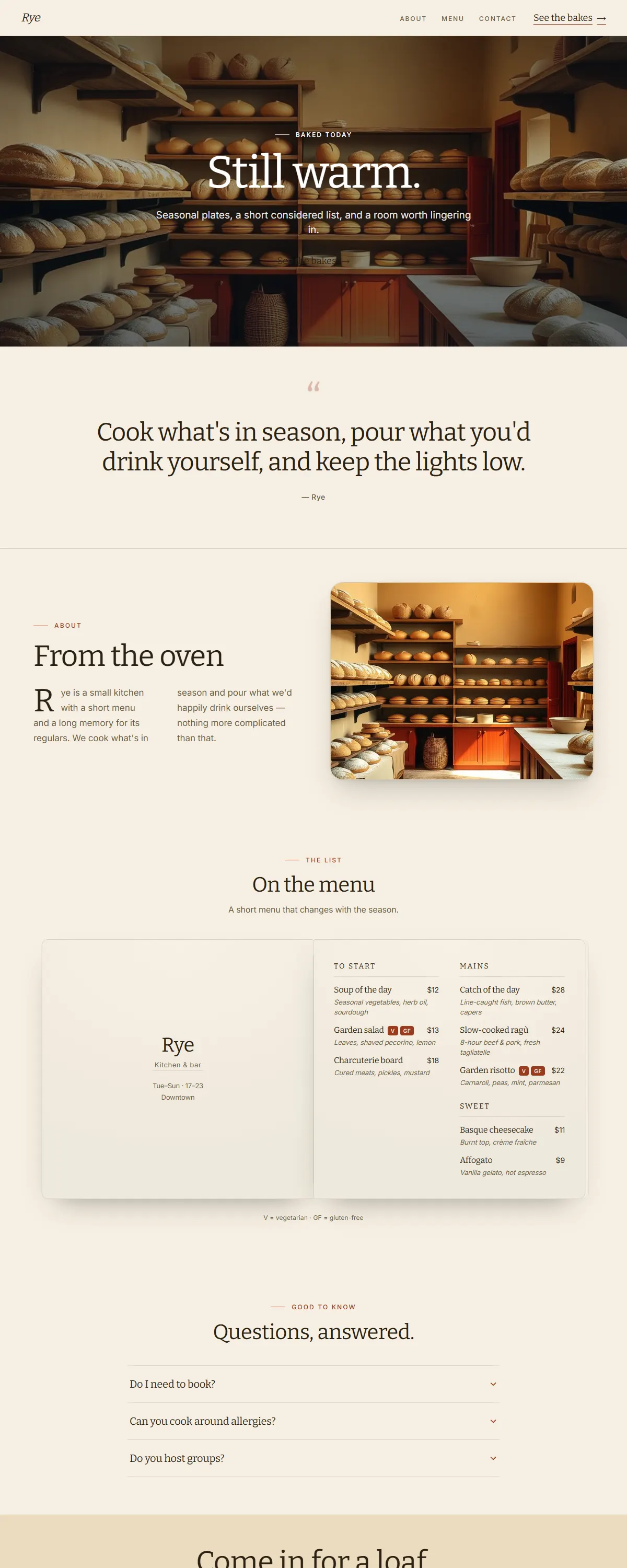
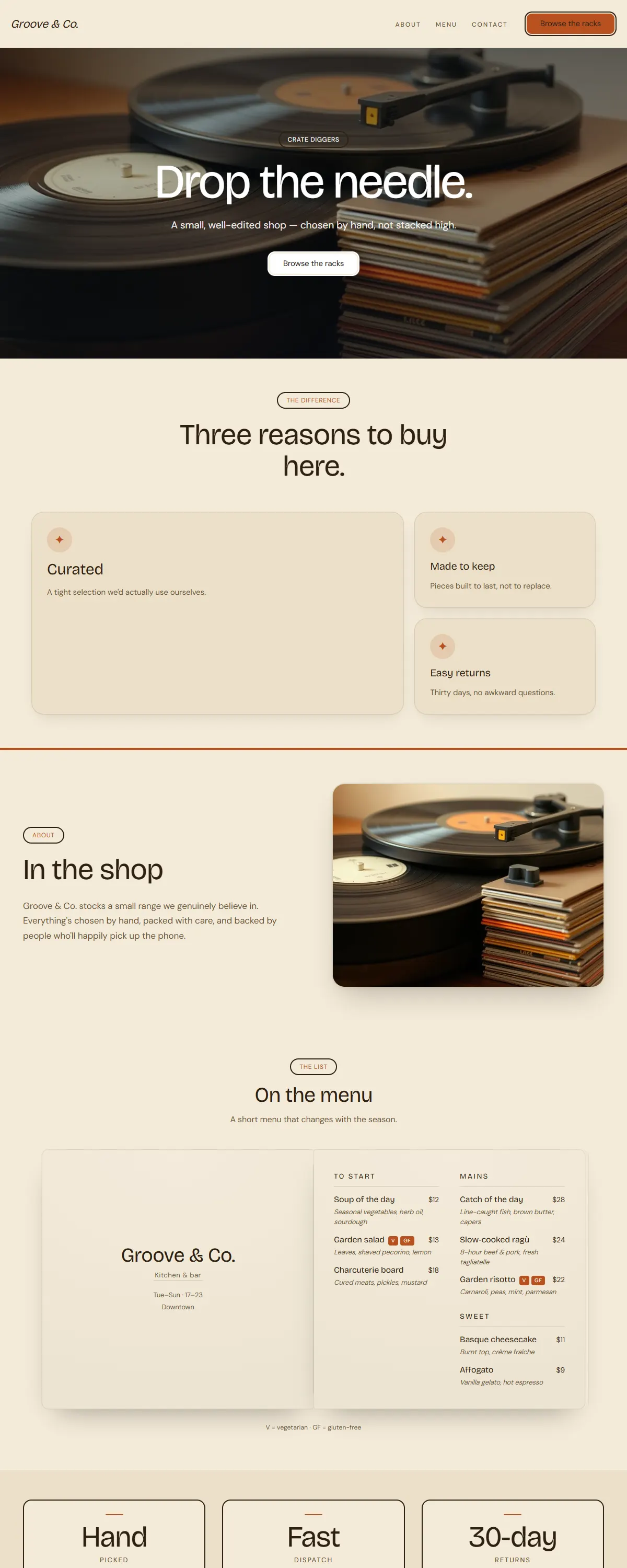
Warm clay and sand with a characterful Fraunces. Hand-made and grounded.
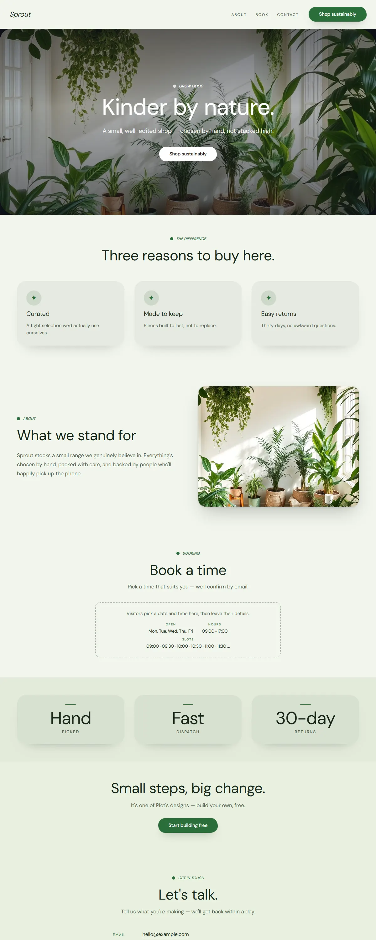
Fresh, bright and eco — leaf green on soft cream with a friendly rounded sans.
Earthy maximalist — warm sand, rust and deep green with a sturdy Zilla slab serif.
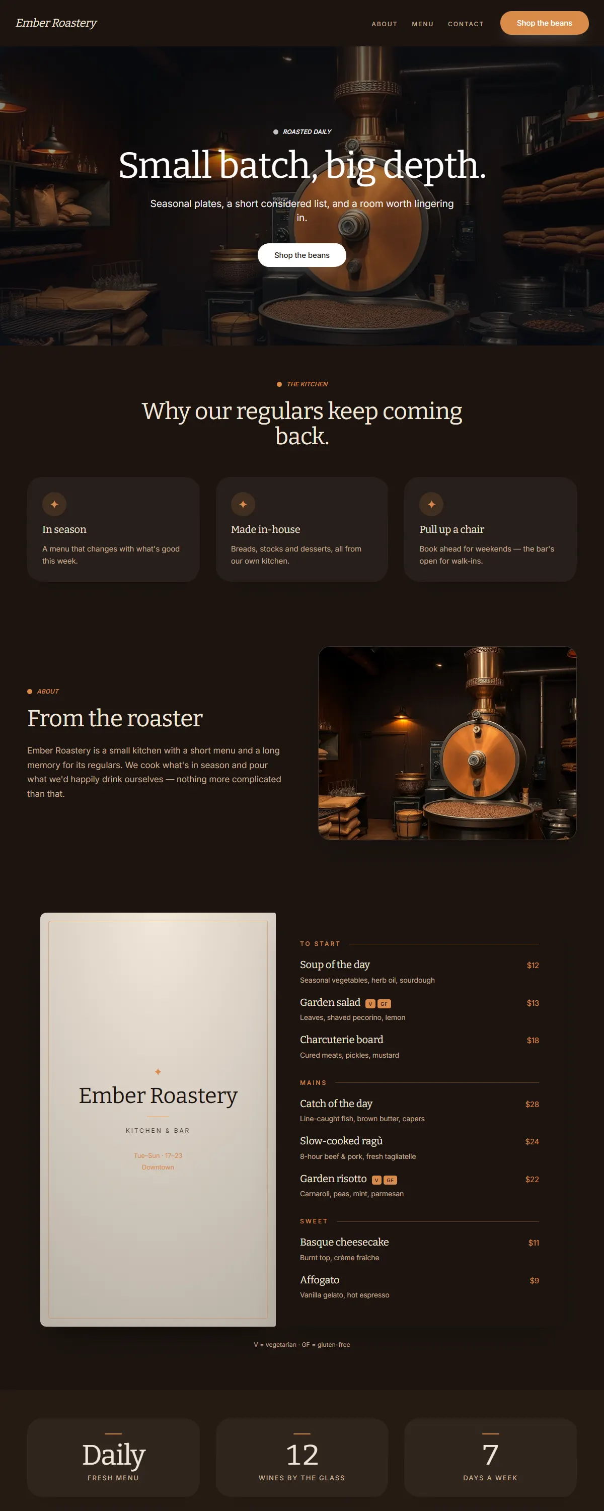
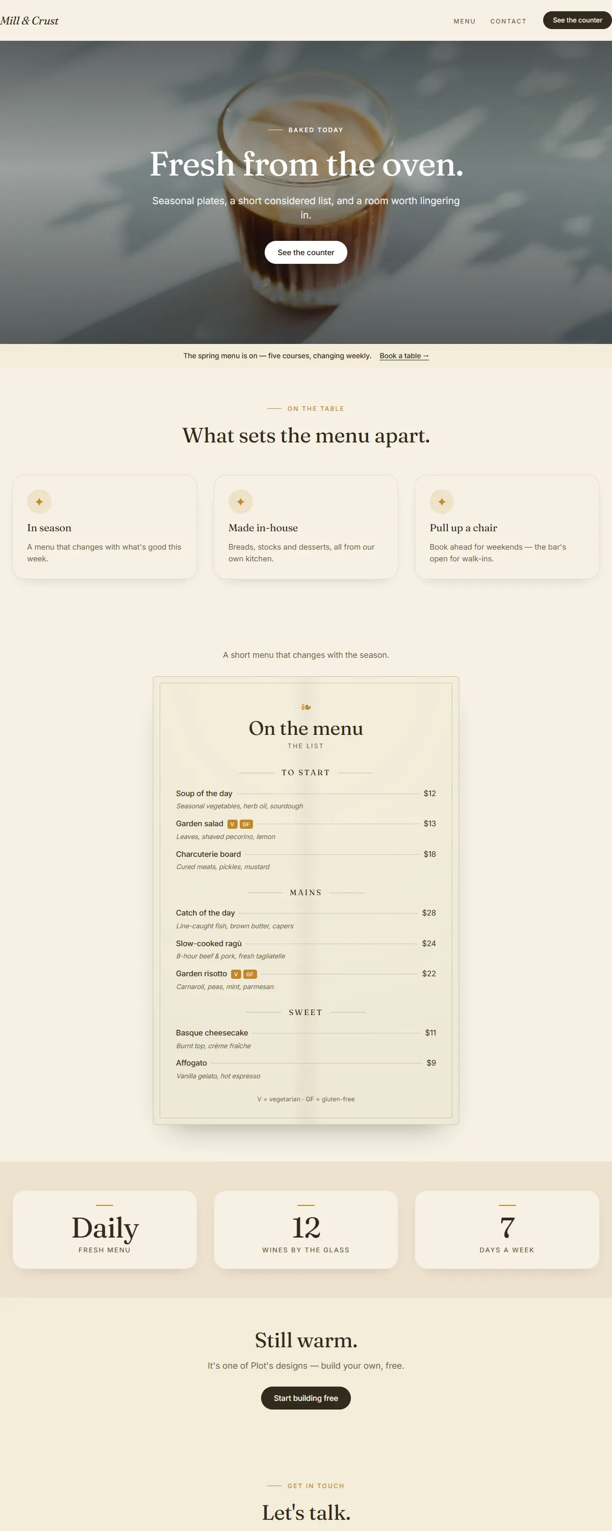
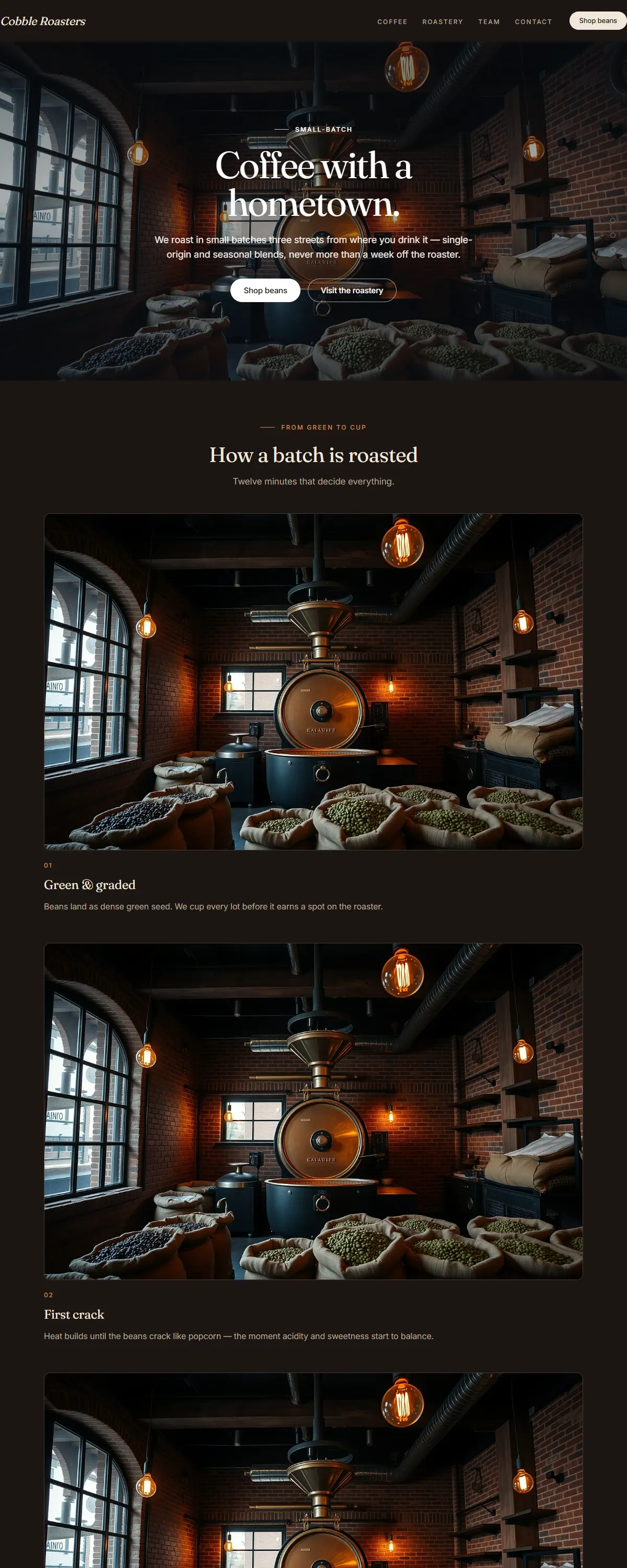
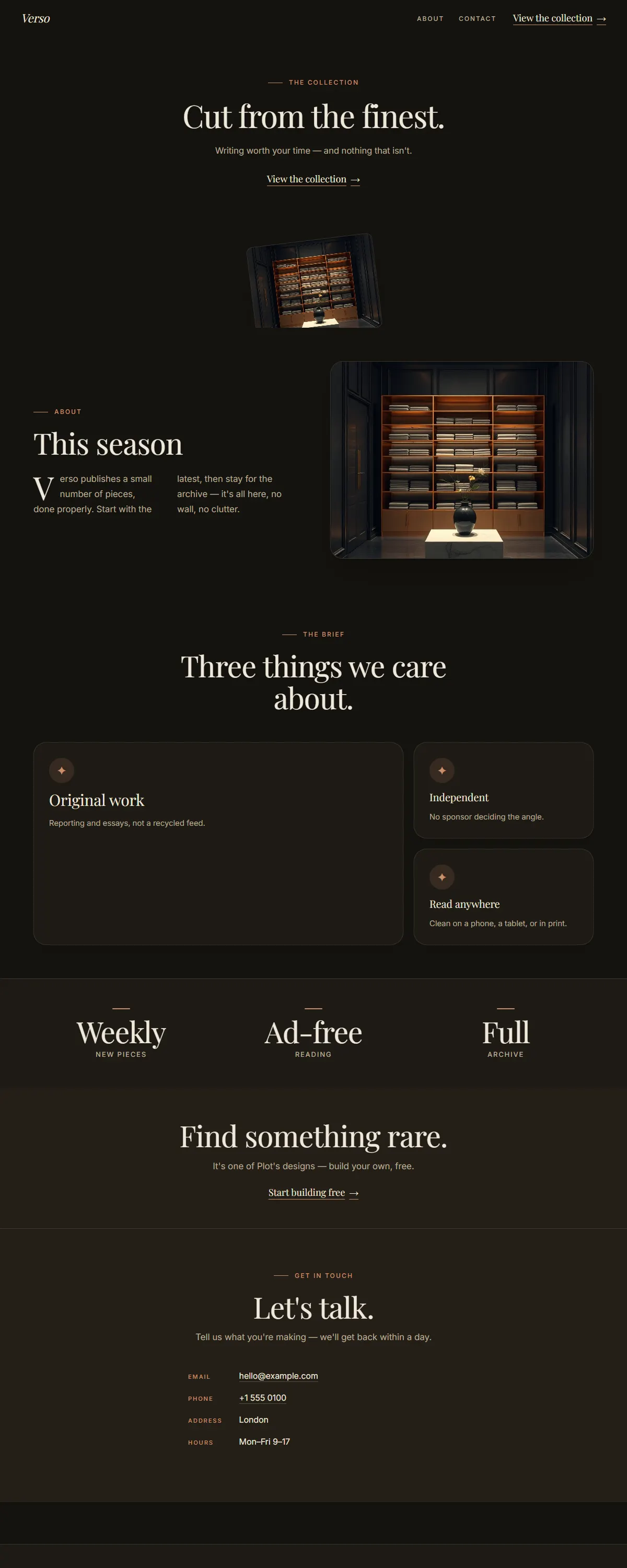
Dark coffee-roastery warmth — espresso and caramel with a sturdy Bitter slab serif.
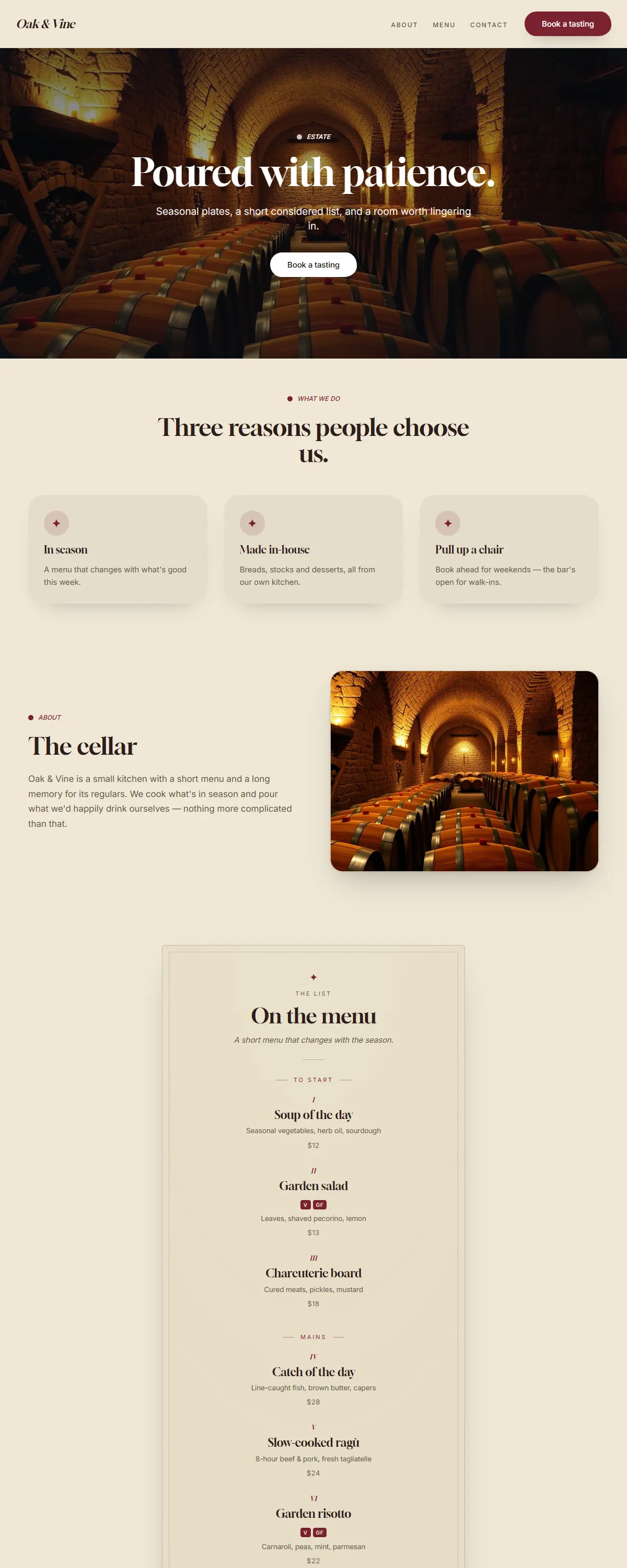
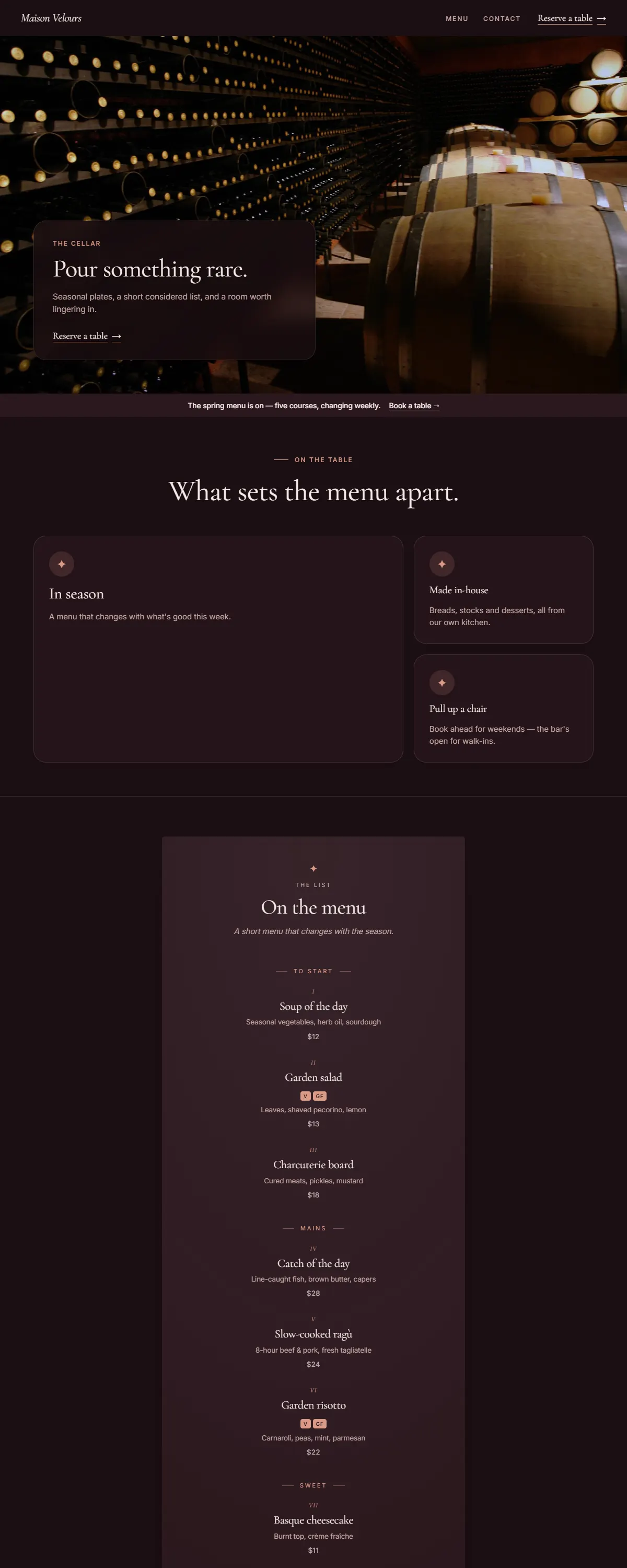
Rustic winery warmth — parchment and deep wine-red with an elegant Gloock serif.
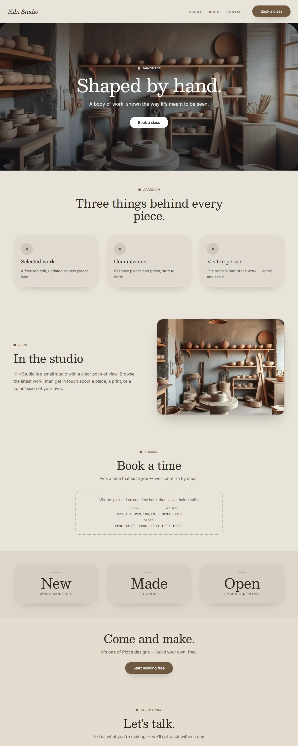
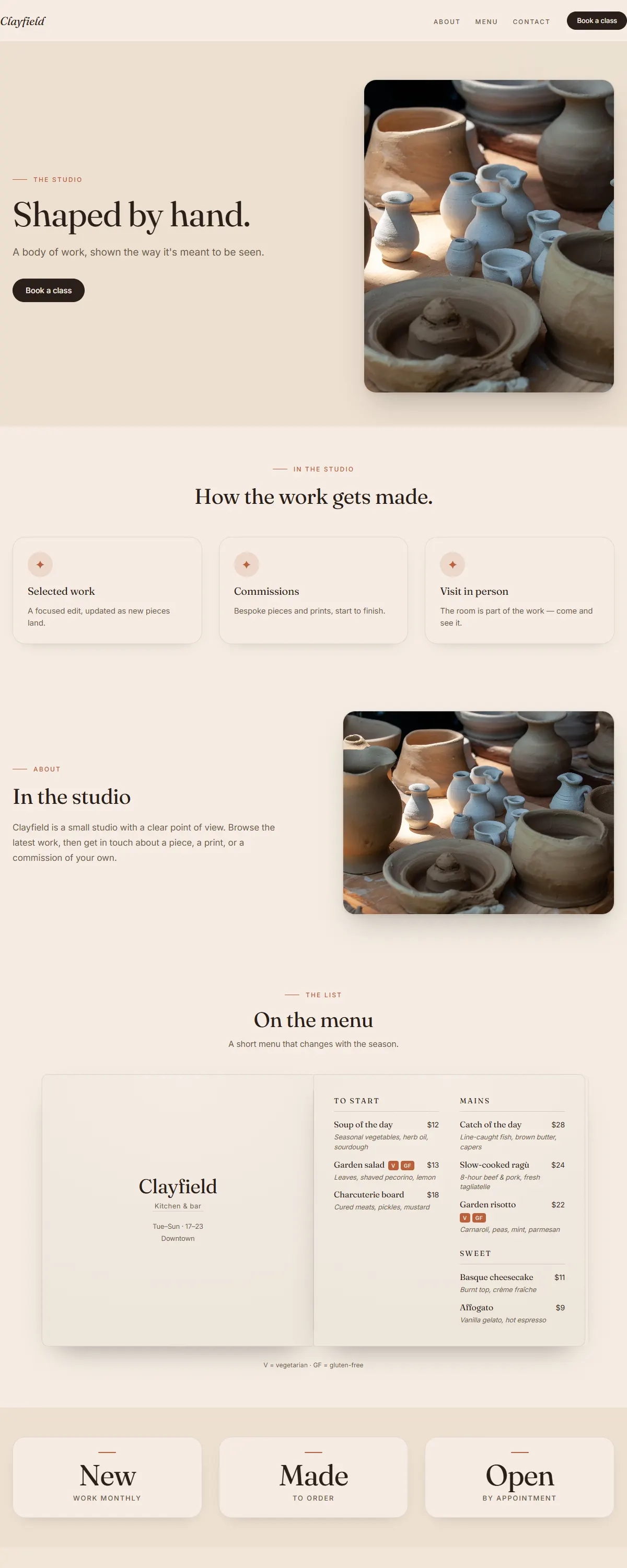
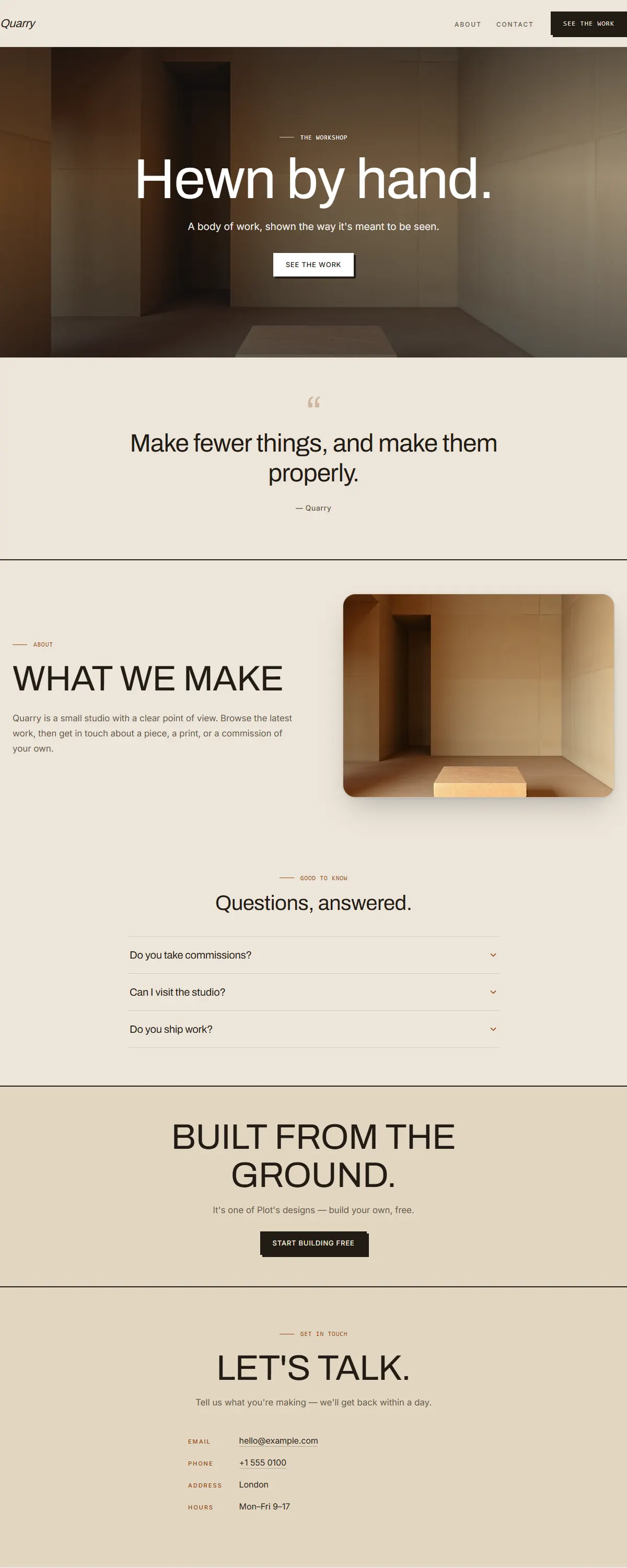
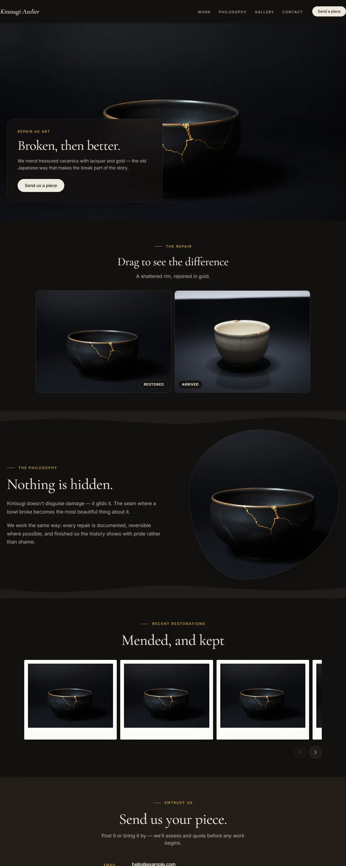
Warm, tactile craft studio — stoneware grey and raw clay with a soft Besley slab.
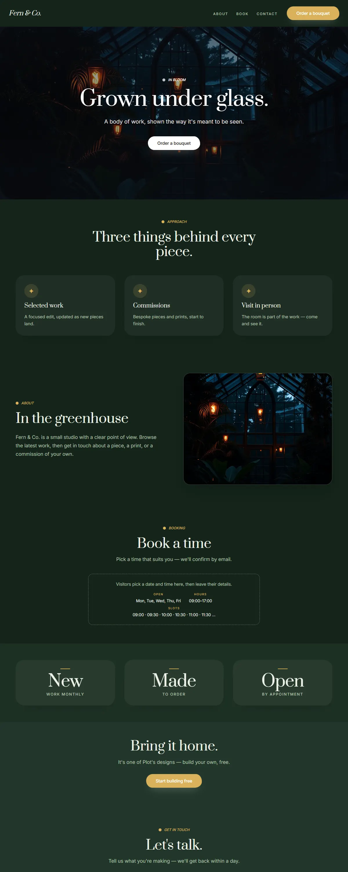
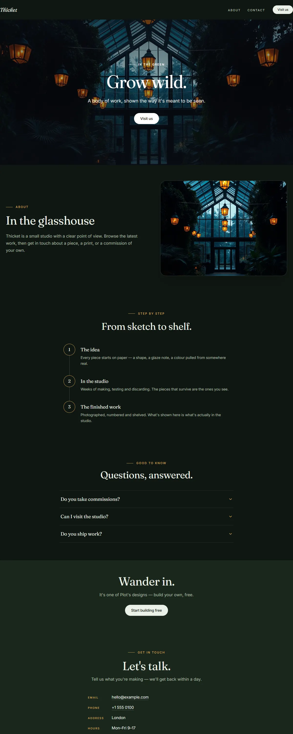
Dark greenhouse botanical — deep forest green with warm brass and an elegant Prata serif.
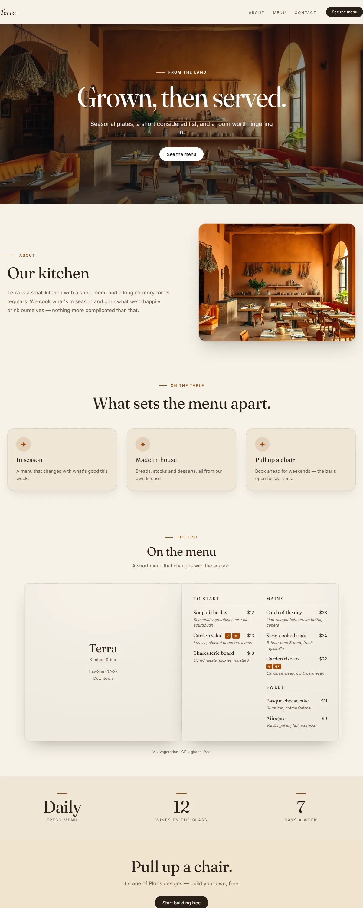
Warm clay and sand with burnt orange and a characterful Fraunces. Honest, hearty, farm-to-table.
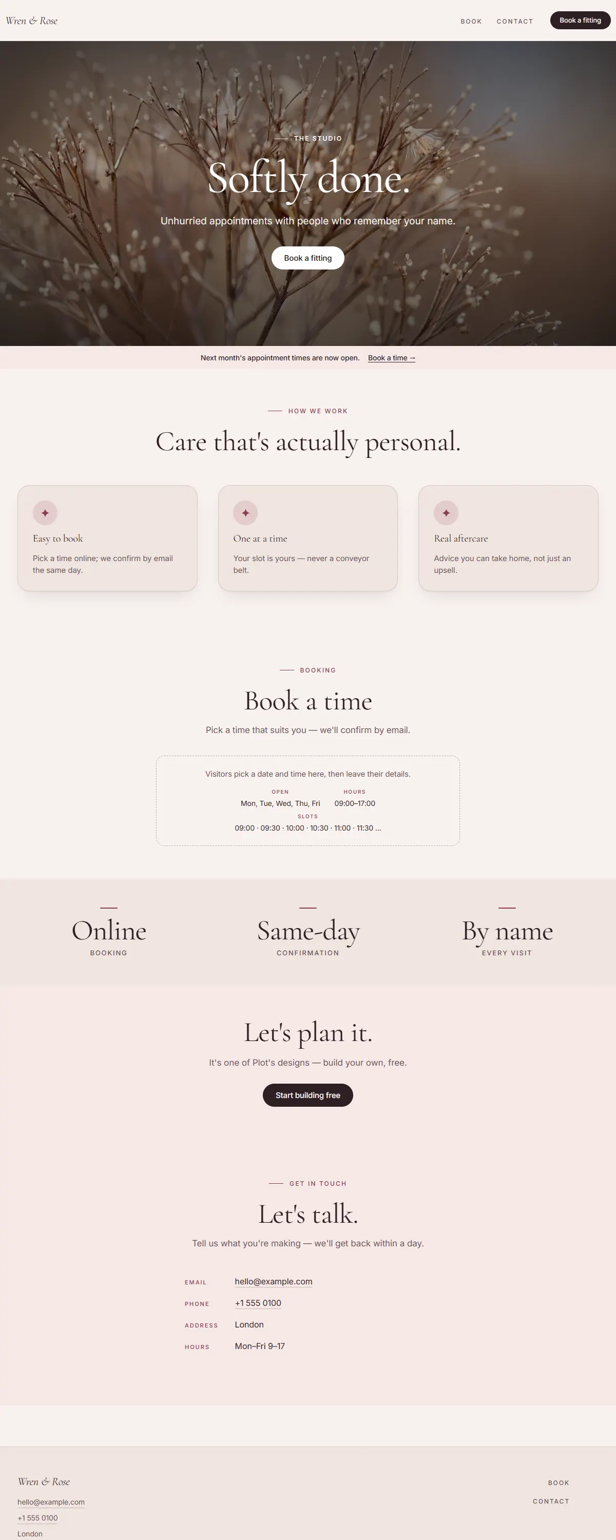
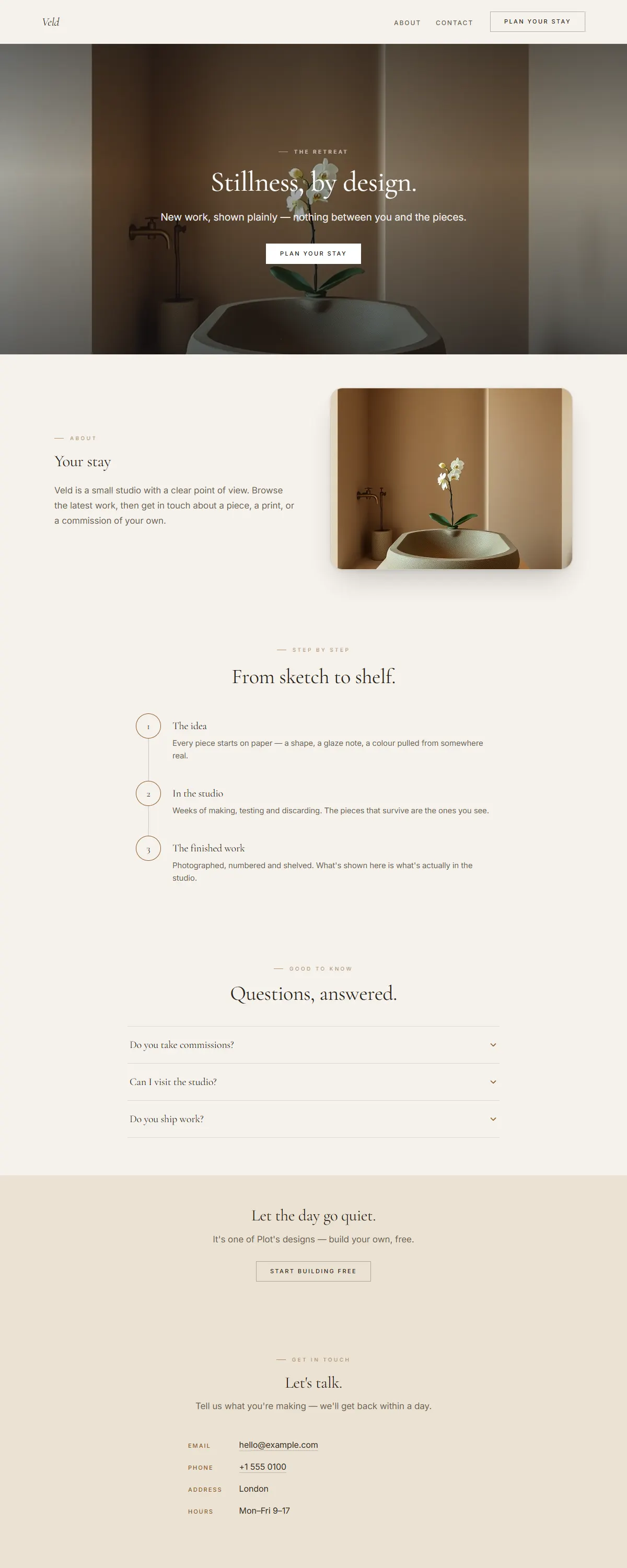
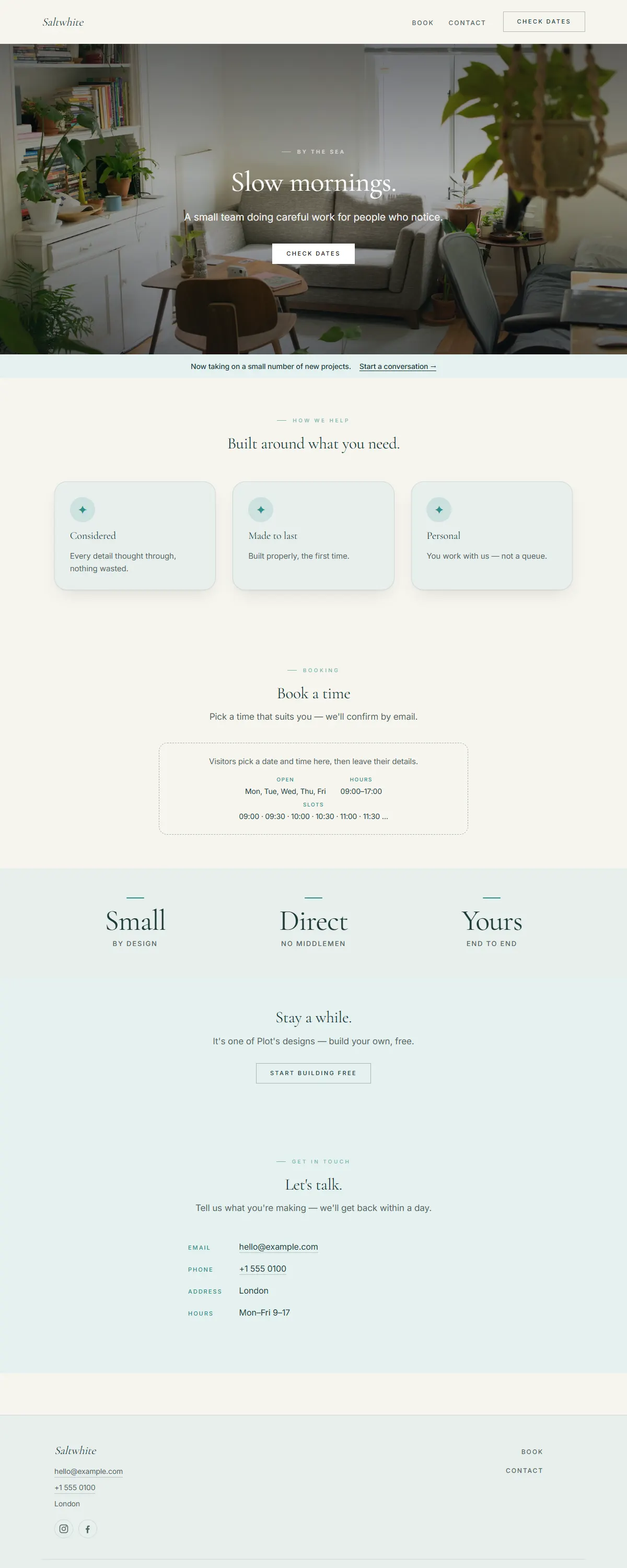
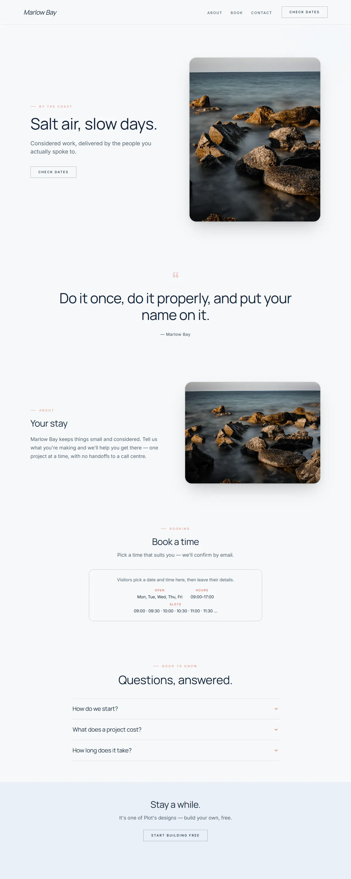
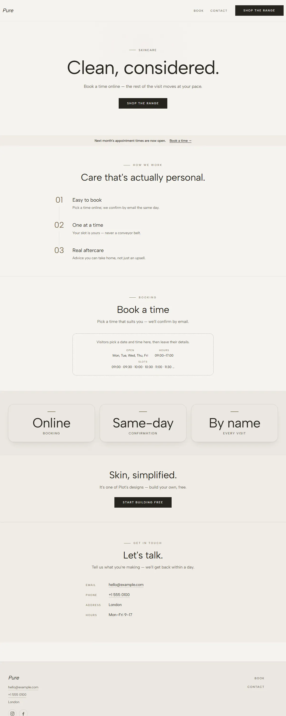
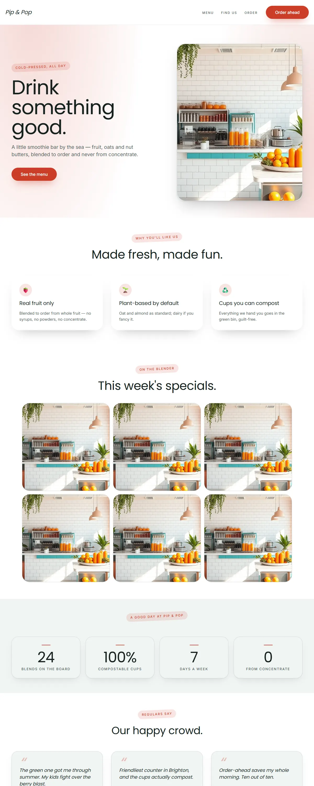
Soft sand and sage with a gentle Spectral serif. Slow, coastal, unhurried.
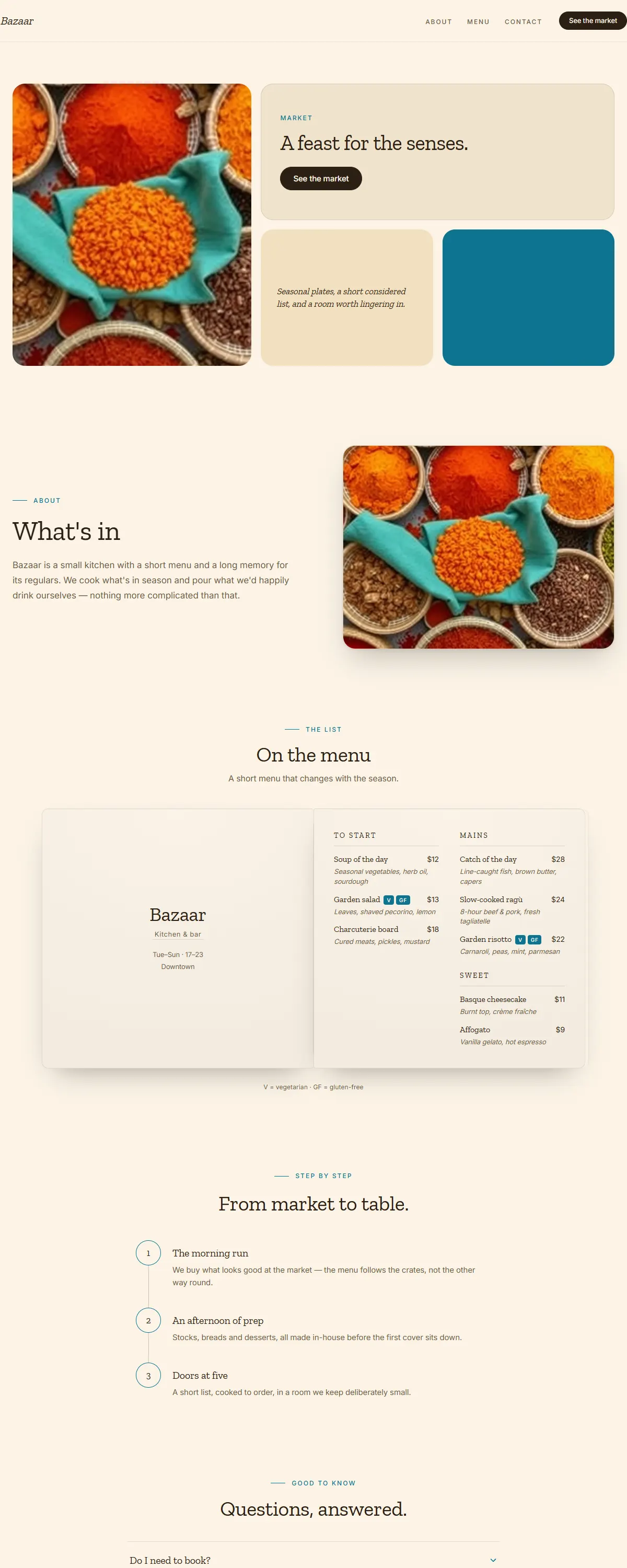
Saffron, terracotta and teal with a sturdy Zilla slab. Earthy maximalist, warm and abundant.
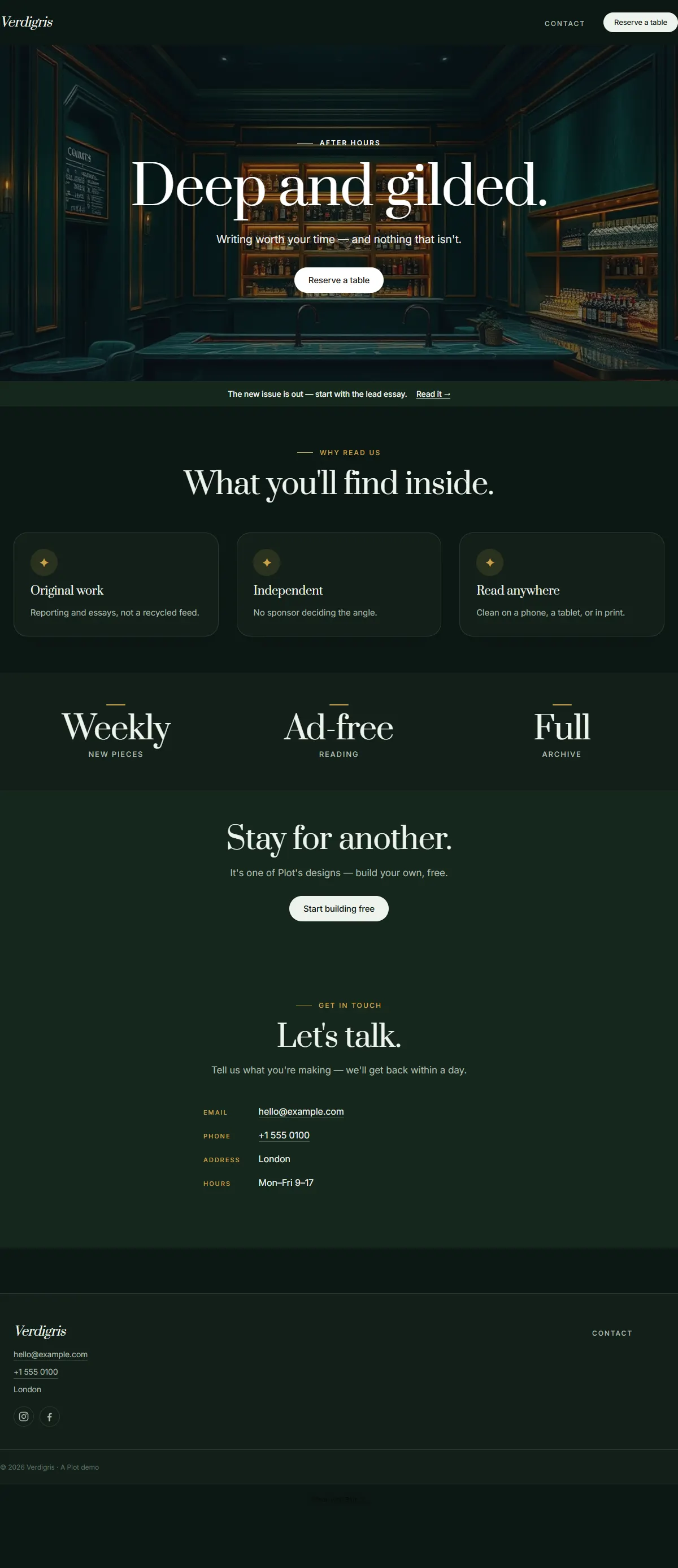
Deep forest green with warm amber and a characterful Fraunces. Moody botanical after dusk.
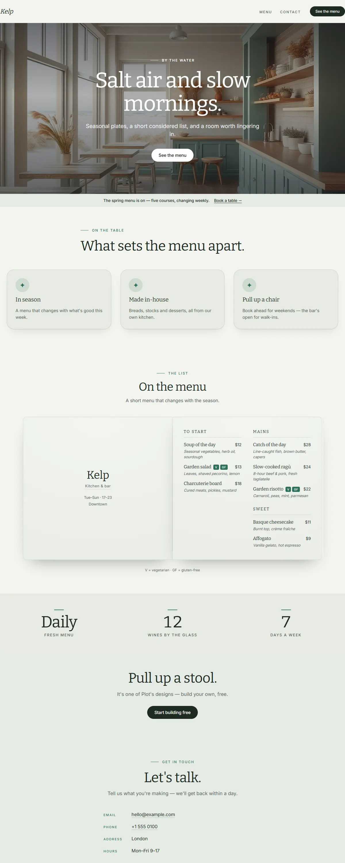
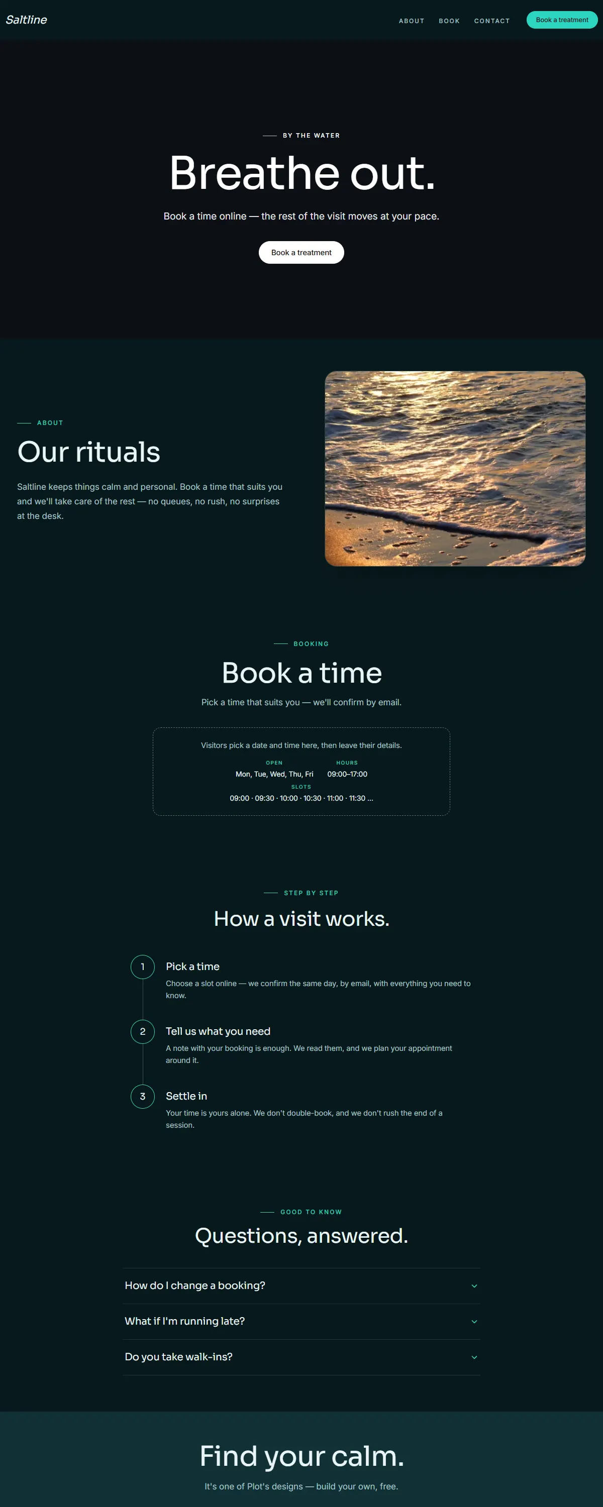
Sea-glass green and warm sand with a sturdy Bitter slab. Breezy, coastal, unhurried.
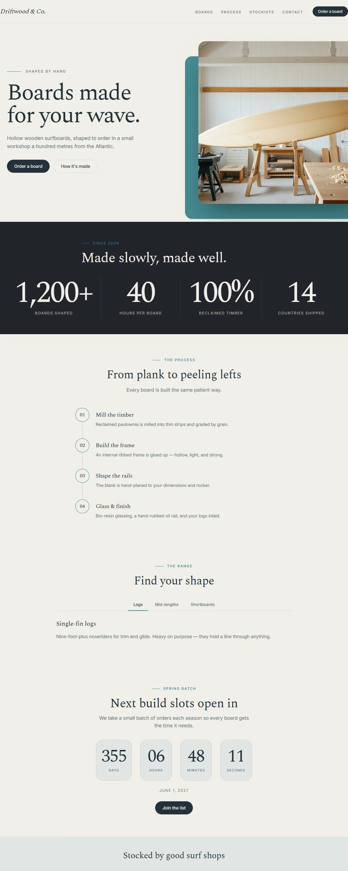
Wheat and brown with a barn-red accent and a sturdy Bitter slab. Honest, hand-made, just-baked.
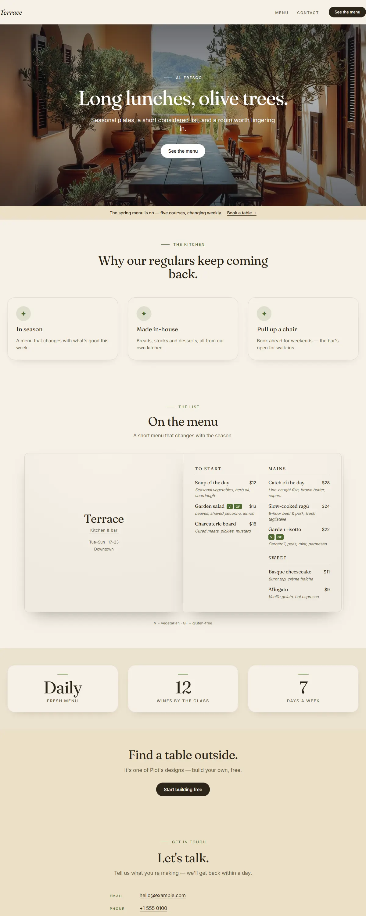
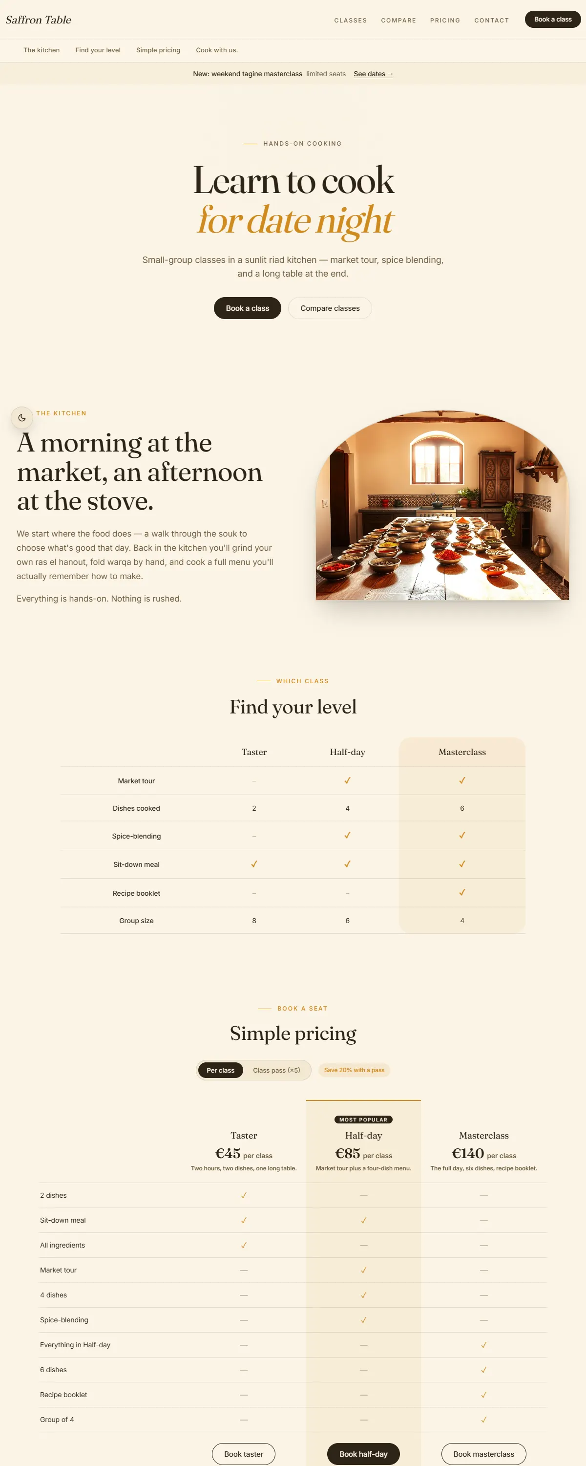
Clay and olive on warm cream with a characterful Fraunces. Sun-warmed Mediterranean ease.
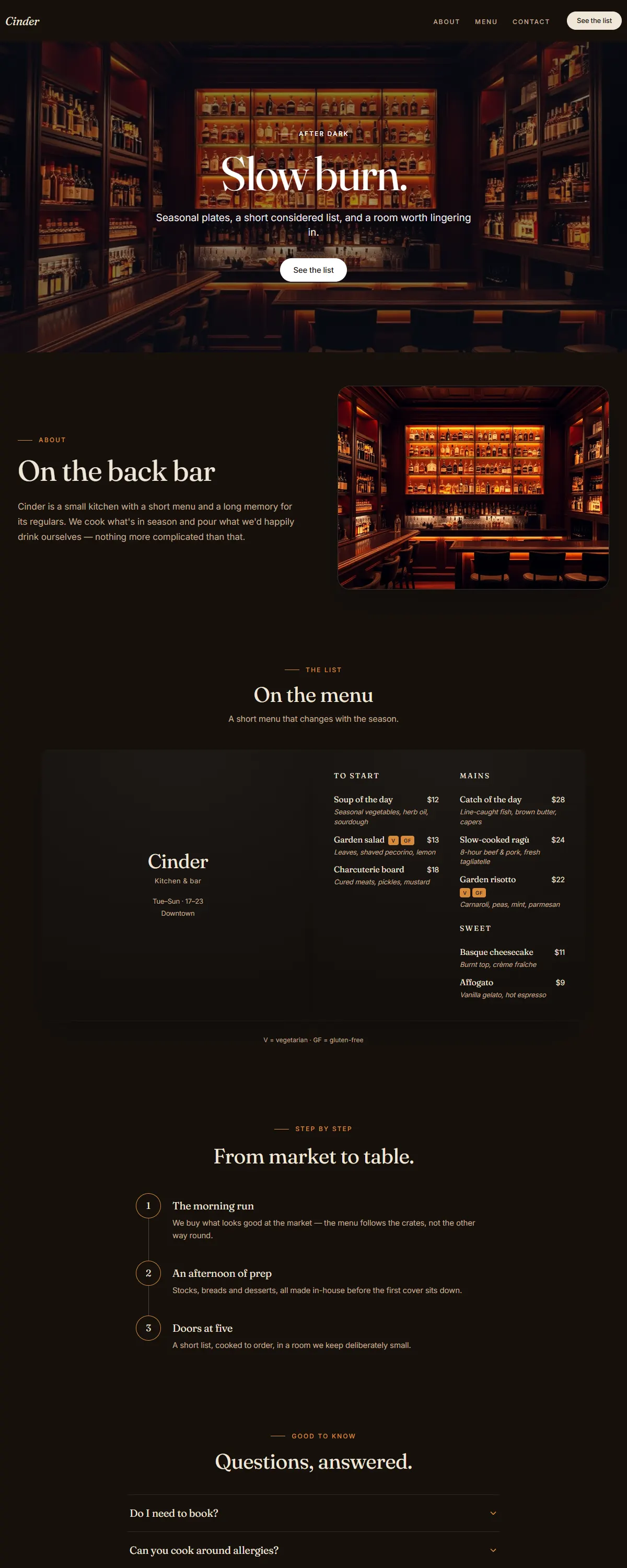
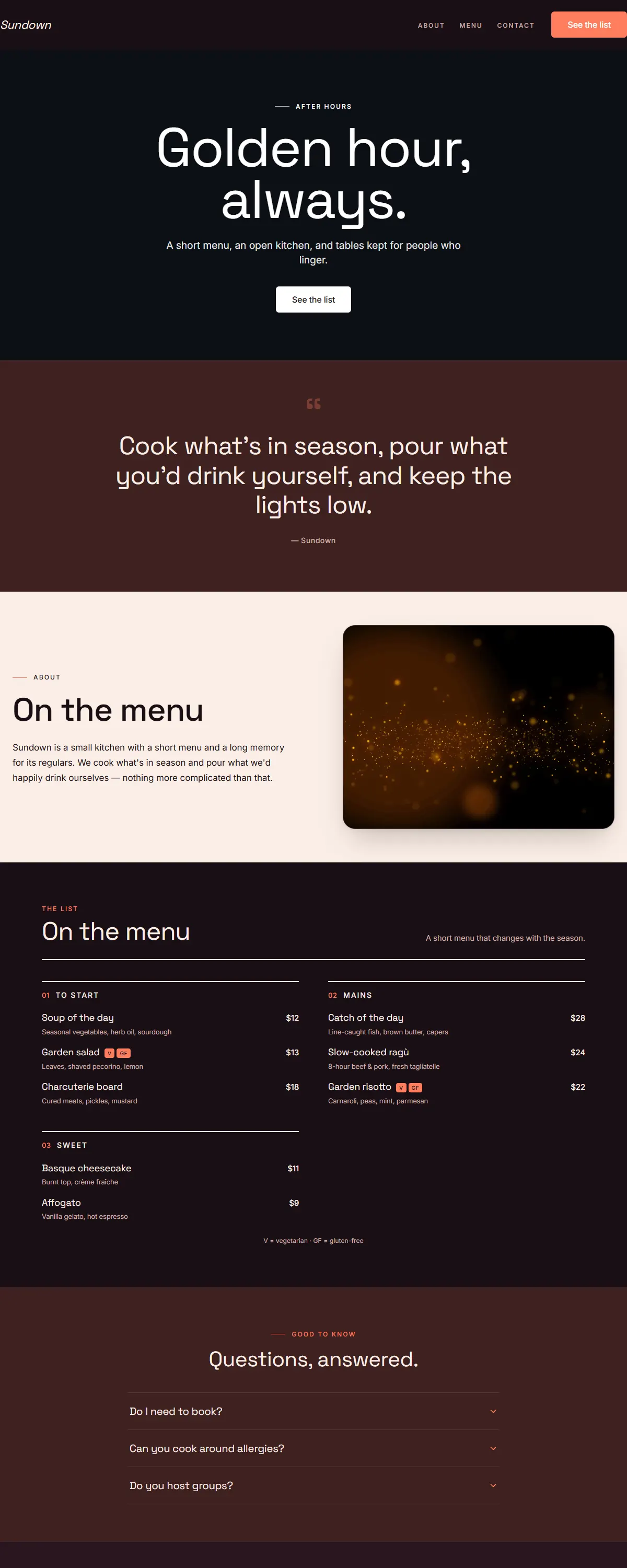
Espresso-dark with a warm amber glow and a characterful Fraunces. Slow-burn, after-dark warmth.
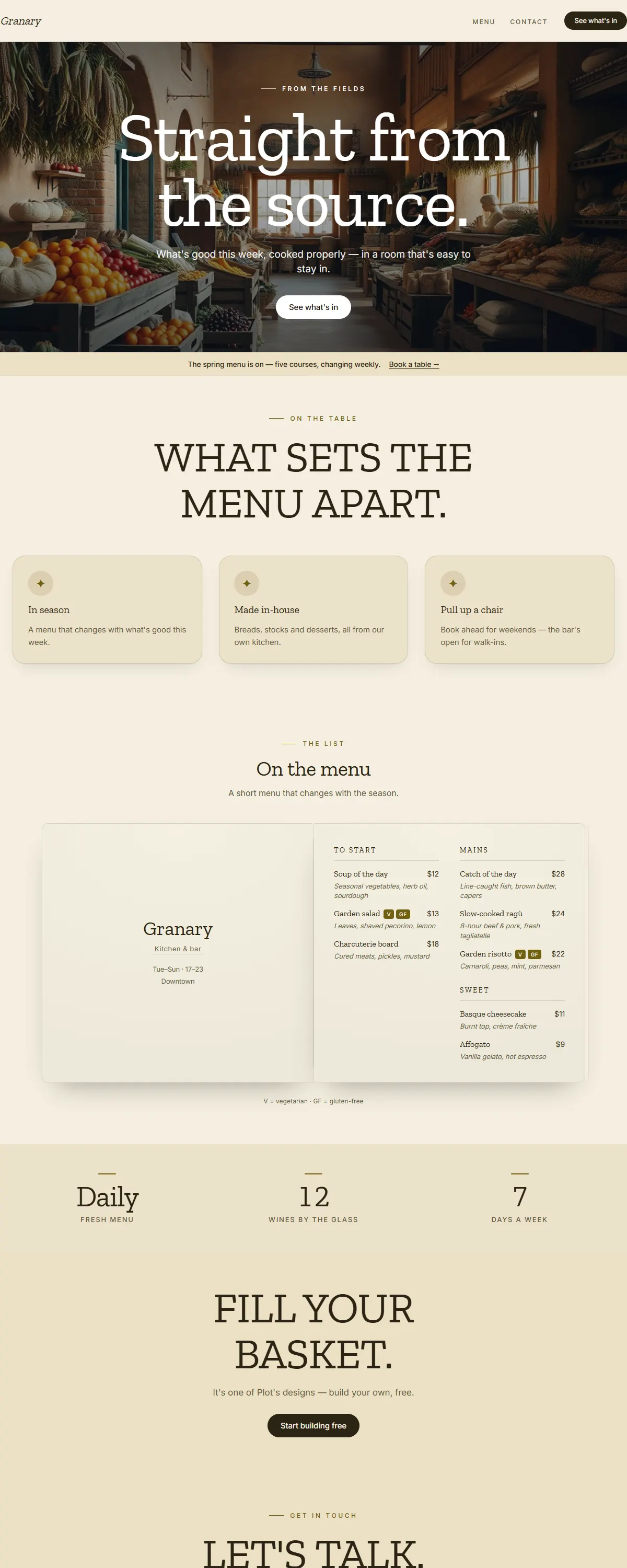
Wheat and sand with a dark-mustard accent and a sturdy Zilla slab. Honest, seasonal, farm-direct.
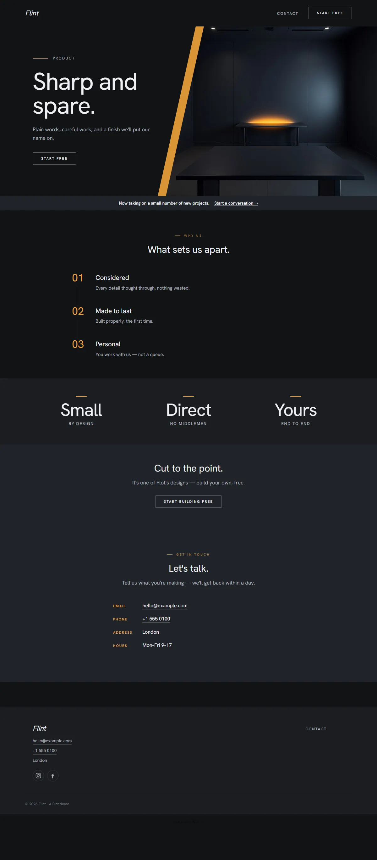
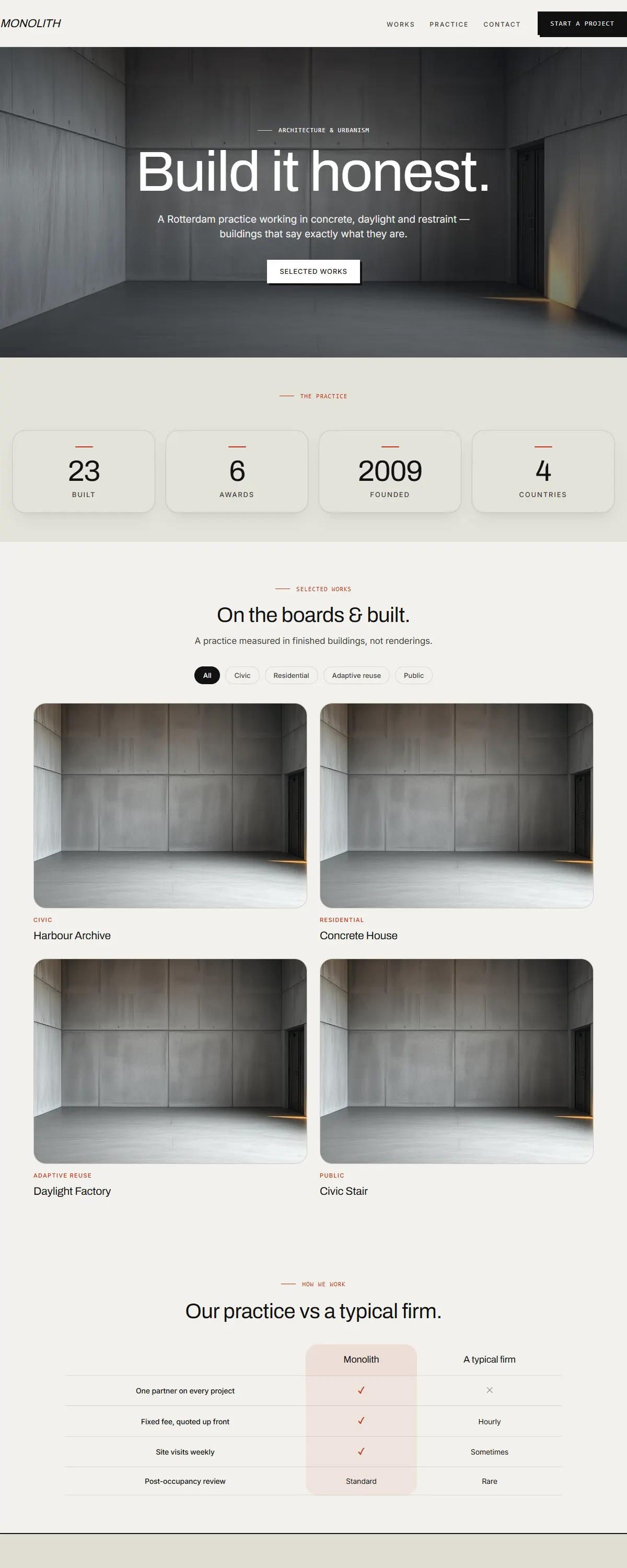
Warm sand concrete with a terracotta accent and heavy Archivo. Raw, earthy, hand-hewn brutalism.
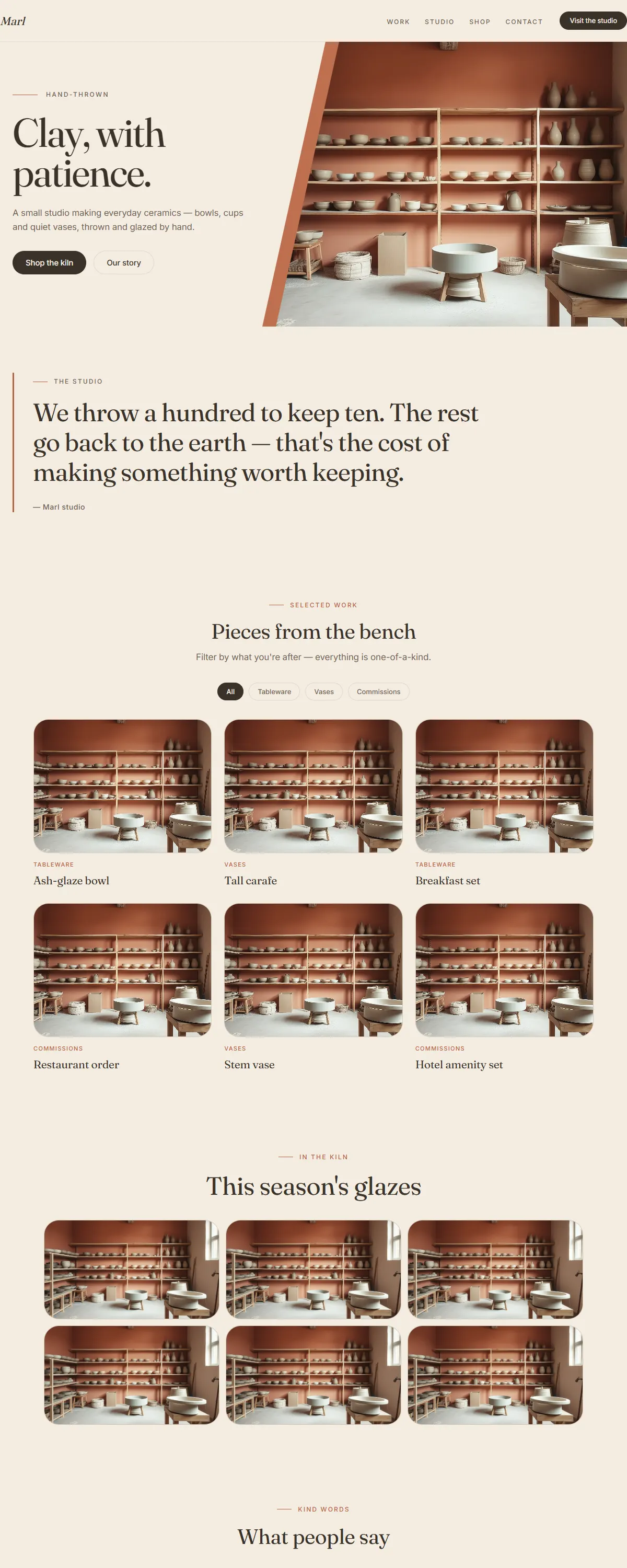
Warm unglazed neutrals and a soft terracotta accent — a calm, hand-made feel for studios and makers.
Dark roasted espresso-browns with a warm crema accent — rich and grounded for roasters, bars and brands.
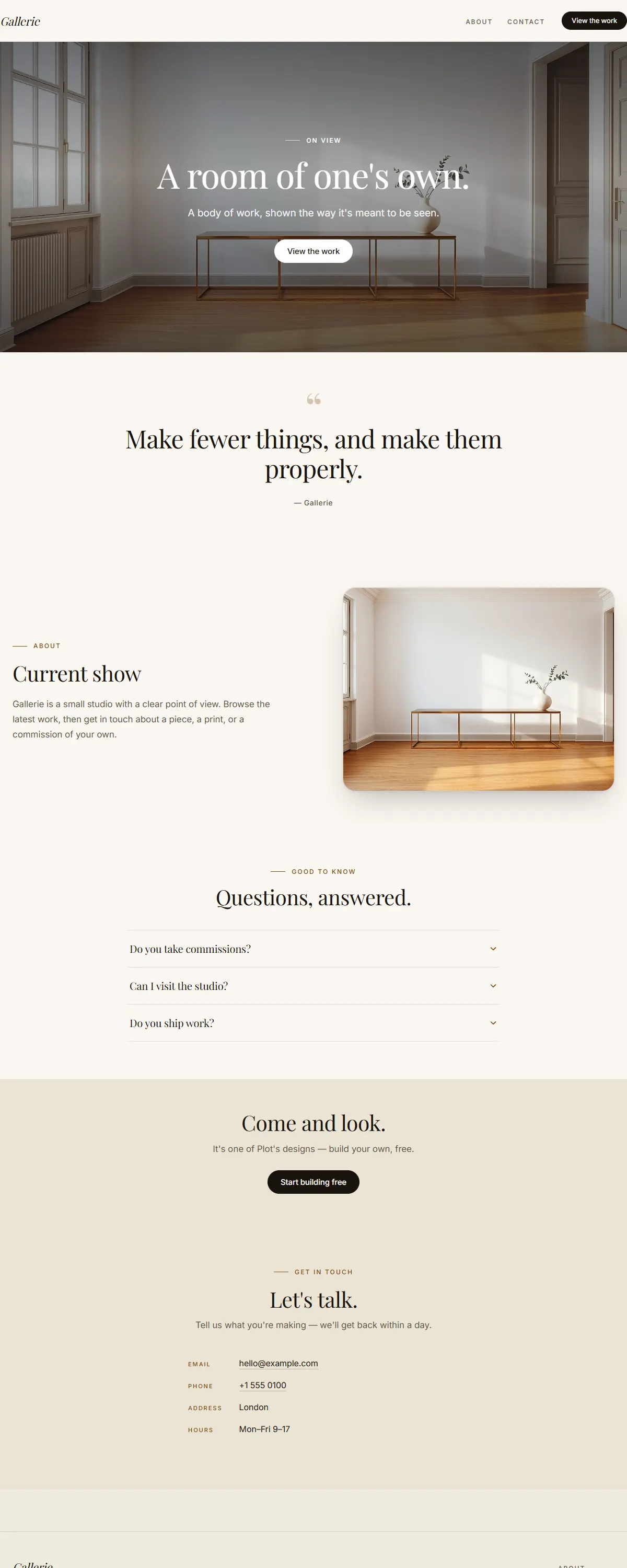
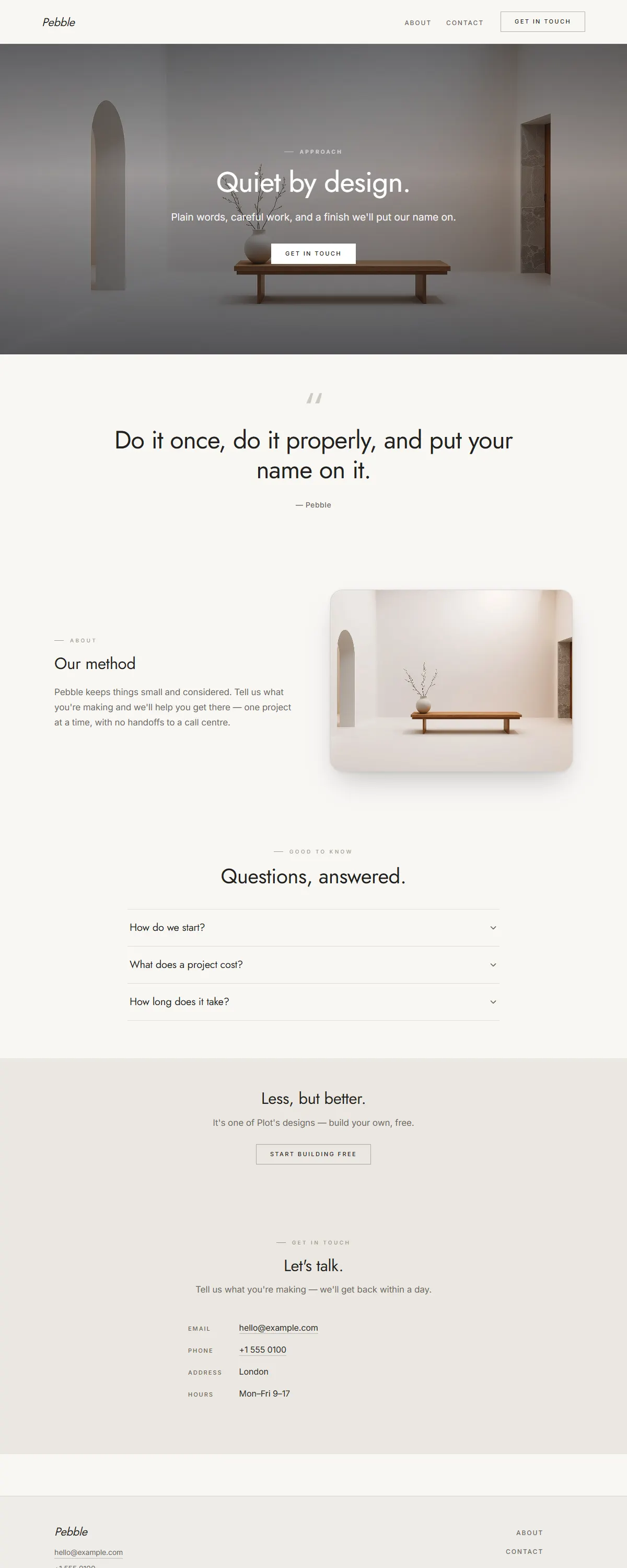
Gallery-like neutrals with a deep oxblood accent. Quiet luxury for craft-driven businesses.
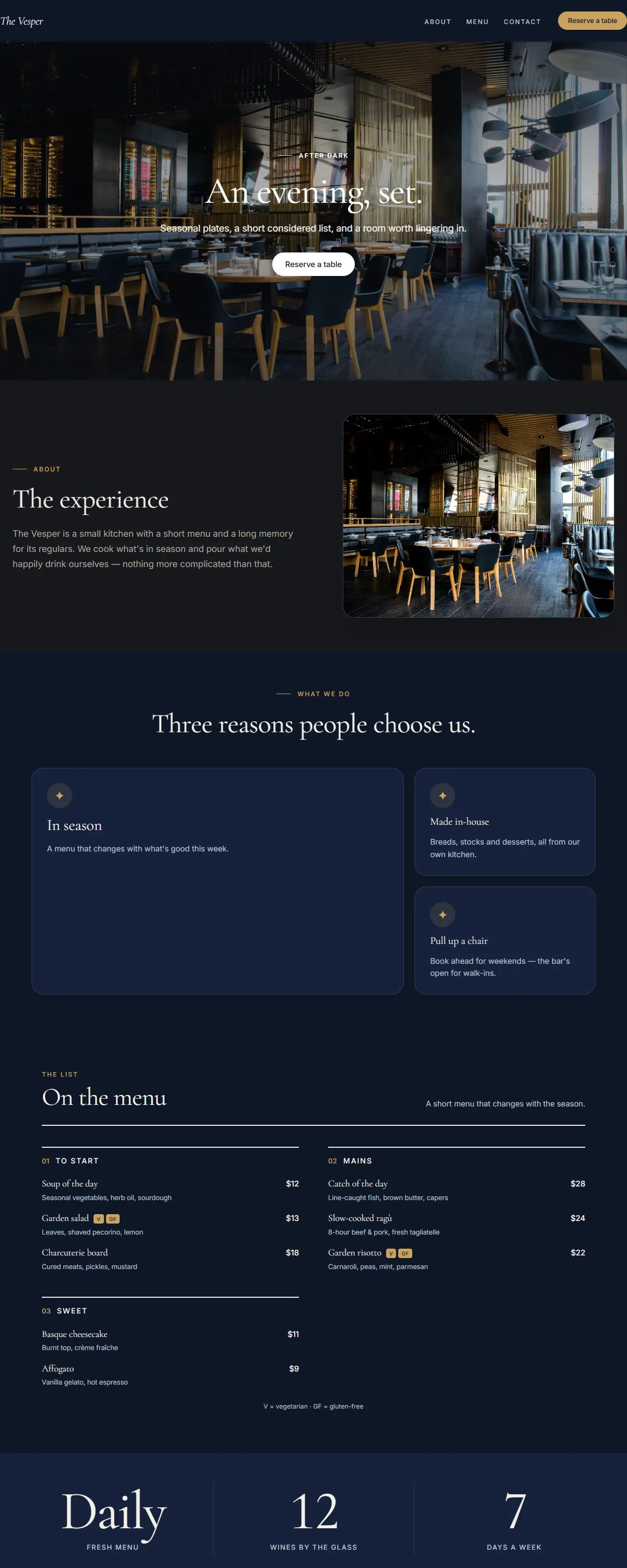
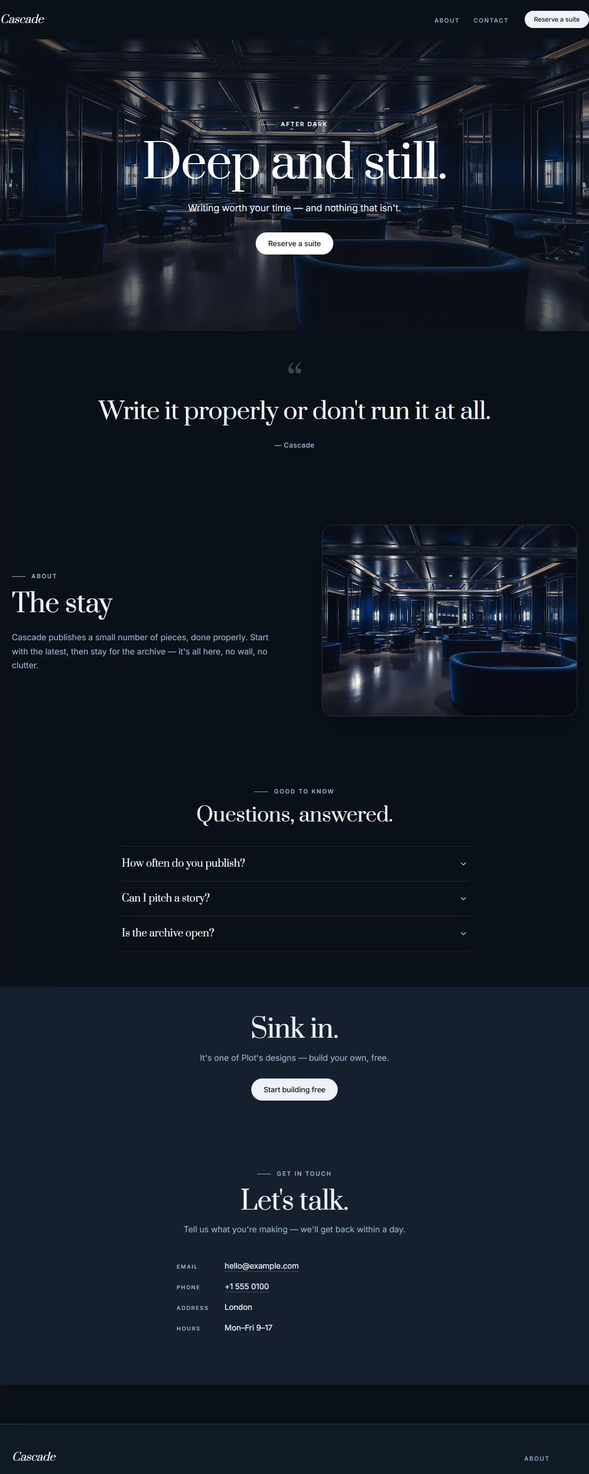
Deep navy with warm gold. Quiet, after-dark luxury.
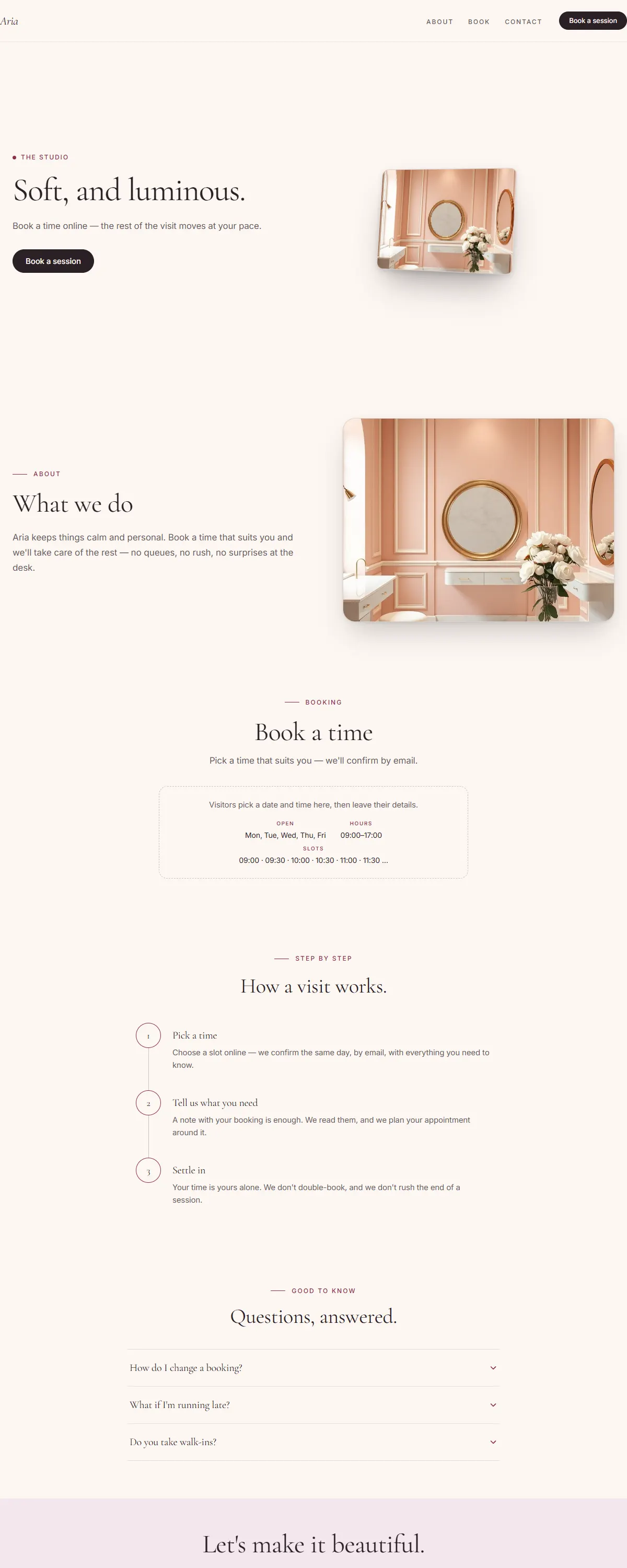
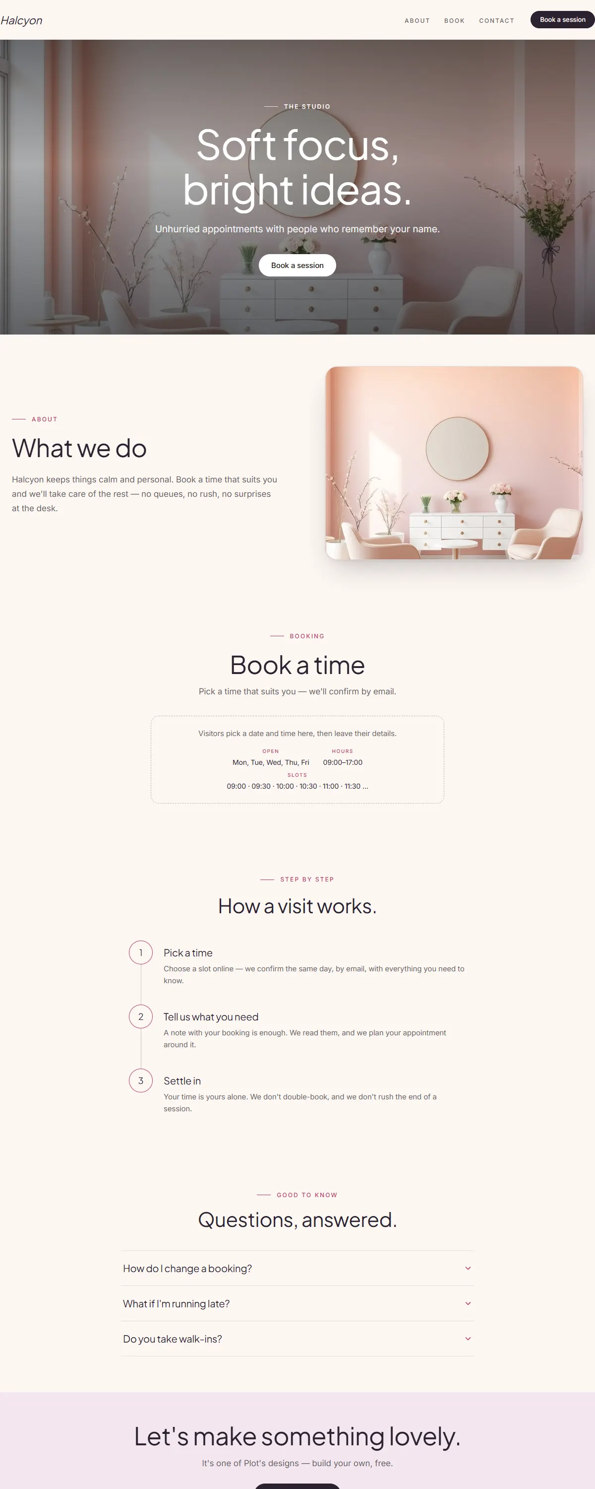
Soft blush with a deep berry accent. Refined and warm.
Charcoal and champagne gold with an elegant serif. Quiet, premium, after-dark luxury.
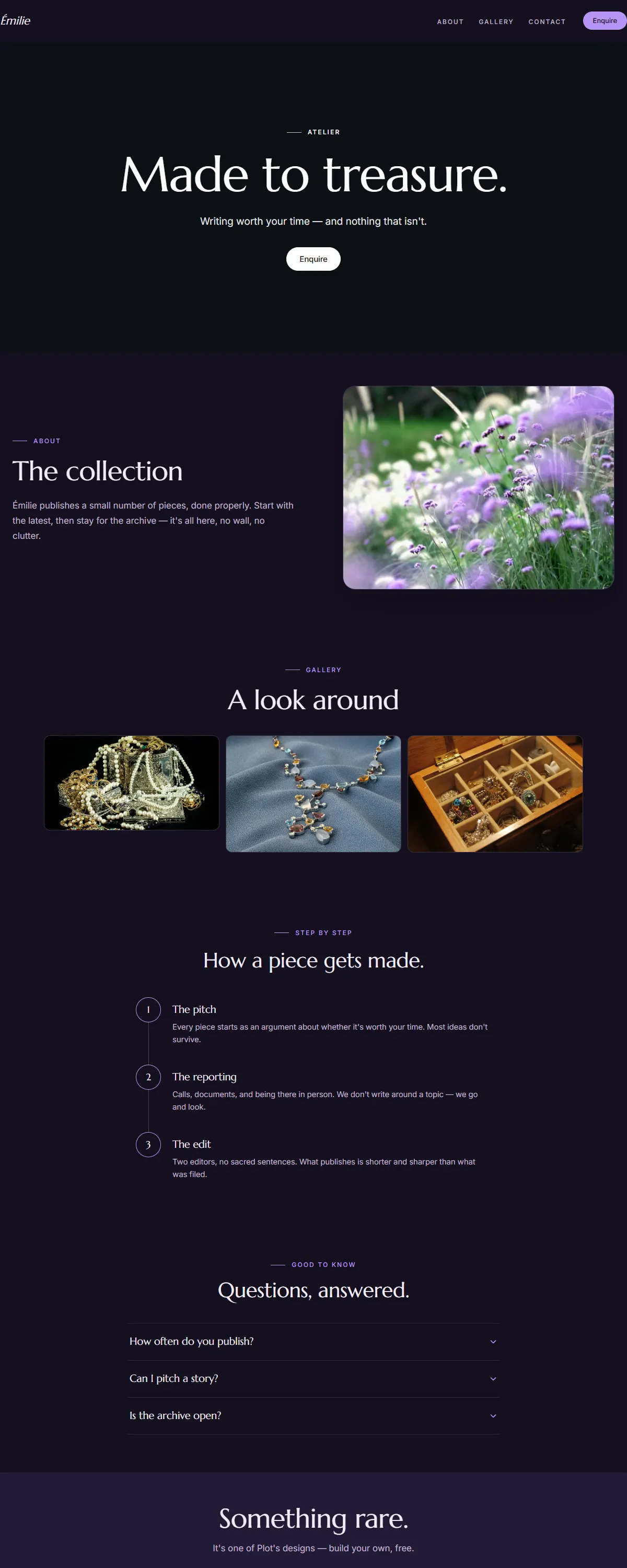
Deep plum and soft lilac with an elegant serif. Quiet, creative luxury.
Pure black with electrum gold and an elegant Marcellus serif. After-dark luxury.
Deep wine and rose-gold with a soft serif. Plush, intimate, indulgent.
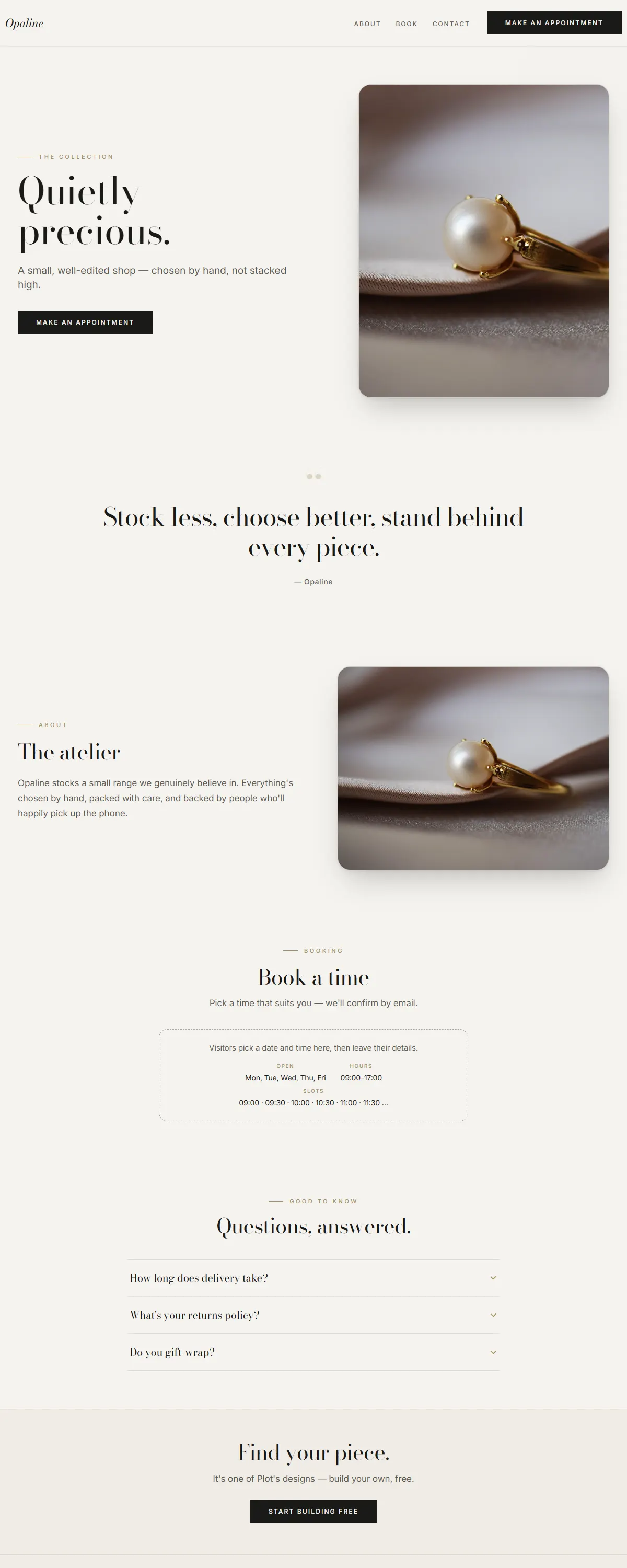
Pearl ivory and champagne with high-contrast Bodoni. Quiet, precious refinement.
Deep emerald and gold with a classic Garamond. Heritage luxury, built to outlast.
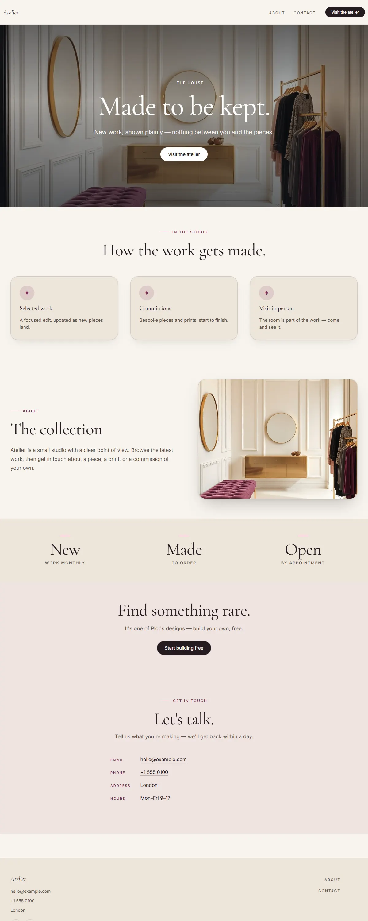
Ivory and brass with a Playfair display serif. Warm, golden, boutique luxury.
Warm charcoal and bronze with a characterful Fraunces. Understated dark luxury.
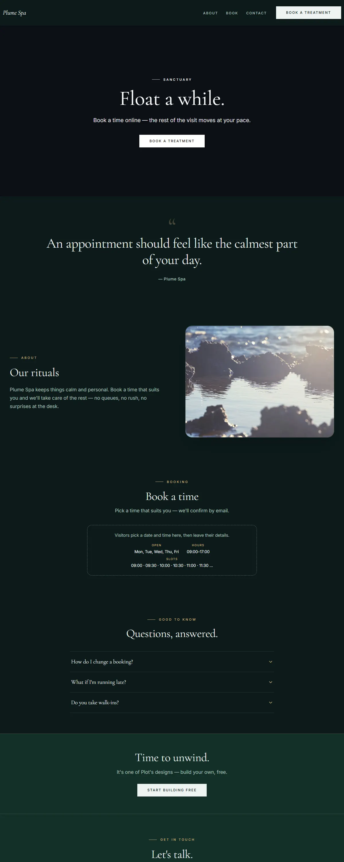
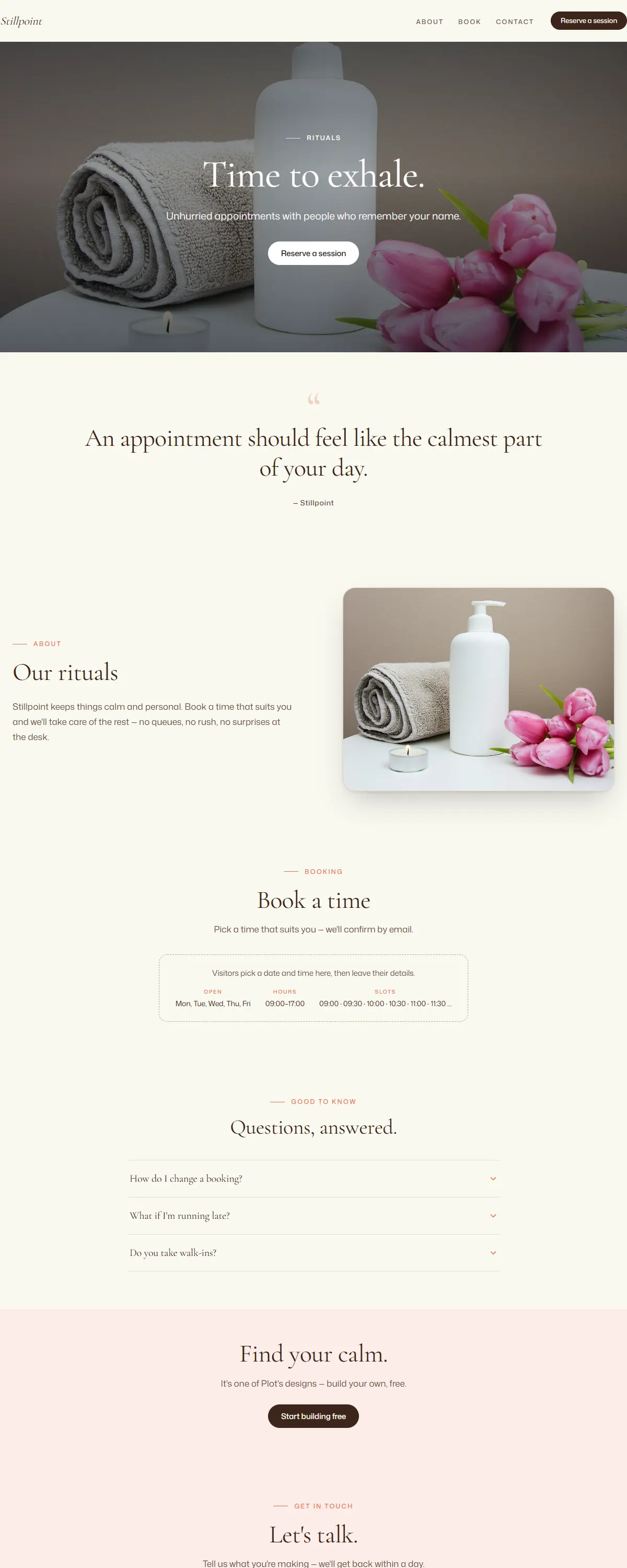
Deep teal and champagne with a soft serif. Serene, after-dark spa luxury.
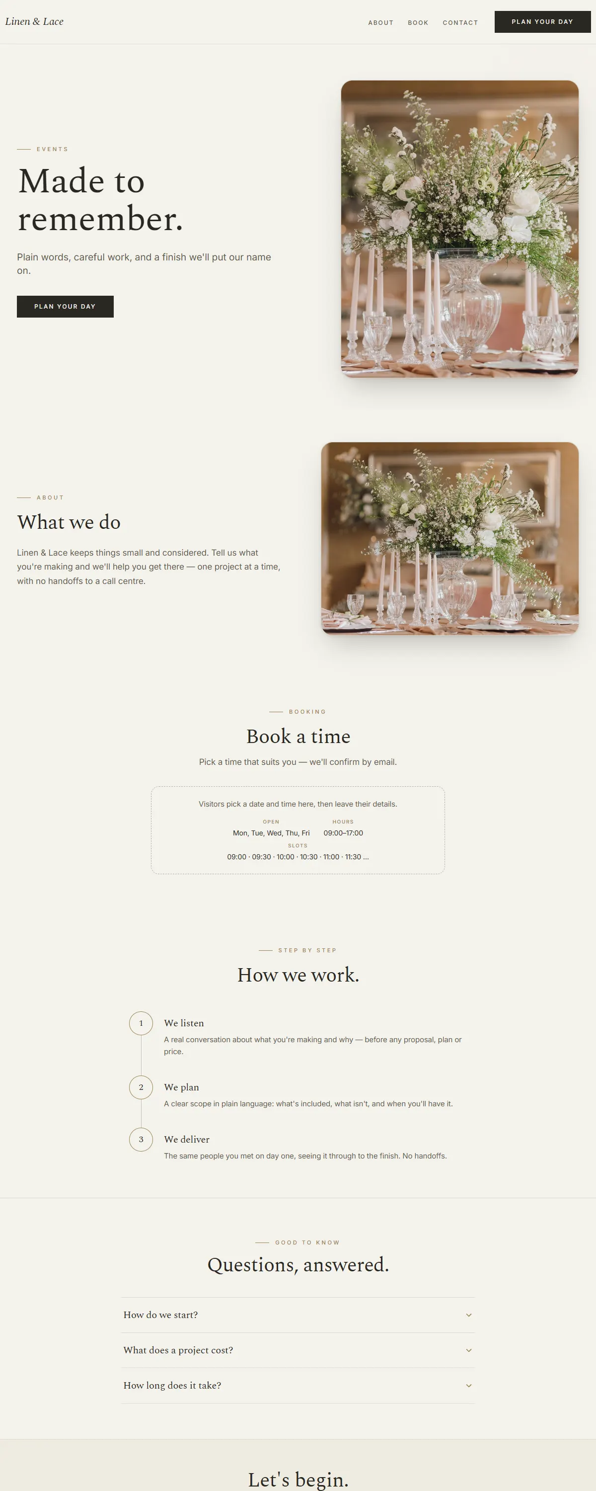
Soft greige and sage-gold with a gentle Spectral serif. Refined for occasions.
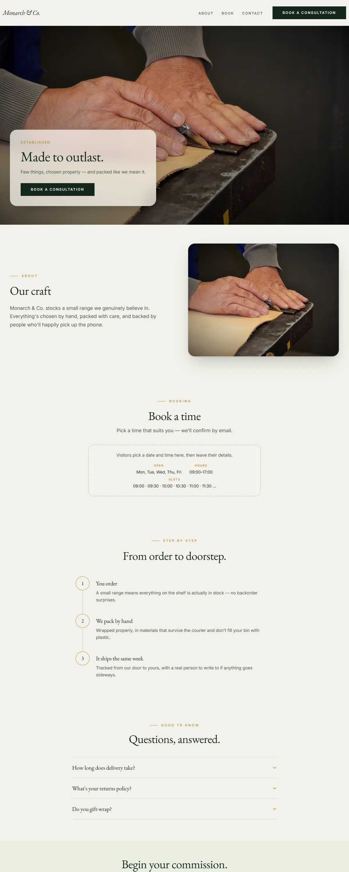
Grounded oak and warm stone with a classic Baskerville serif. Premium and calm.
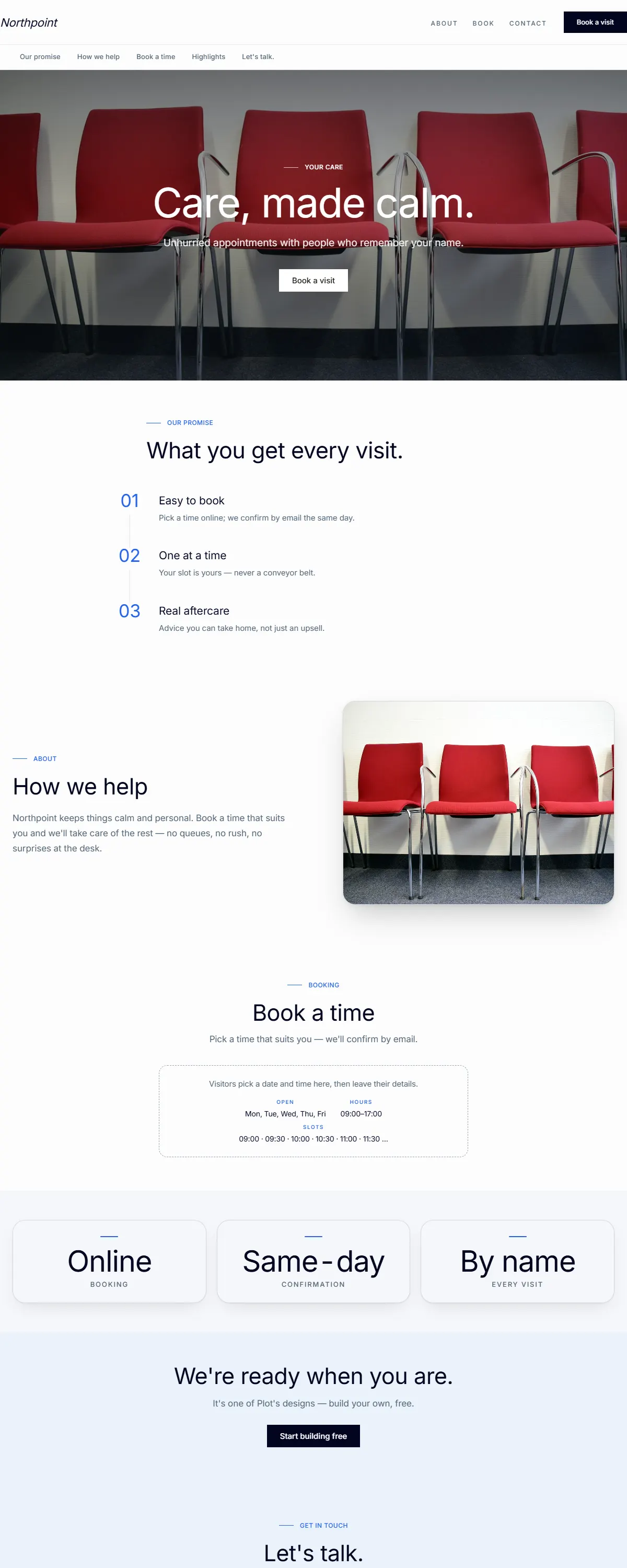
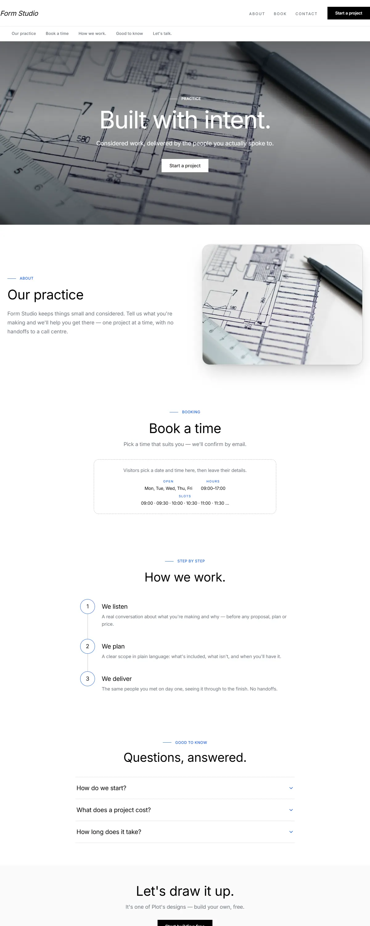
Warm, trustworthy professional — ivory and deep navy with a classic Cardo serif.
Warm, wanderlust hospitality — golden sand and an elegant Italiana display serif.
Near-black after-dark luxury with champagne gold and a classic Marcellus serif.
Calm sage and cream with a deep-teal accent and an airy Cormorant serif. Quiet, spacious luxury.
Deep emerald and brushed gold with an elegant Prata serif. Opulent, after-dark indulgence.
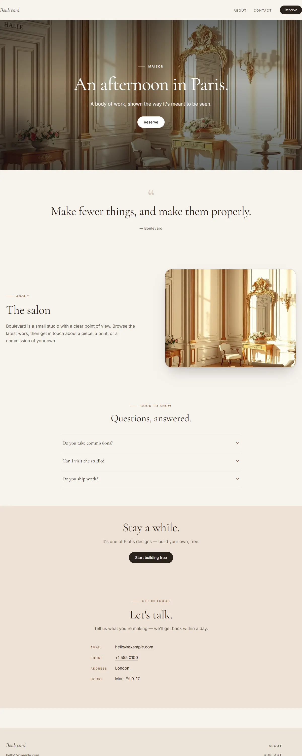
Cream and warm bronze with an elegant Cormorant. Parisian, refined, unhurried luxury.
Deep sapphire and brushed silver with an elegant Prata. Still, after-dark hotel luxury.
Deep wine and gold with an elegant Italiana display. After-dark poster luxury.
Soft ivory and deep aubergine with an elegant Cormorant. Quiet, considered boutique luxury.
Black board-formed concrete with a single champagne-gold line and heavy Saira. Brutalist luxury.
Warm greige and antique bronze with an airy Cormorant. Spacious, quiet, spa-grade luxury.
Oxblood lacquer with a soft rose-gold accent and an elegant Prata. Glossy, intimate, after-dark.
A soft champagne-to-blush gradient with a deep berry accent and an elegant Cormorant. Refined and lovely.
Charcoal and rose-bronze with an elegant Playfair. After-dark editorial luxury.
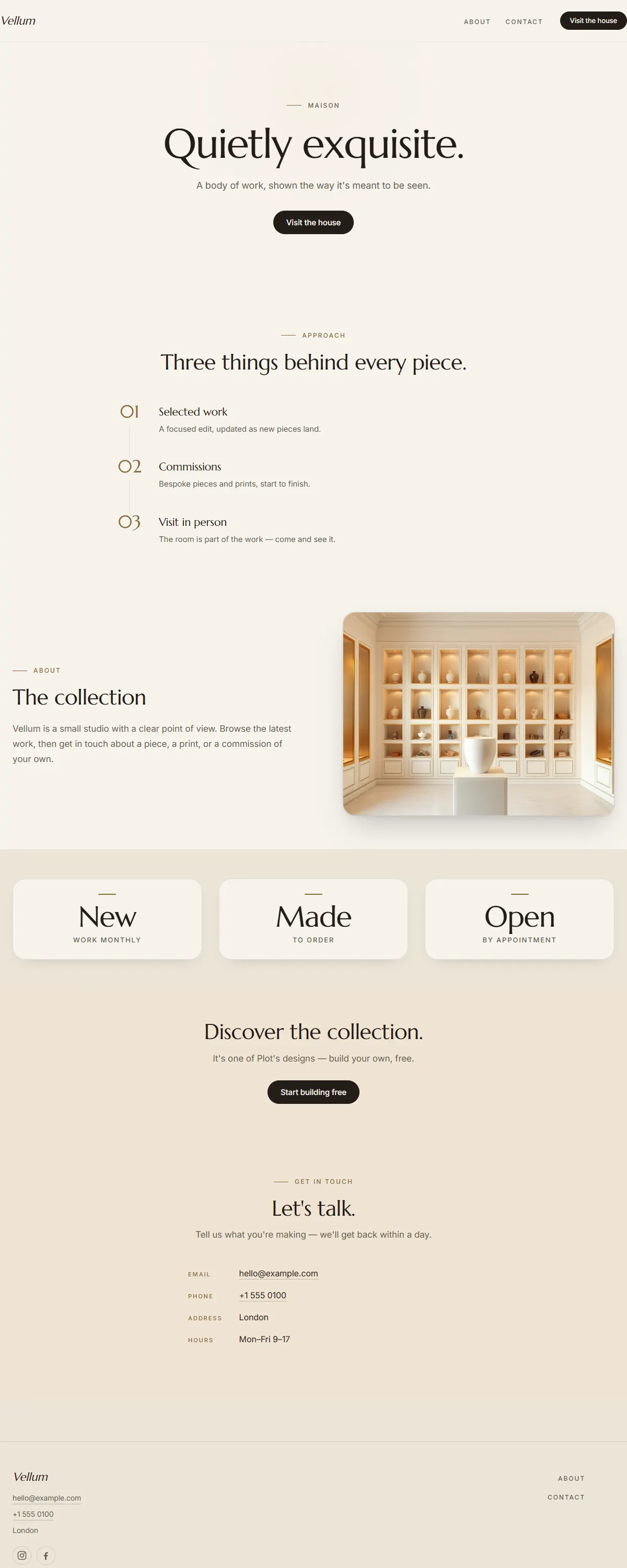
Soft ivory with a warm bronze accent and a classic Marcellus. Quietly exquisite boutique luxury.
Near-black charcoal with a true gold accent — hushed, reverent luxury for ateliers and fine craft.
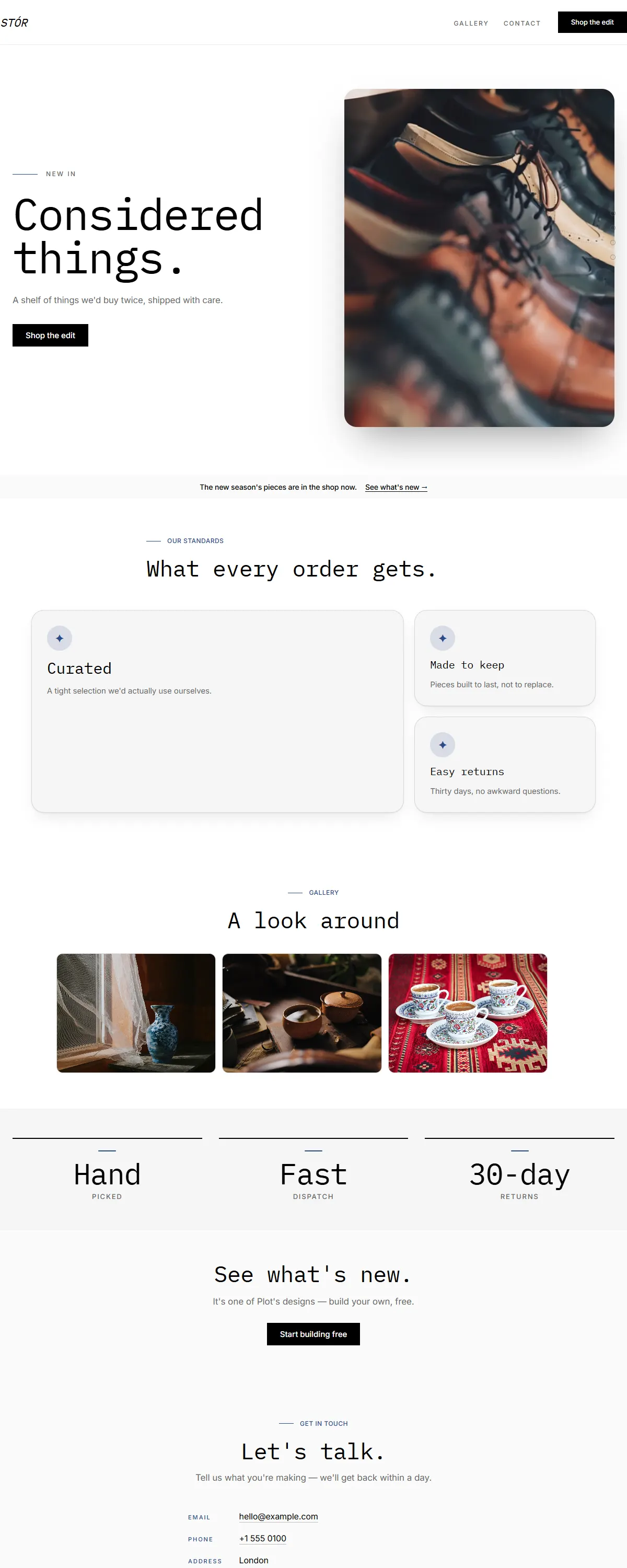
High-contrast type on white, monospace headings, product-photo-first. Curated retail.
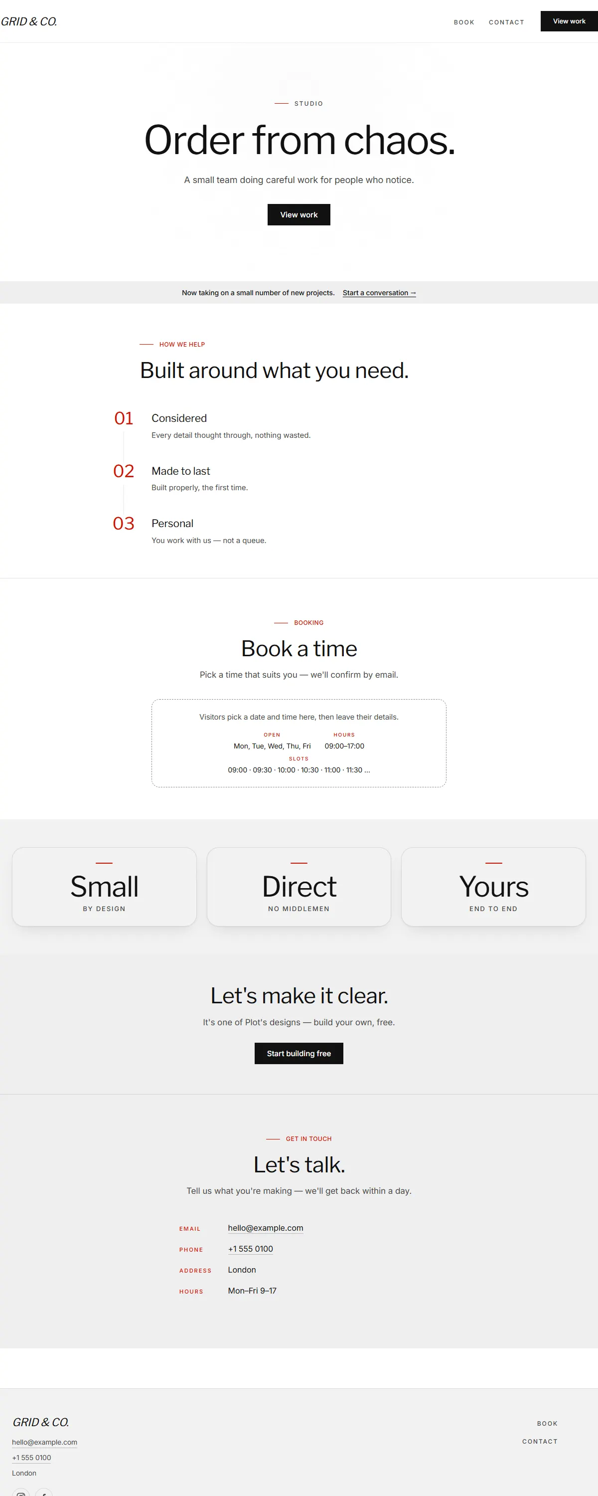
Bold magazine headlines on white, with a single red accent.
Bright white and cobalt with a fine Spectral serif. Clean, museum-grade calm.

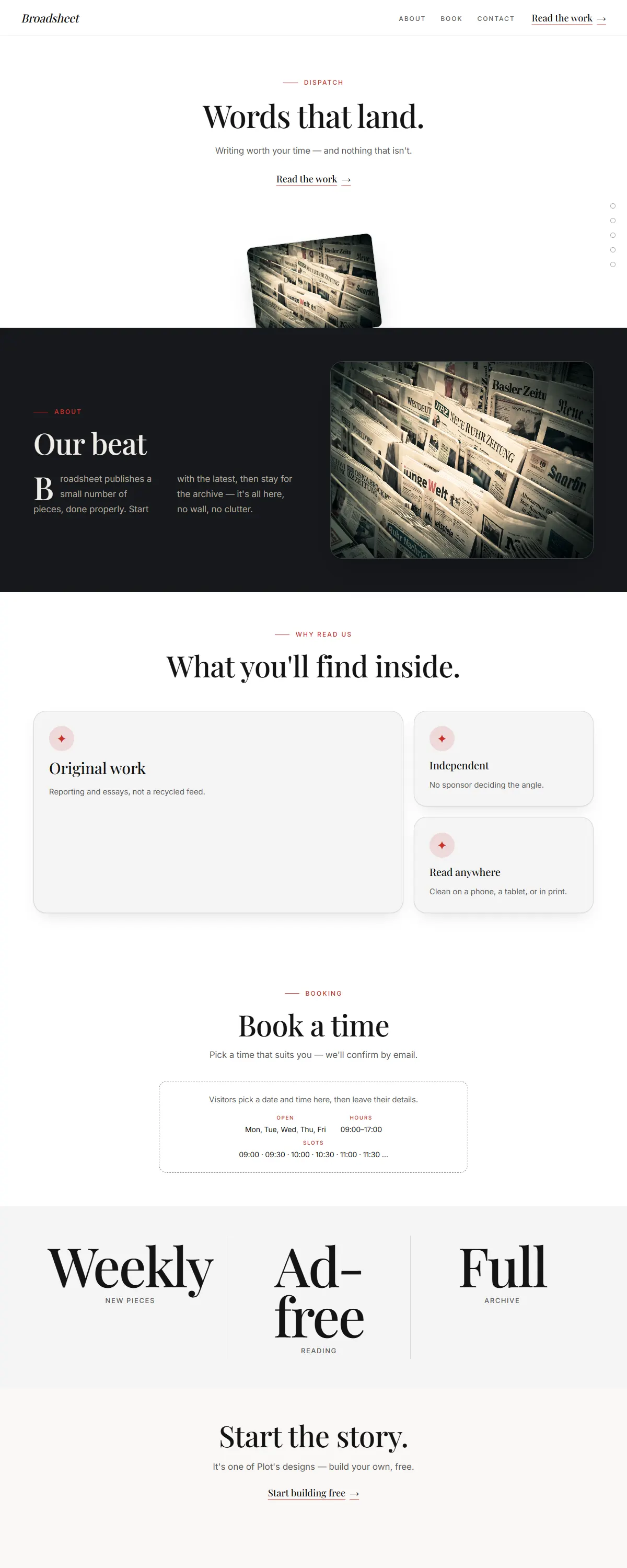
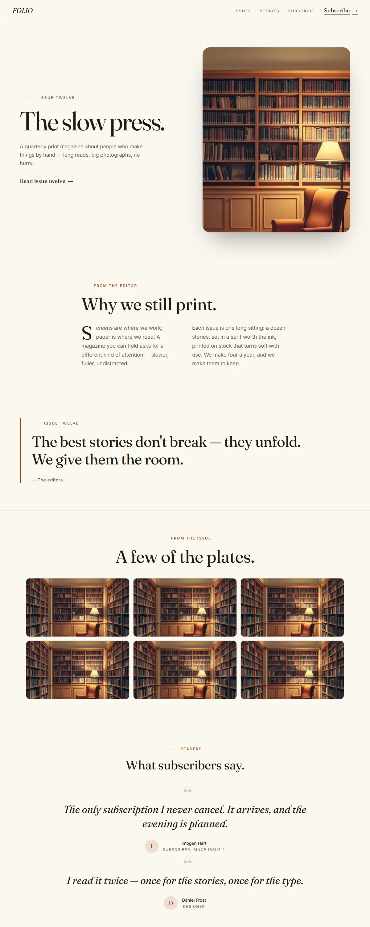
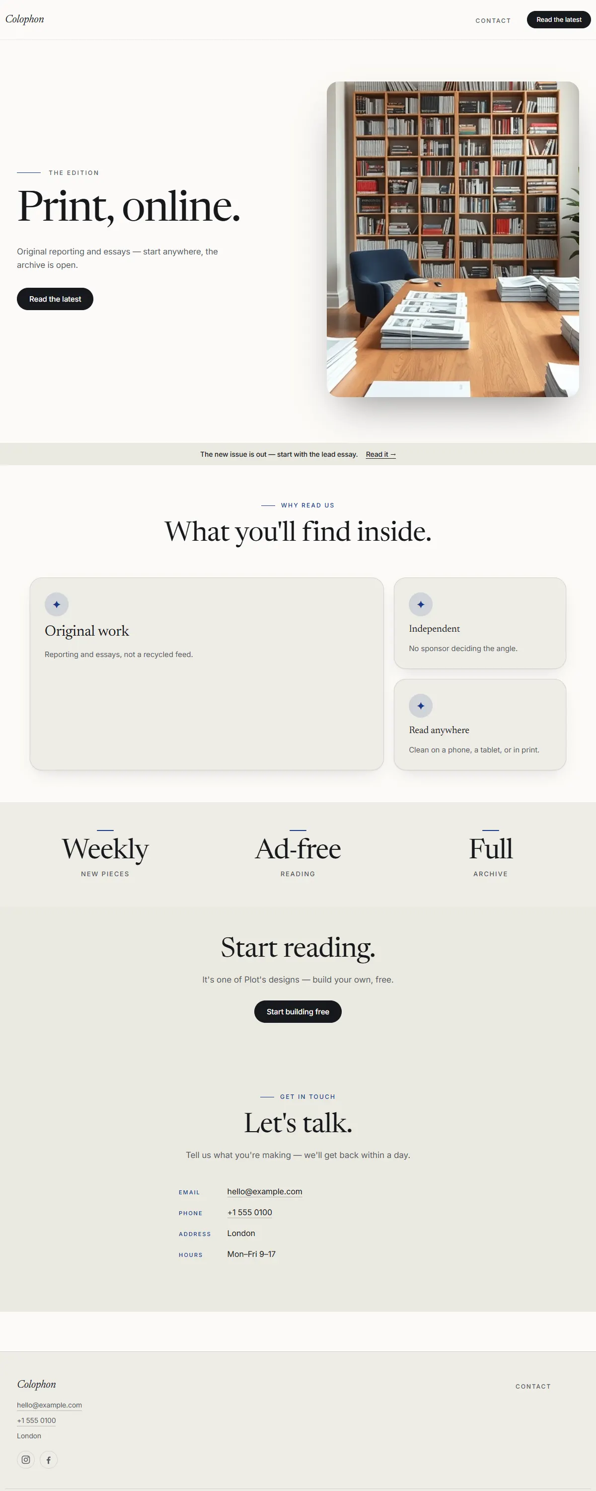
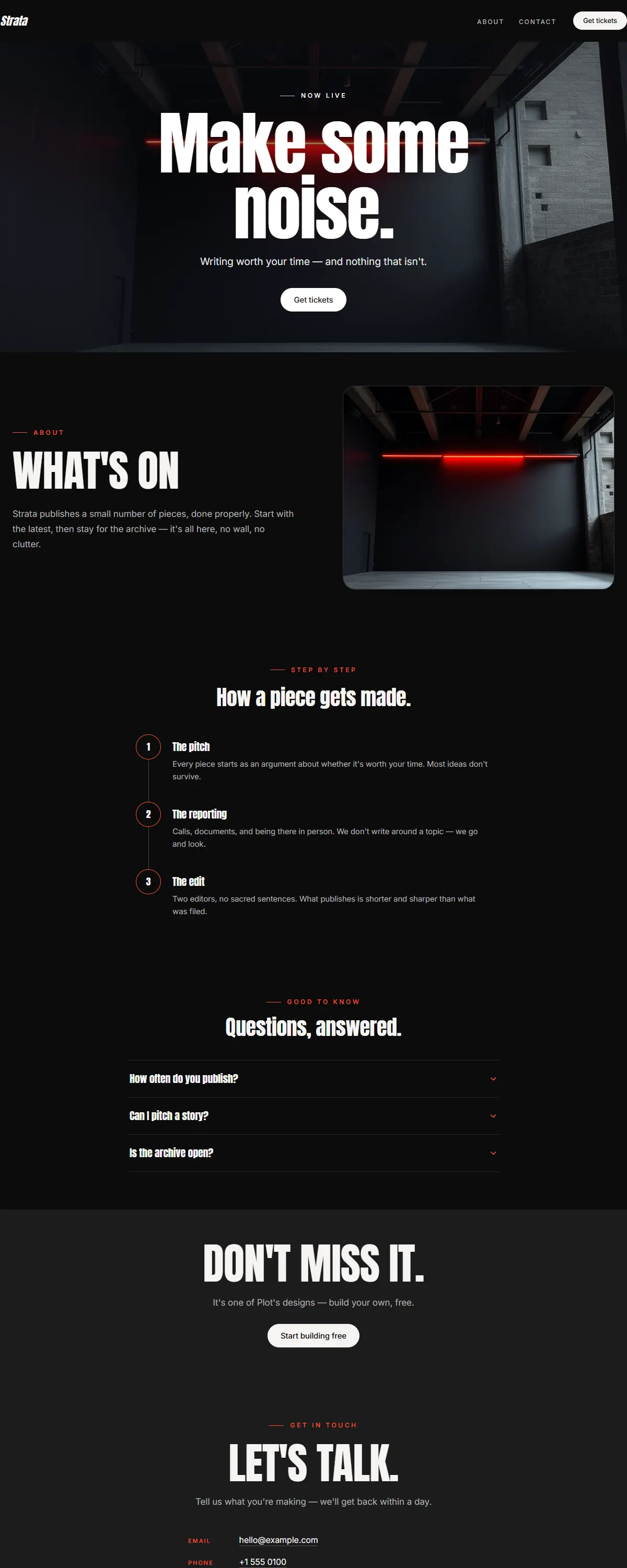
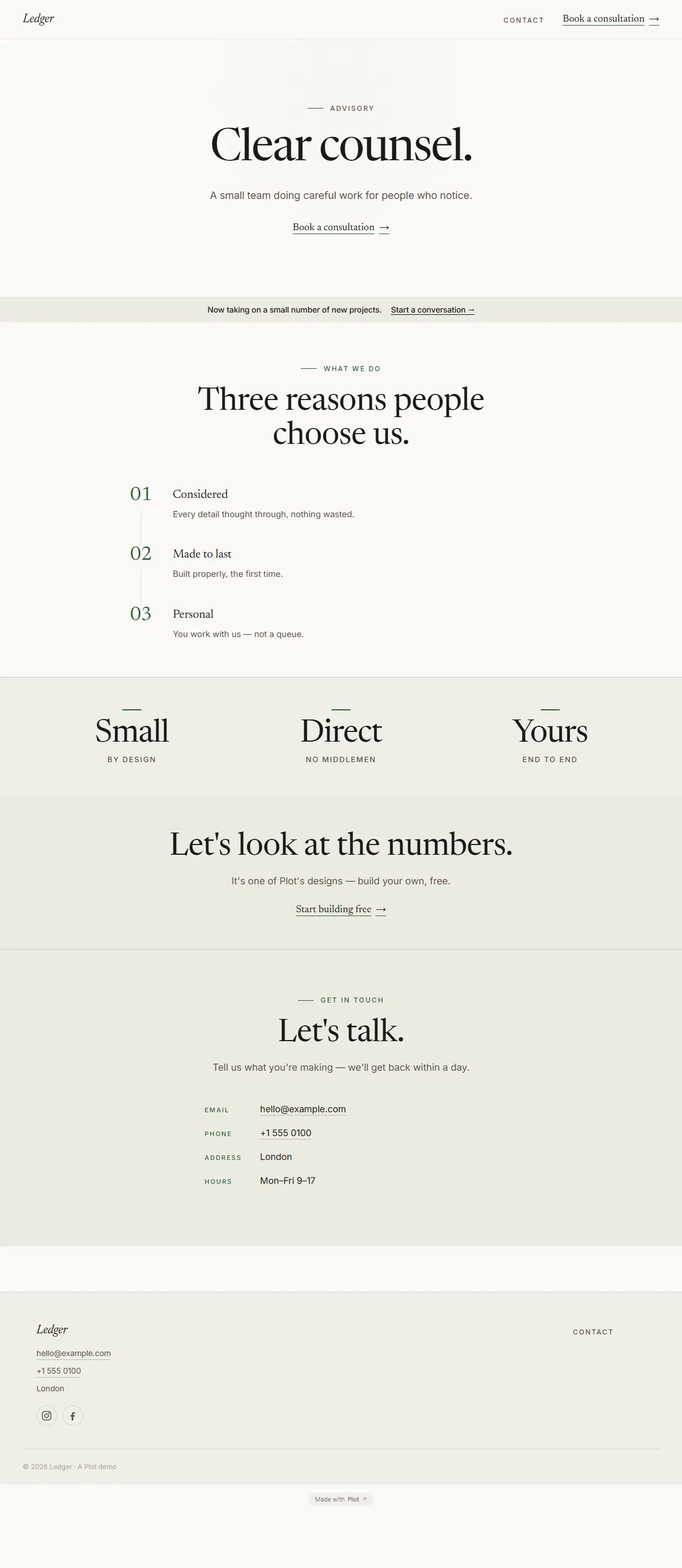
Newsprint cream and ink with a Lora serif and a rust accent. Editorial and literary.
Off-white and black with bold Archivo and a single red accent. Fashion-editorial.
International typographic style — pure white, a precise grotesk and one red accent.
Newsprint cream and ink with a rust accent and a literary Fraunces serif. Editorial and considered.
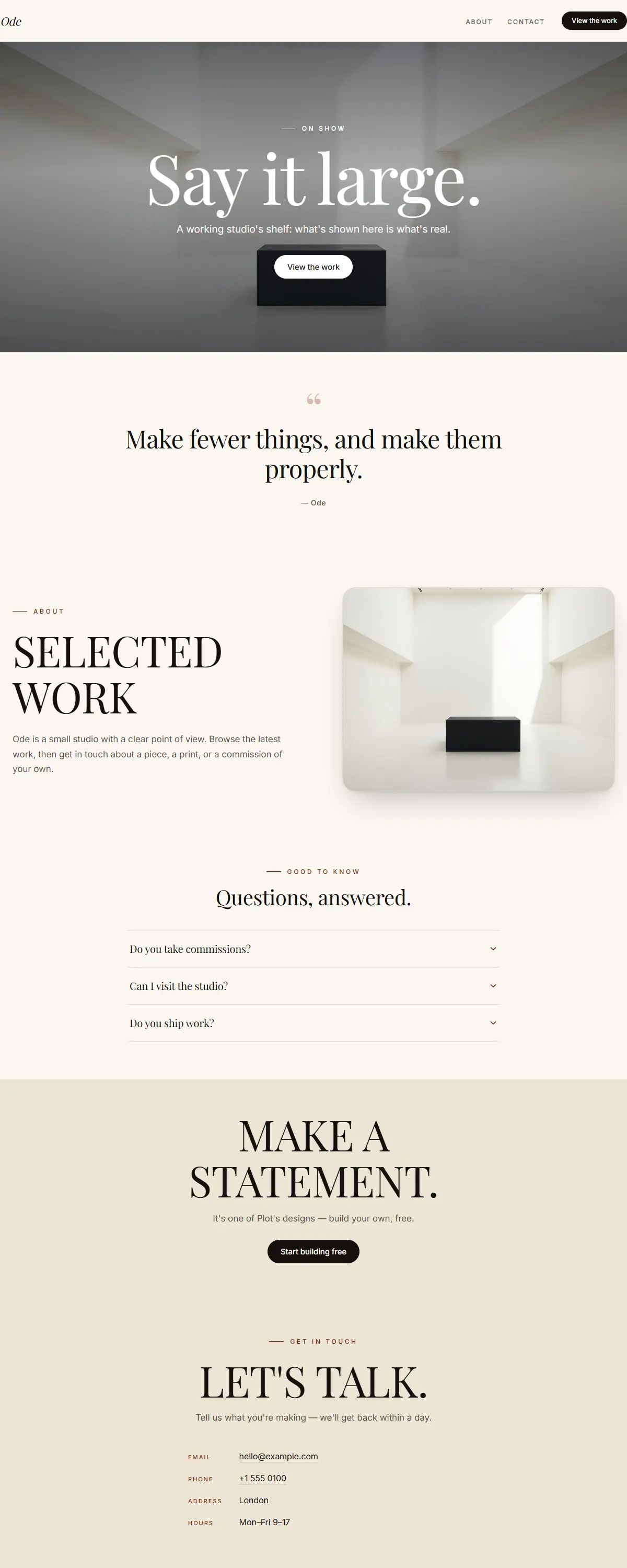
Ivory and black with an oversized Playfair serif. A typographic poster that says it large.
Warm cream and ink with a plum accent and a literary EB Garamond. Quiet, considered editorial.
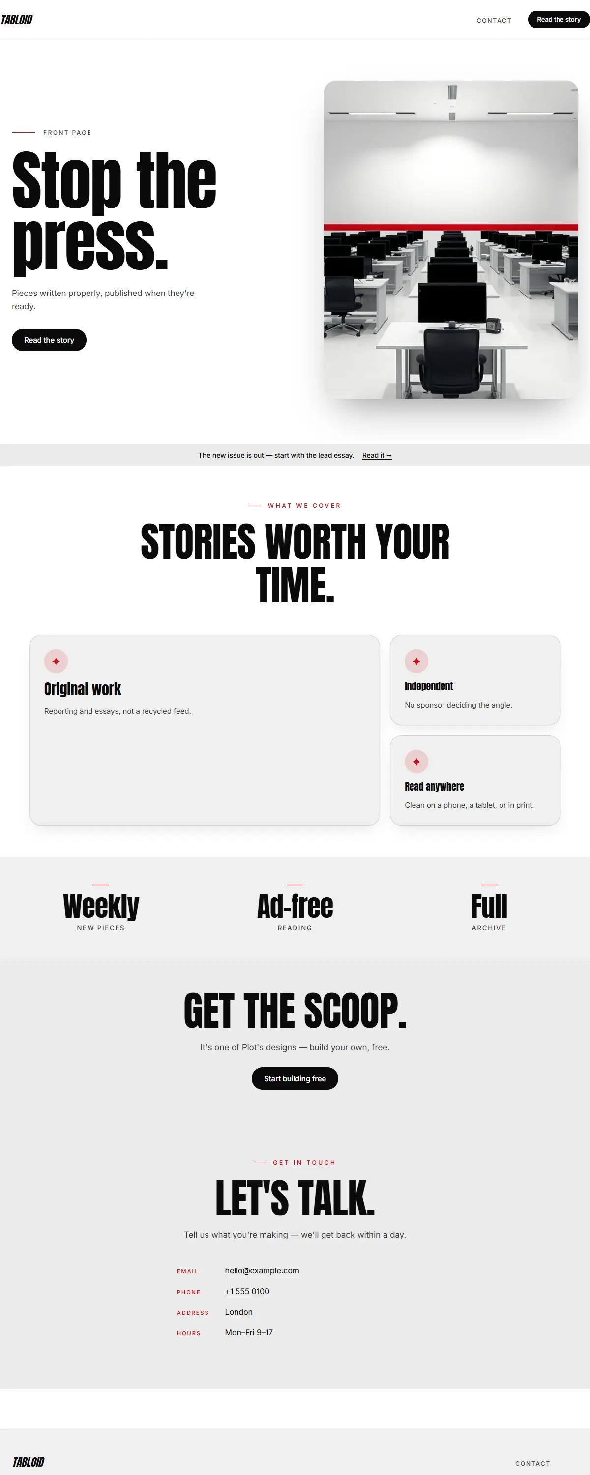
Pure black-on-white with one red and a heavy Anton poster face. Loud newsprint energy.
Warm white and ink with a brass accent and an oversized Playfair. Curated, gallery-grade calm.
Warm white and ink with a royal-navy accent and a literary Newsreader. Modern publishing, set well.
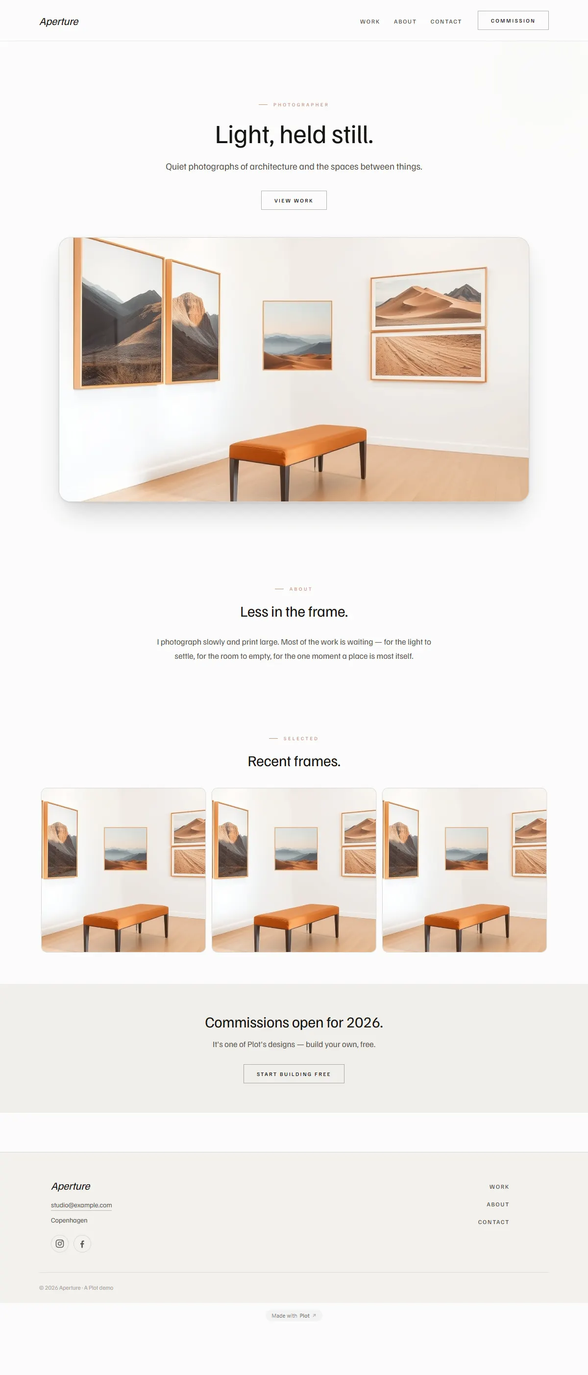
Crisp paper-white with a graphite accent and editorial type — a clean frame for photographers and studios.
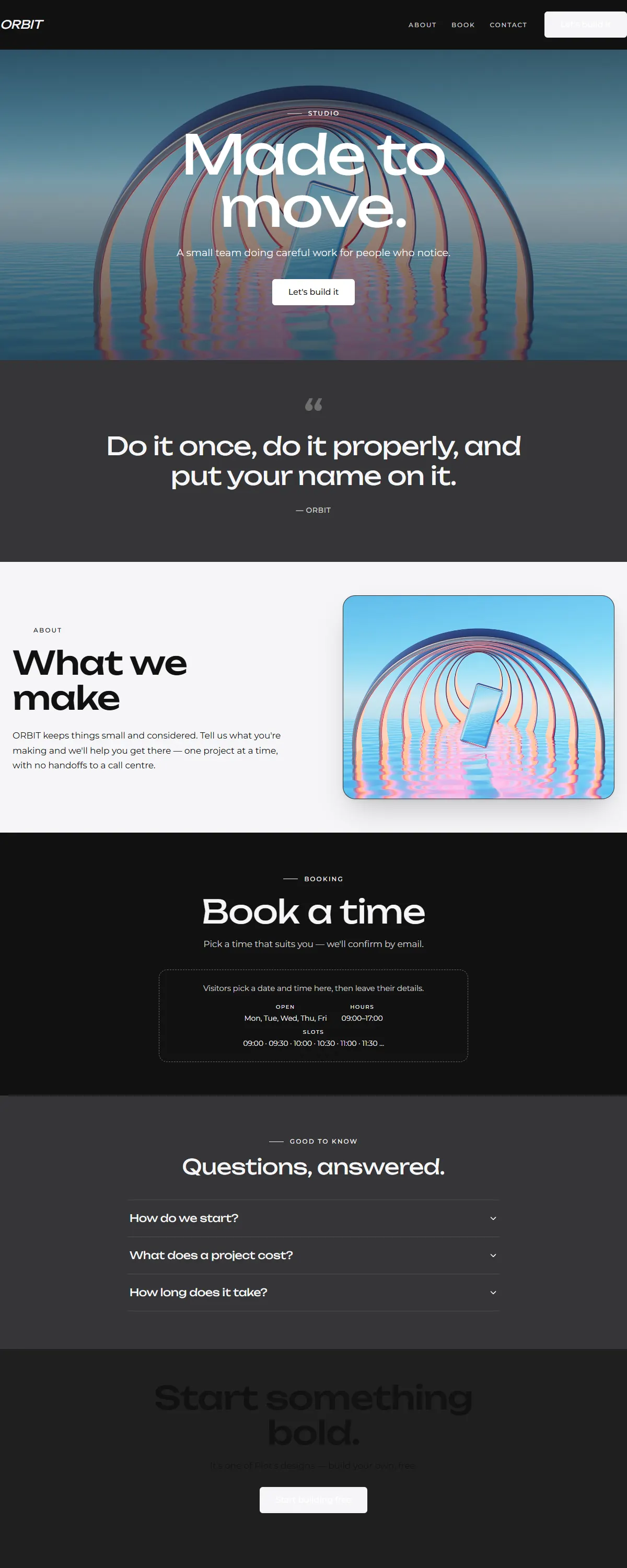
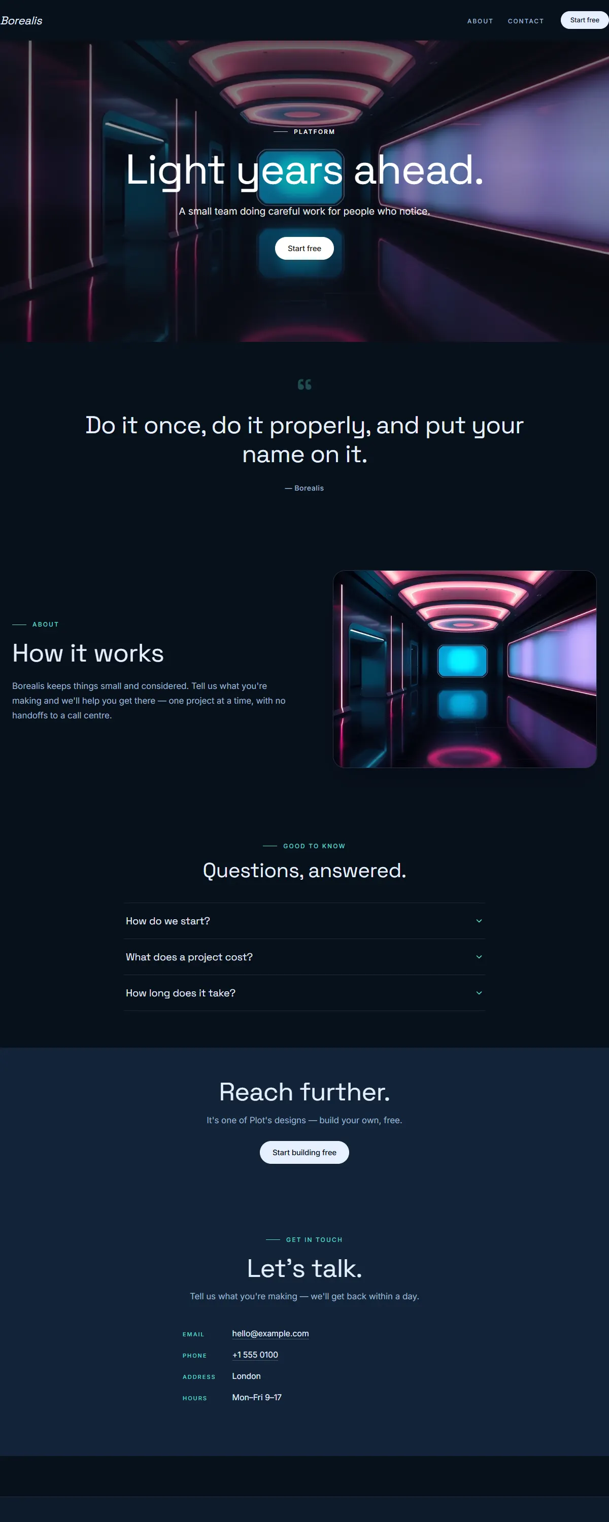
Deep-space dark canvas with sharp Unbounded typography. Confident and modern.
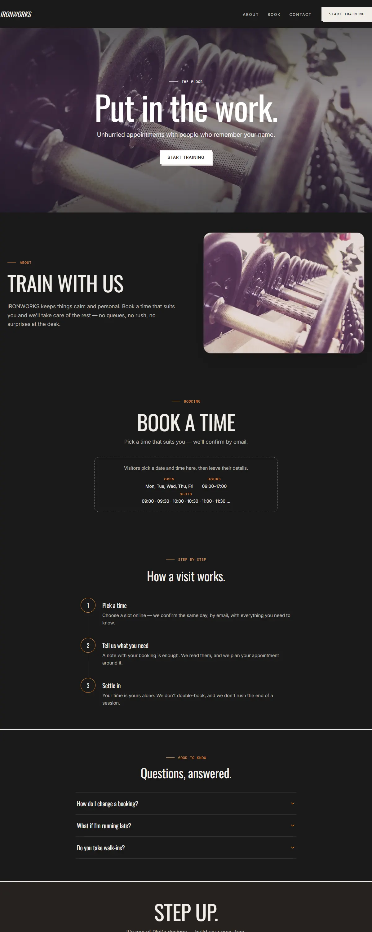
Charcoal and amber with condensed type. Strong and physical.
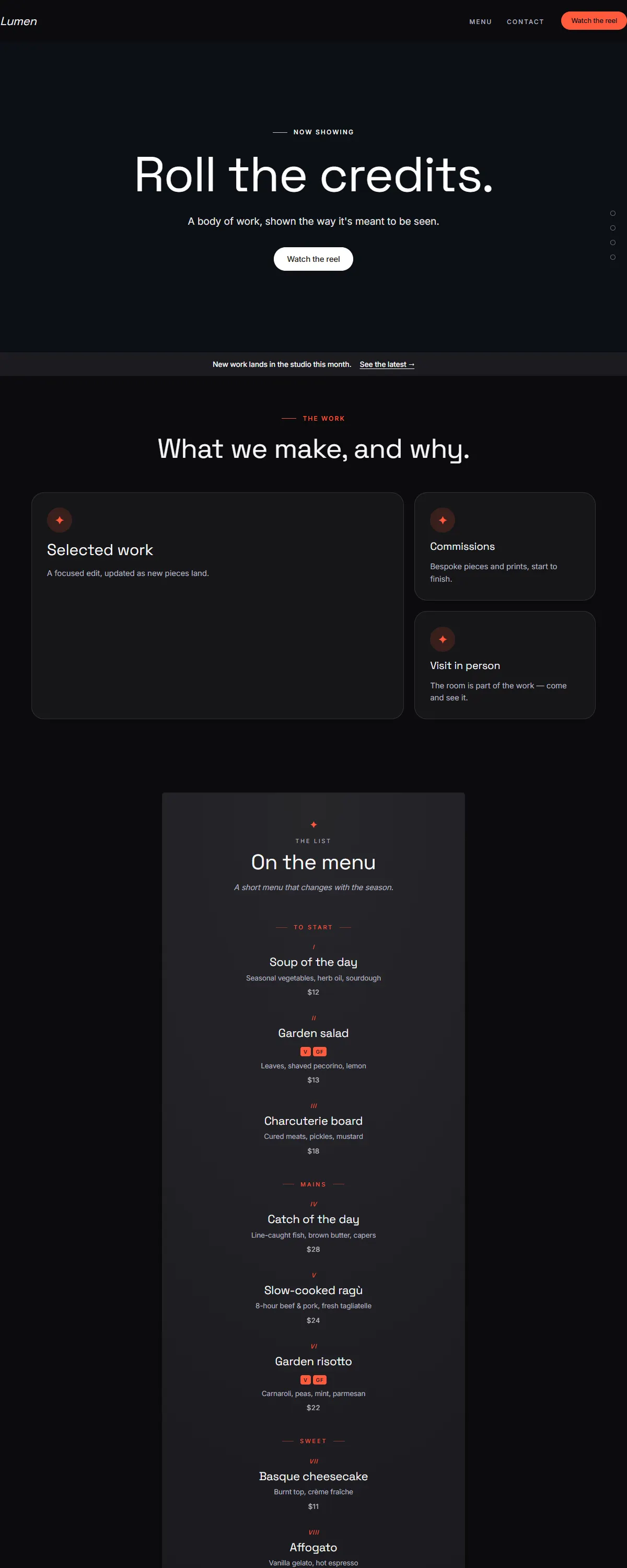
Near-black and cinematic, bold modern type with a vivid coral accent. Built for a video hero.
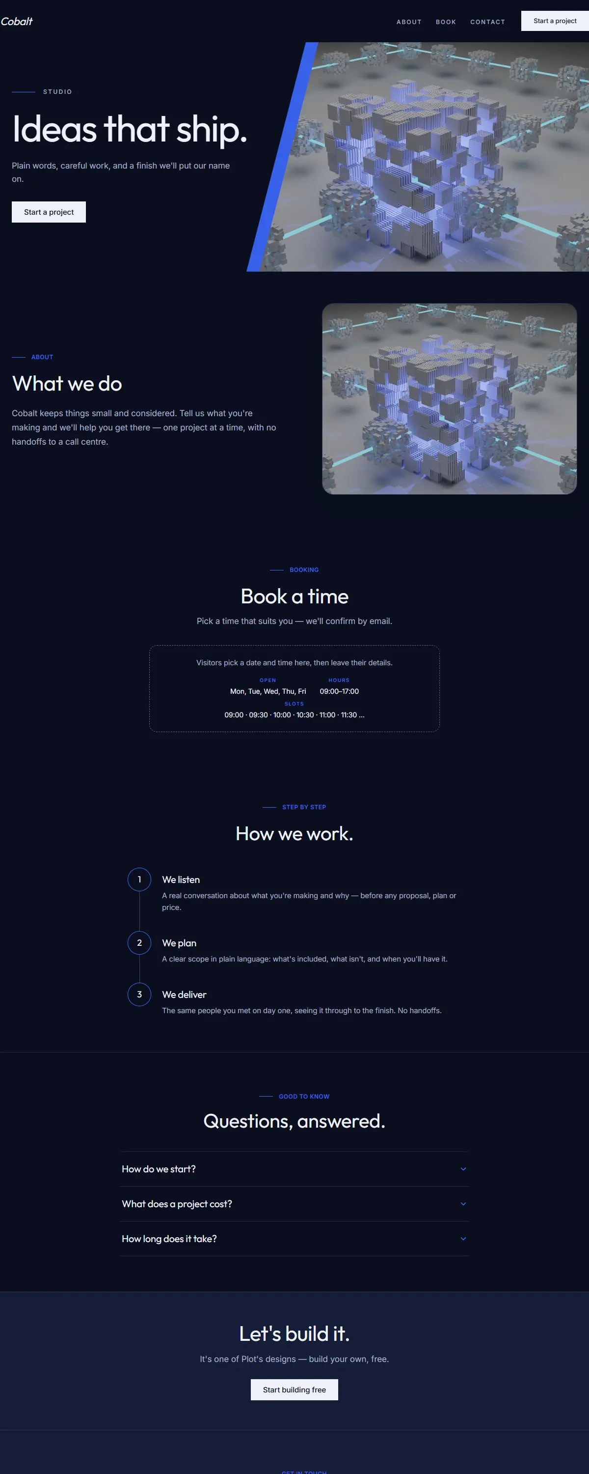
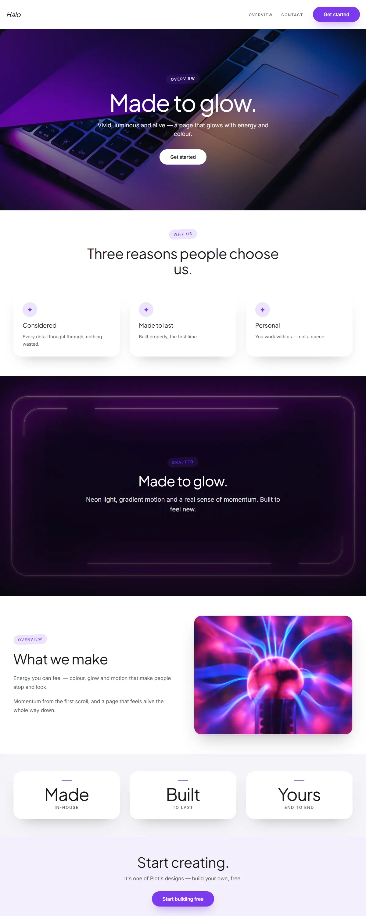
Deep slate-navy with a luminous violet accent and clean geometric type. Modern and confident.
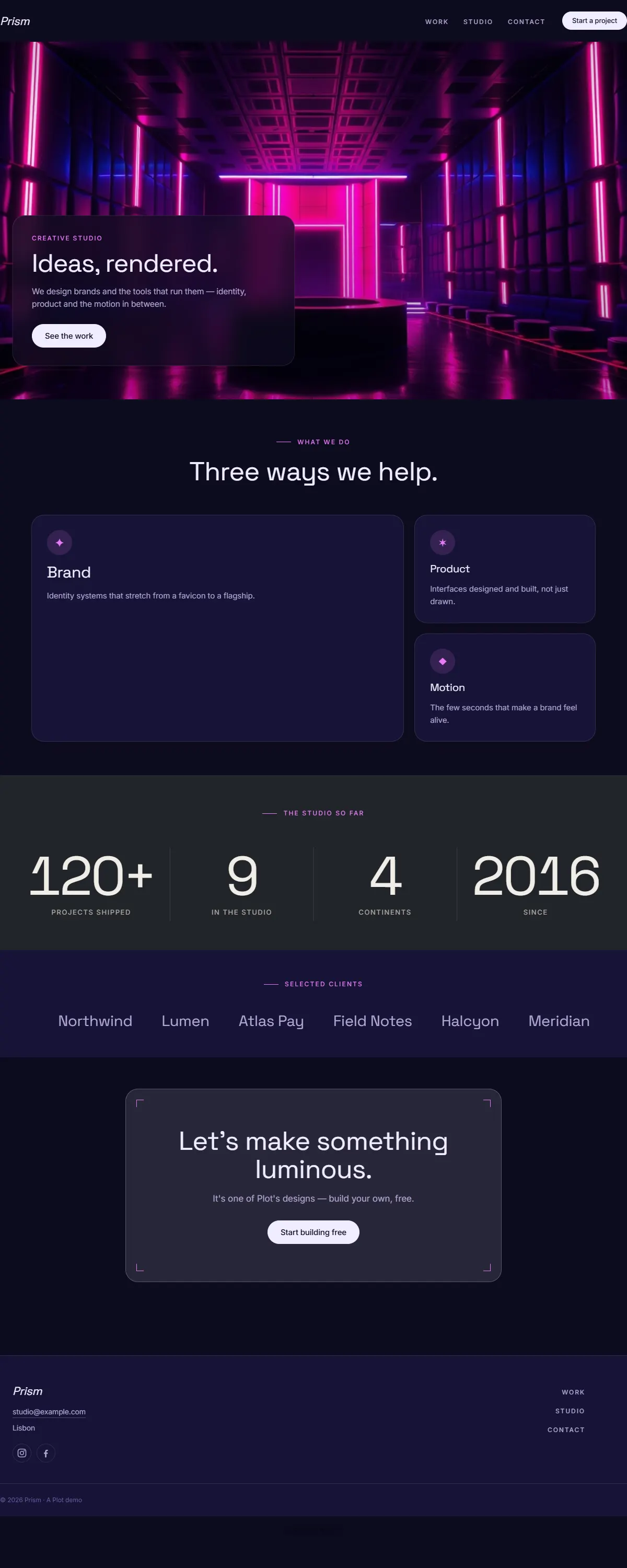
Near-black with electric magenta and bold type. High-energy and loud.
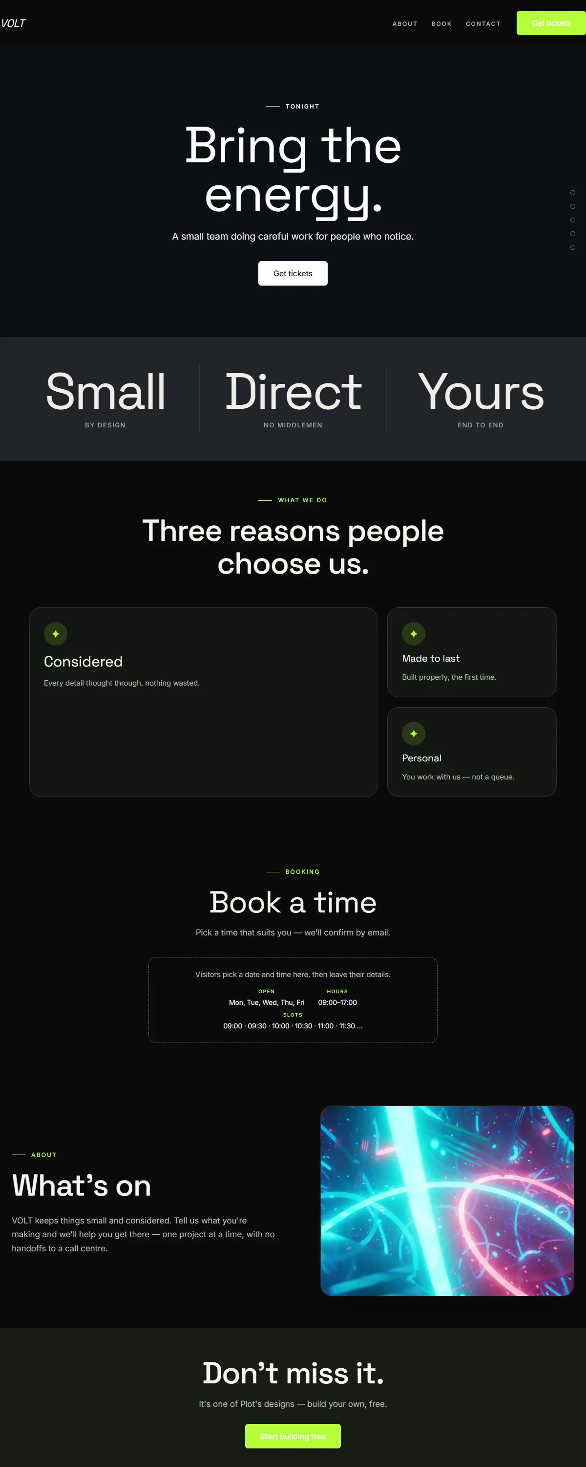
Near-black with electric lime and bold Space Grotesk. High-energy, after-dark.
Warm plum and coral with bold Space Grotesk. Golden-hour warmth for the evening.
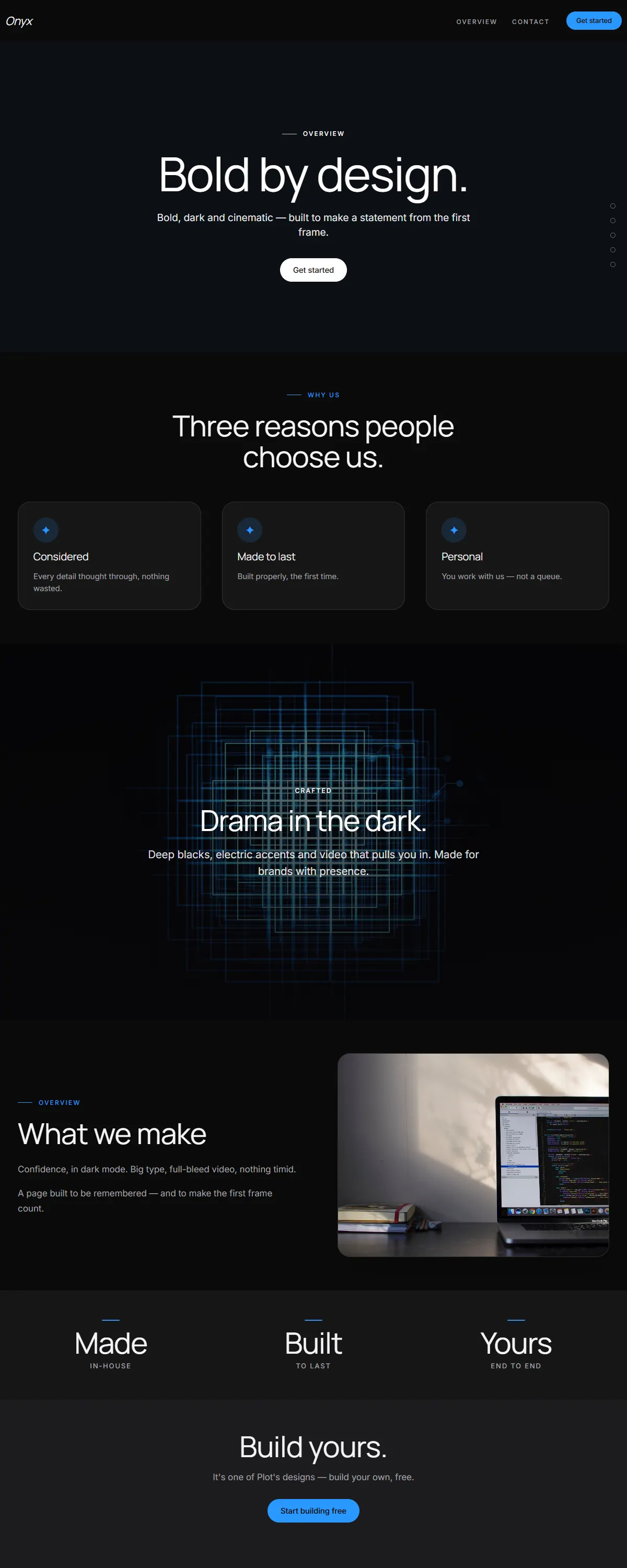
Near-black and cinematic with bold type and a blue accent. Big video moments, Apple-style.
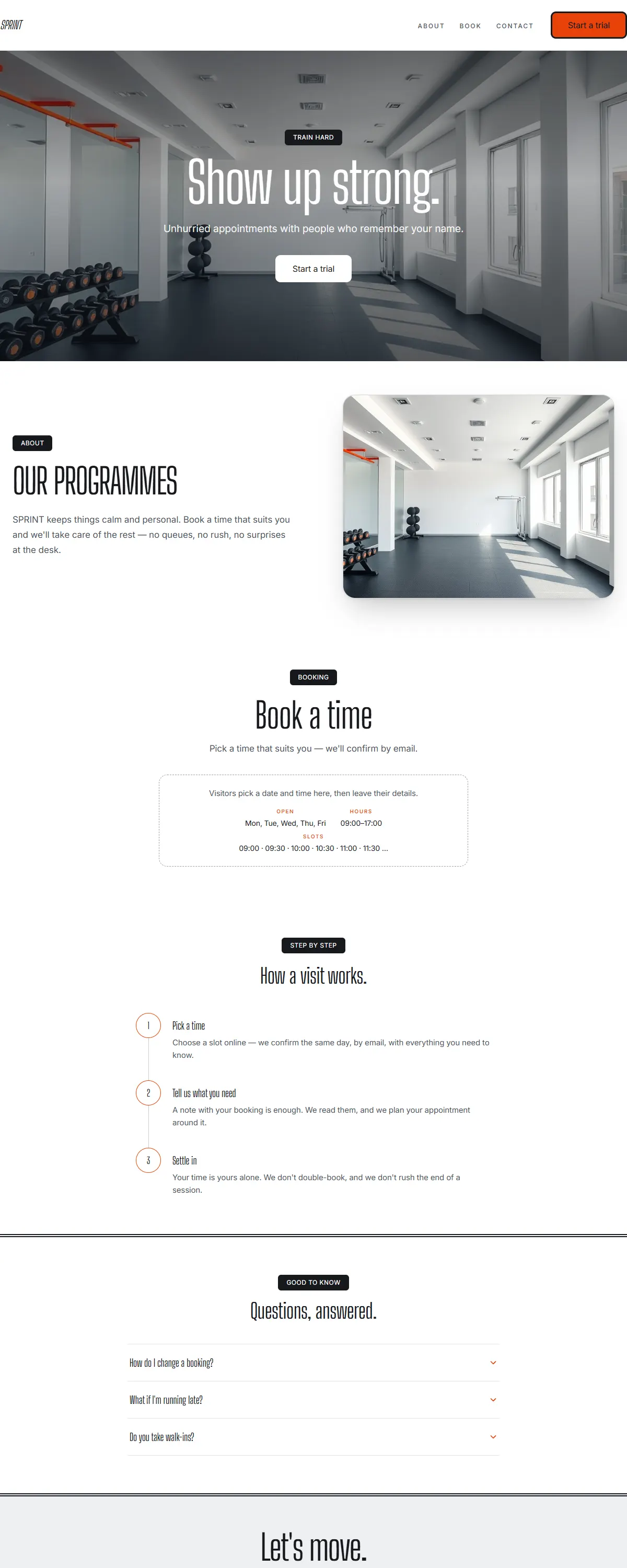
Bright, energetic fitness — clean white, charcoal and electric orange with bold condensed type.
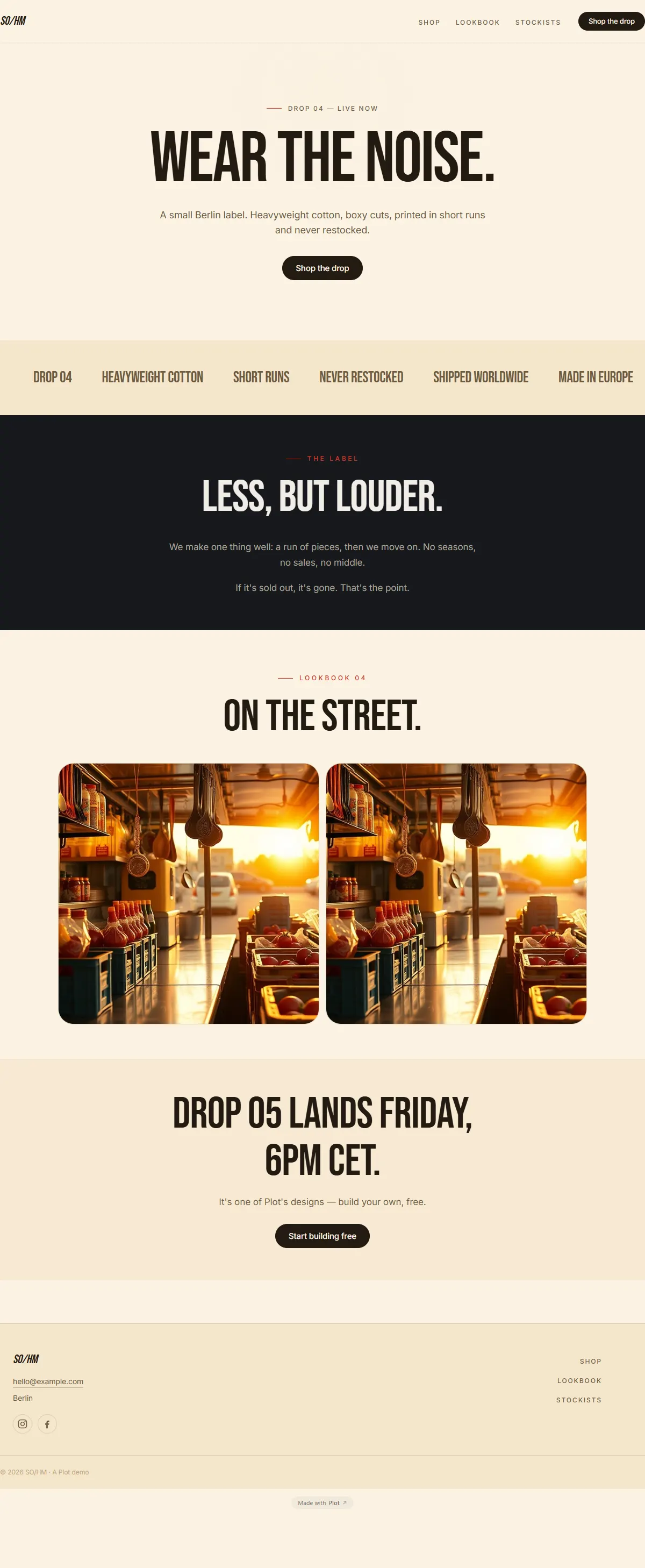
Bold street-food energy — warm cream, chili red and a tall condensed poster face.
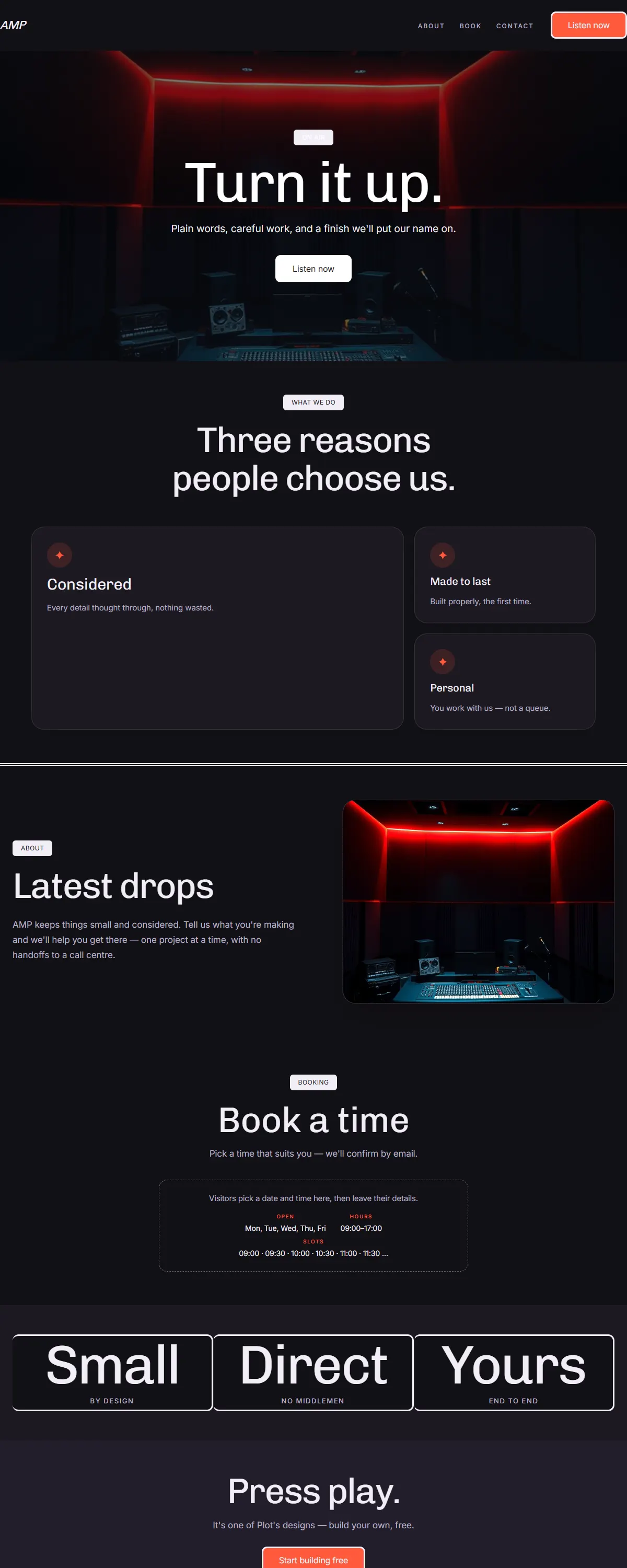
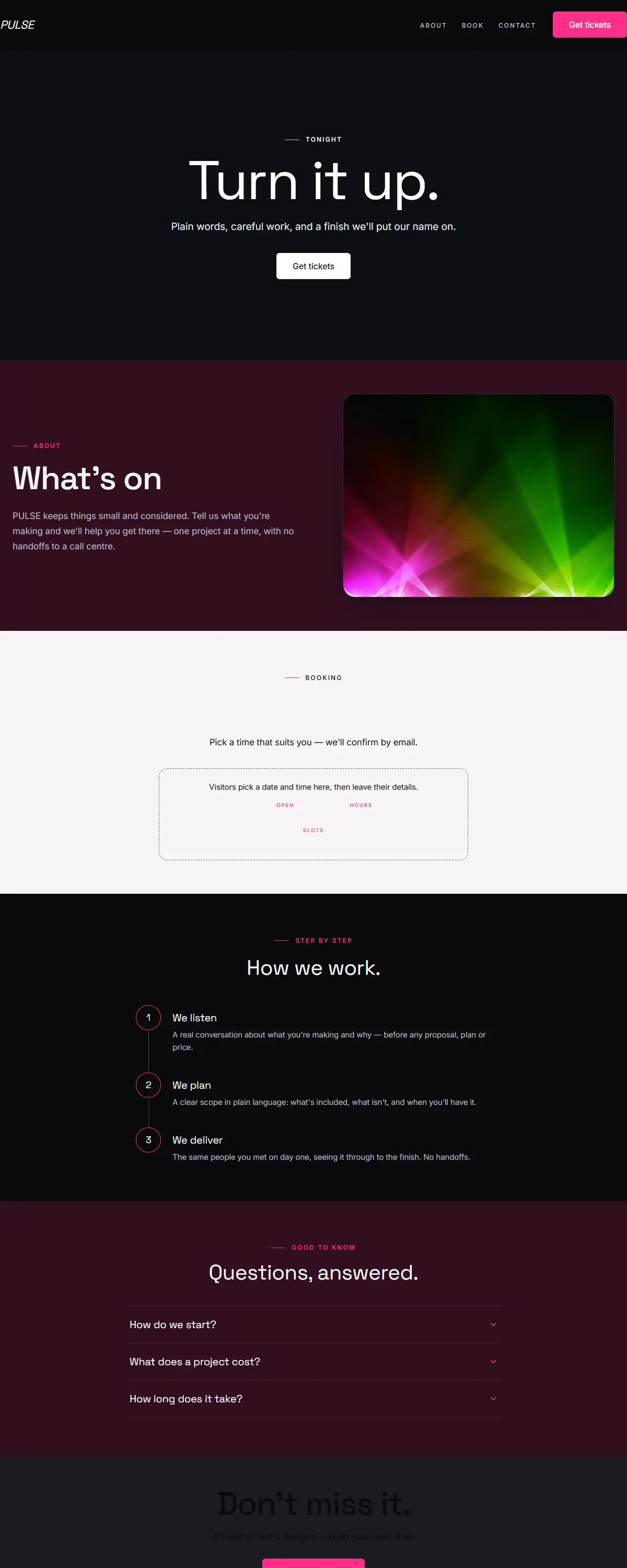
Bold dark stage for music and podcasts — near-black with an electric coral and Chivo.
Sleek dark automotive — glossy black and chrome with a racing-red accent and Saira.
Near-black with a vivid coral and a heavy Anton poster face. Loud, bold, after-dark.
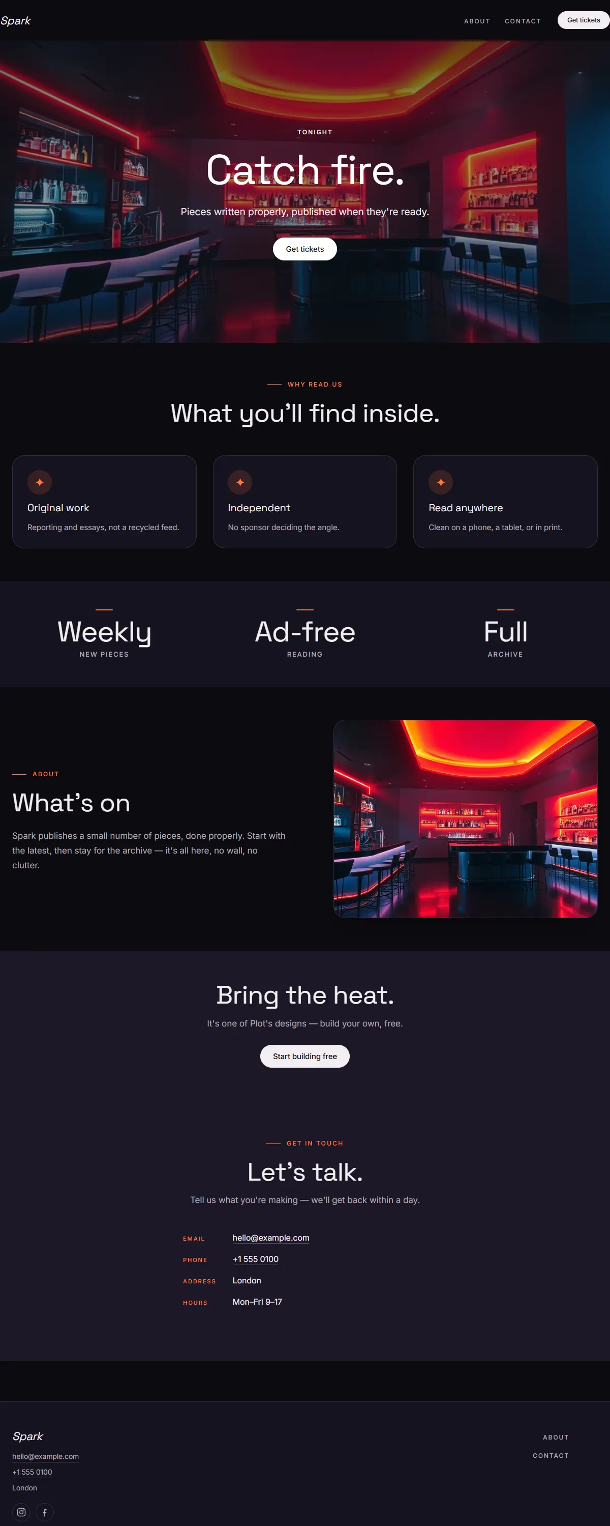
Near-black with a hot orange-pink gradient and bold Space Grotesk. High-energy nightlife.
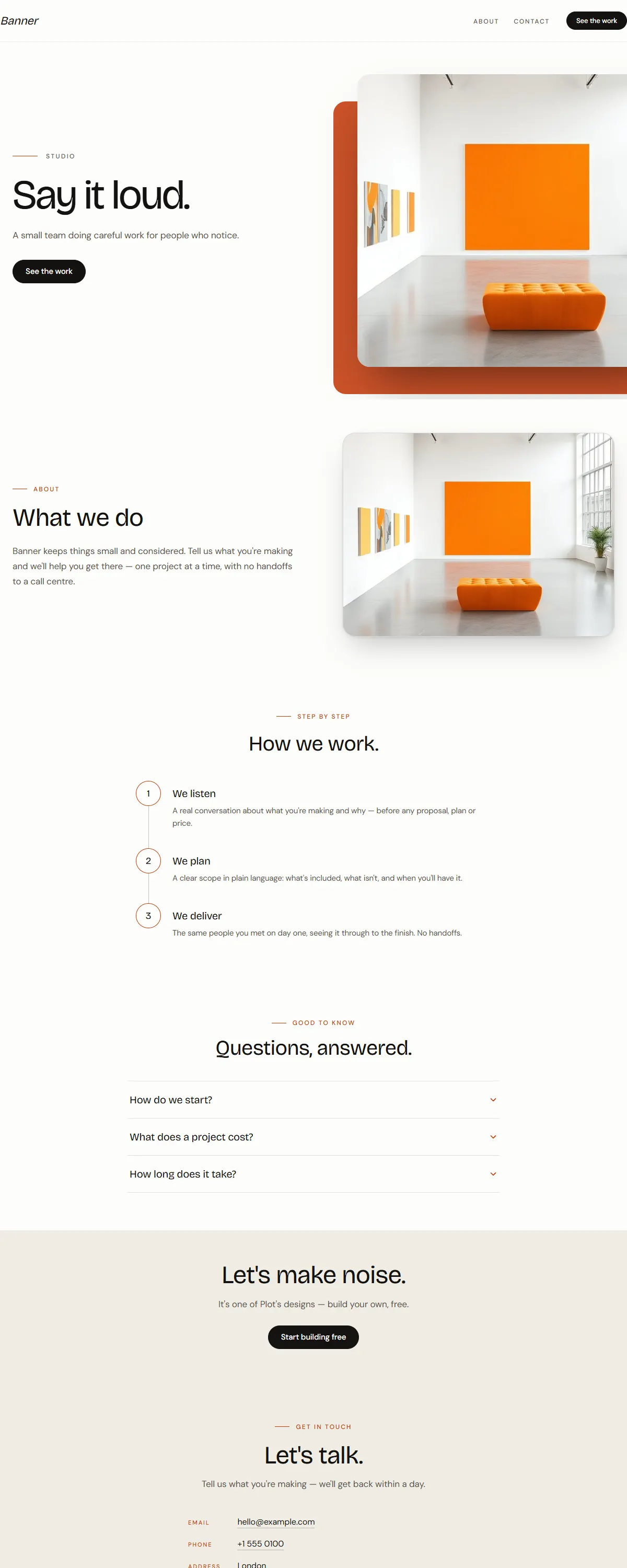
Bright white with a vivid tangerine accent and a bold Bricolage display. Loud, confident, made to be seen.
Near-black with a bold electric-gold accent and a heavy Anton. High-energy and competitive.
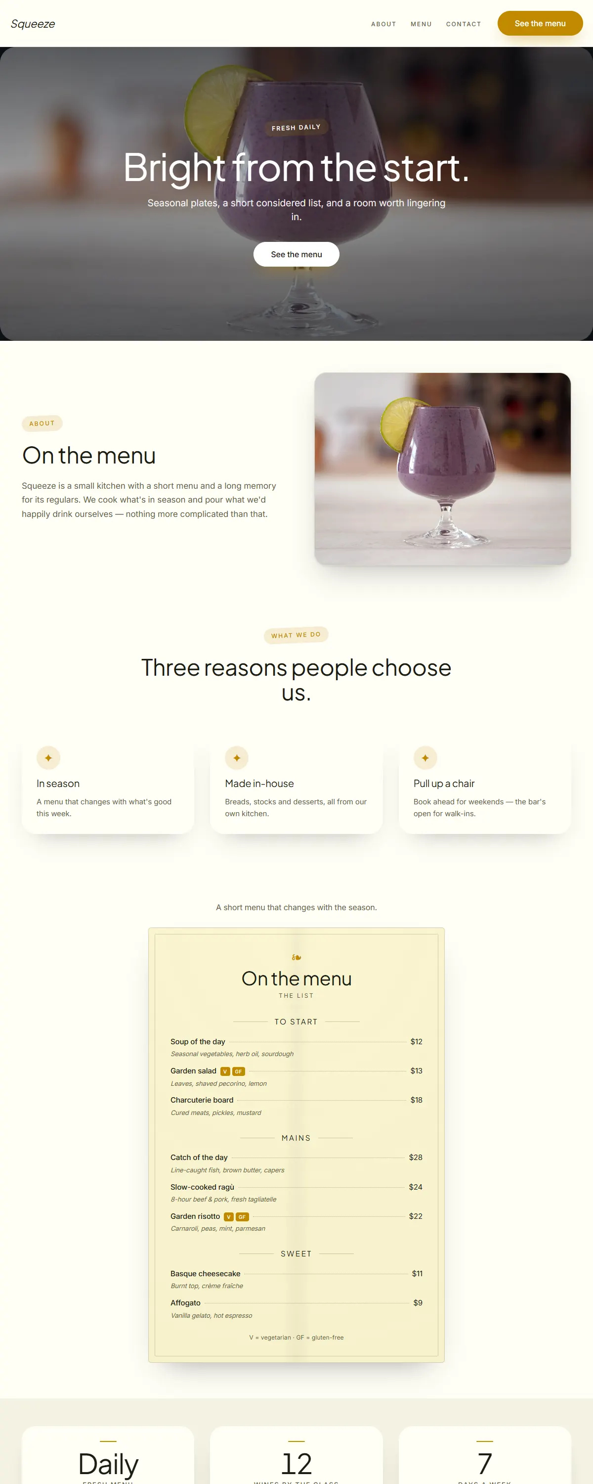
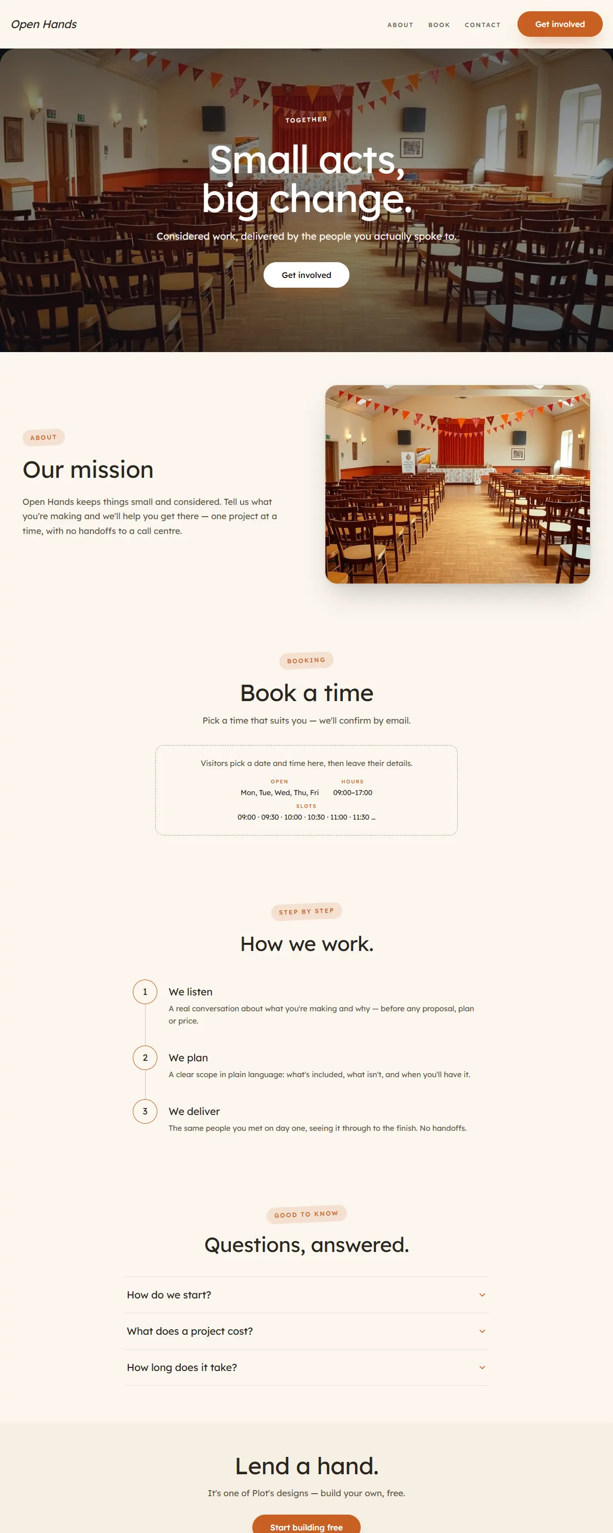
Sun-warmed cream with a bold saffron-gold accent — appetising and lively for food, classes and markets.
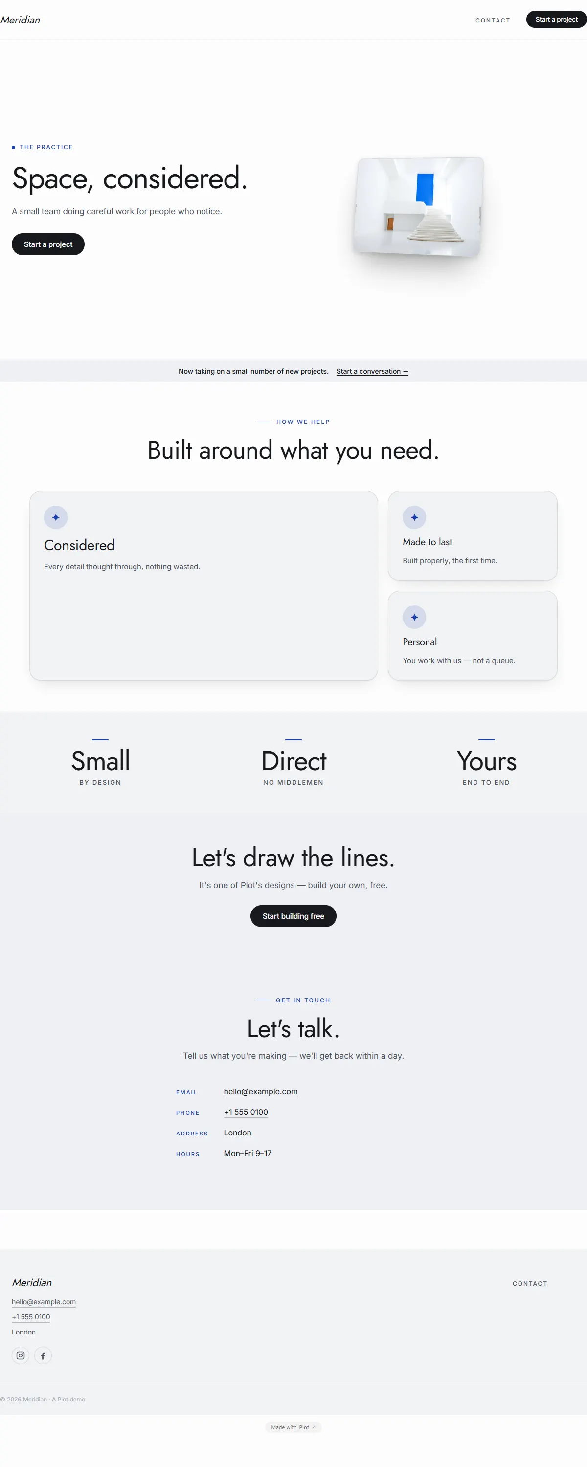
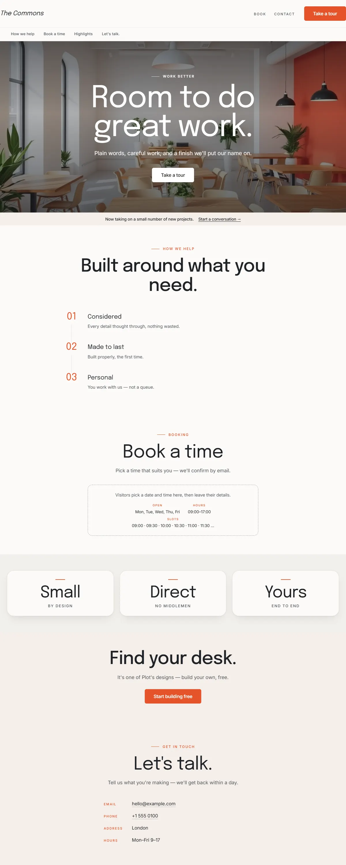
Calm, modern, all-sans look that signals reliability and care.
Airy sand and teal. Light, breezy, unhurried.
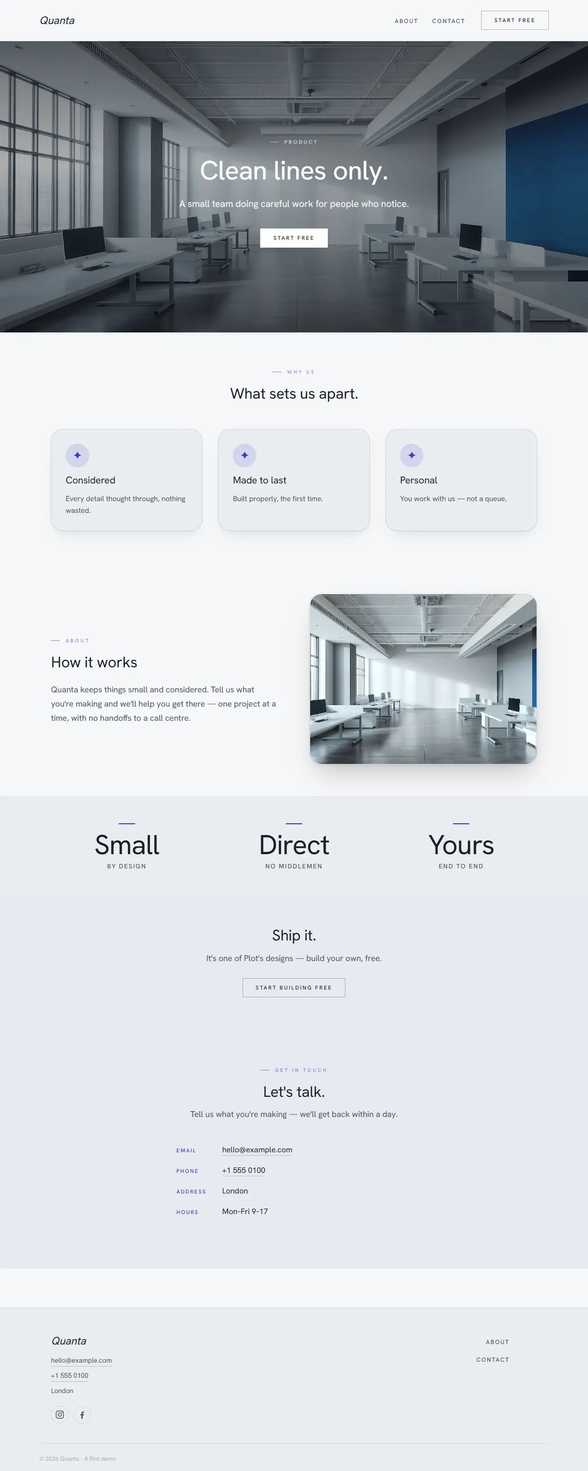
Cool, minimal greys. Restrained and quietly professional.
Deep ocean teal with a bright cyan accent. Calm, clean, modern — made for video.
Pure black-and-white minimalism with strong geometric type. Nothing extra.
Navy and coral on crisp white with rounded Manrope. Breezy and coastal.
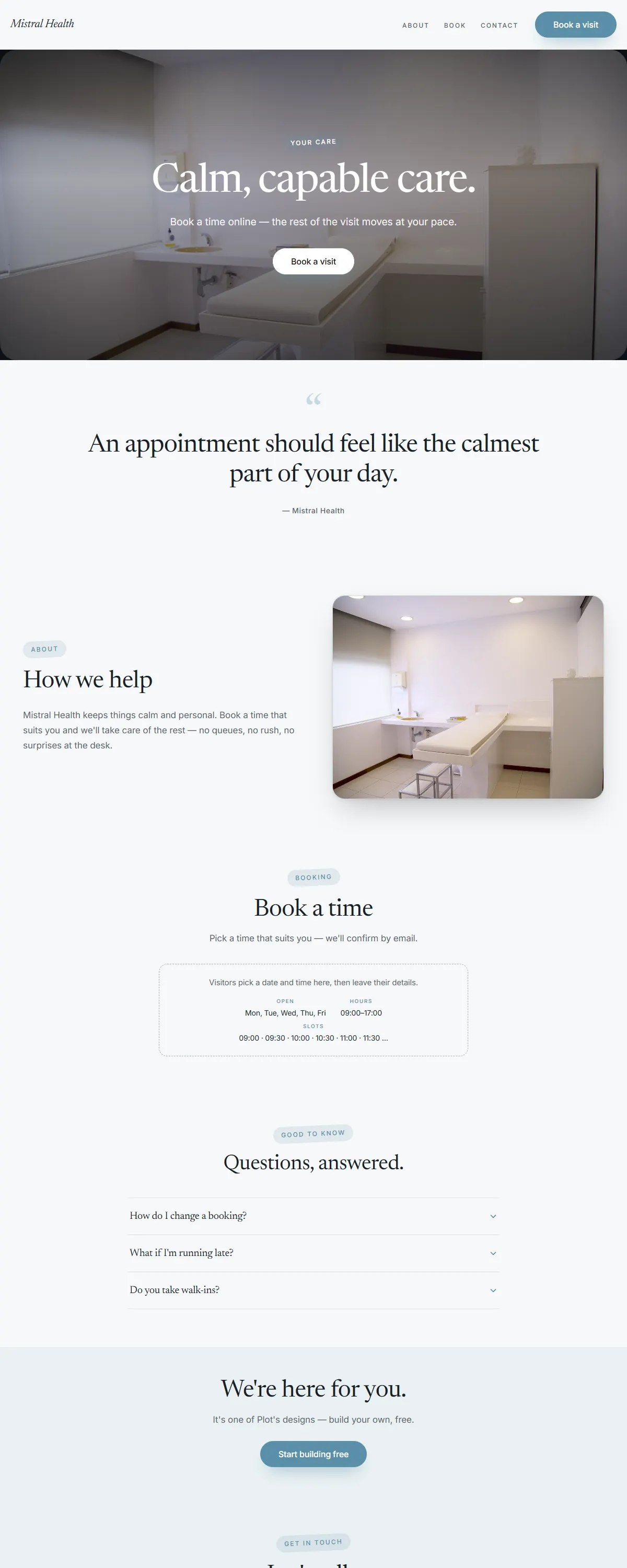
Soft blue-grey and dusty blue with a calm Newsreader serif. Quiet, capable care.
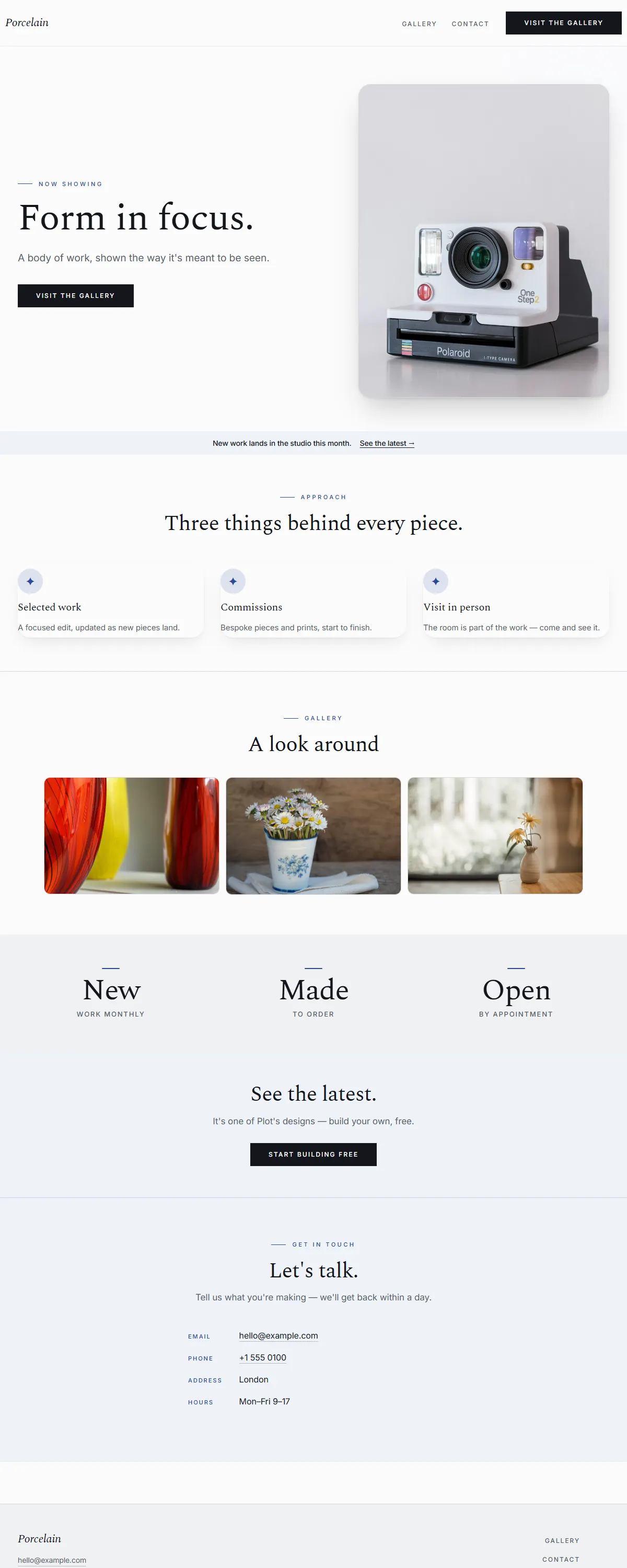
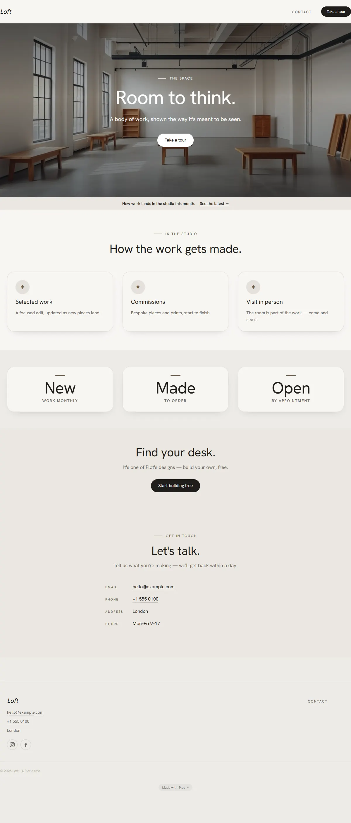
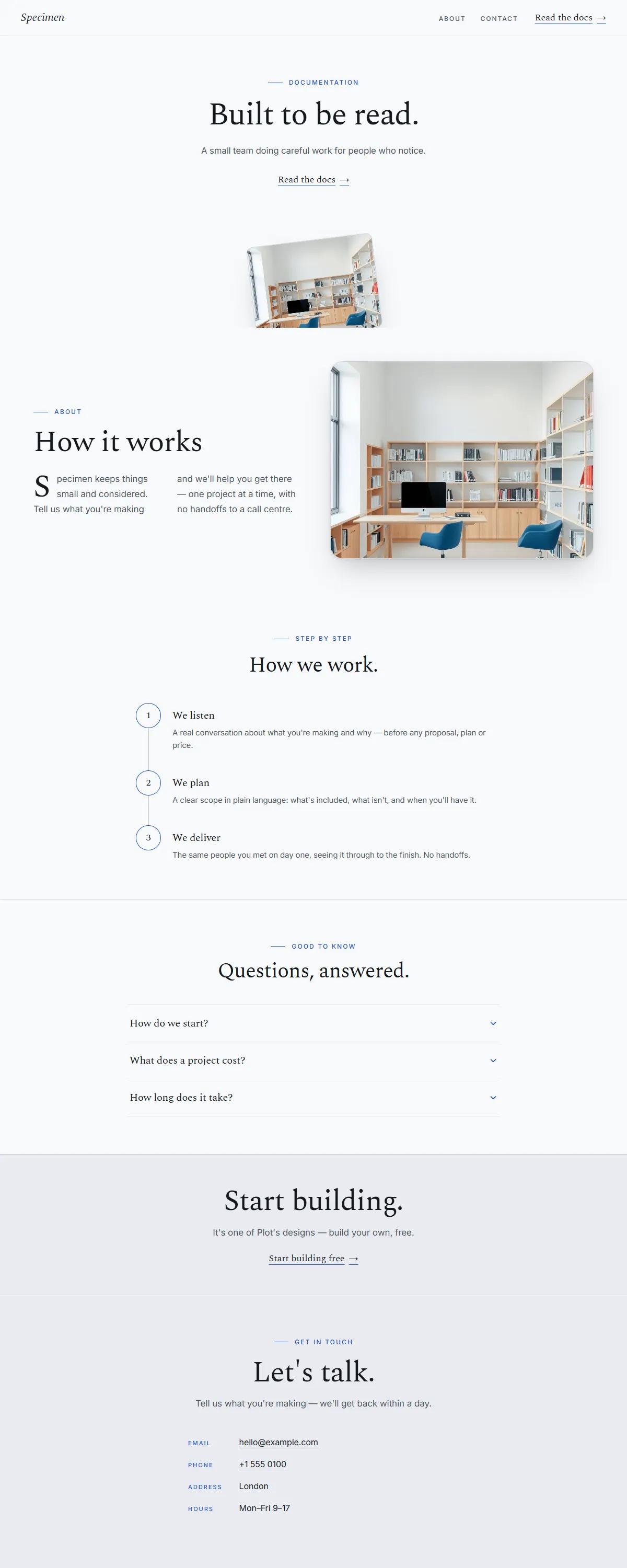
Airy, minimal gallery white with a clean grotesk. Made to frame photography.
Muted dusty pastels on a grounded grotesk — soft sage and stone, never sugary.
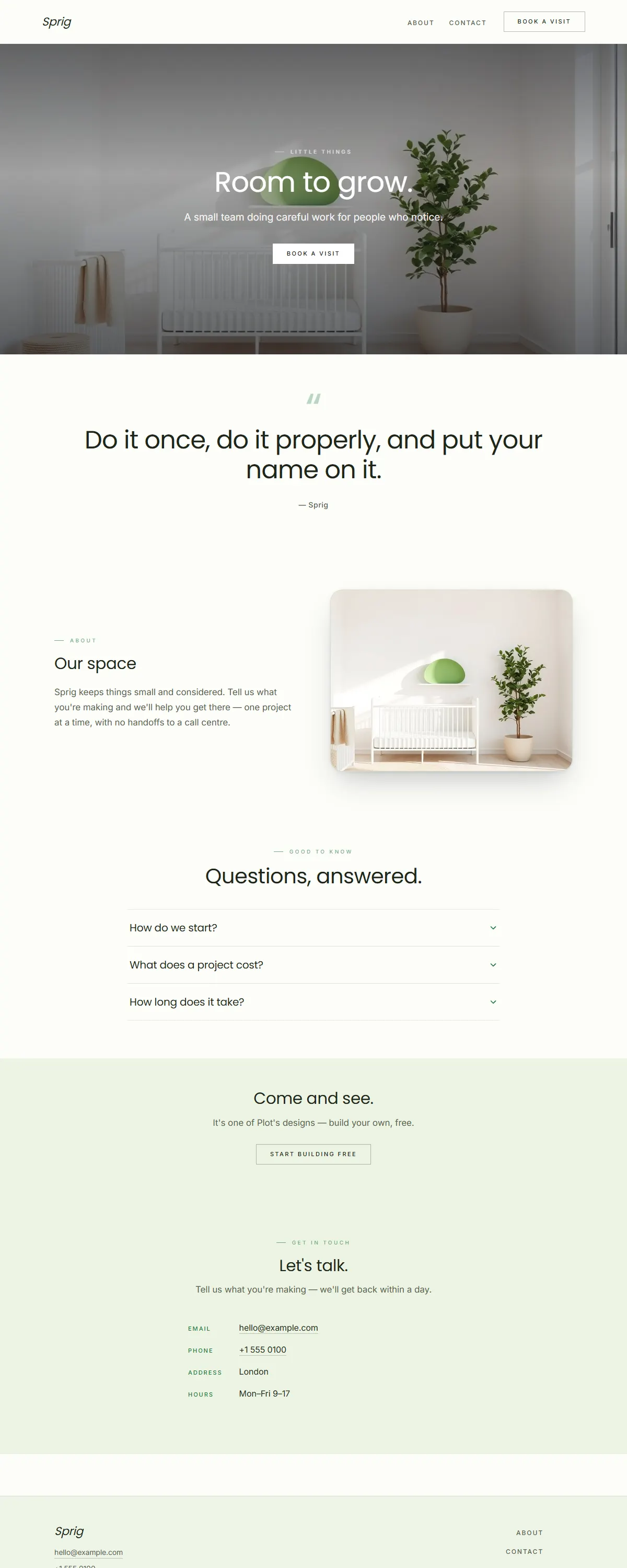
Fresh, calm wellness — cool eucalyptus on soft white with an airy geometric Jost.
Monolithic architectural minimalism — off-white and stone with a clean Schibsted grotesk.
Clean, neutral skincare — soft off-white and warm taupe with a minimal Albert Sans.
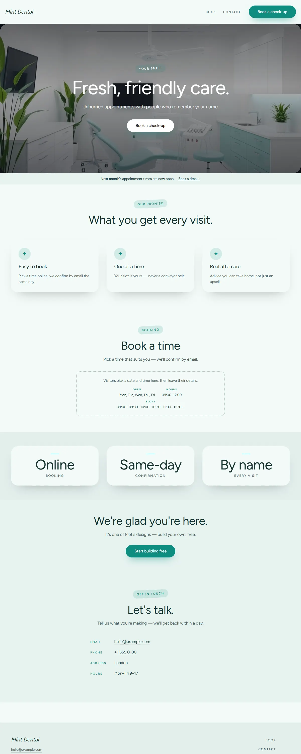
Fresh, friendly medical — crisp white and clean teal-mint with a rounded Figtree.
Warm white and pale taupe with an even Hanken grotesk. Minimal, roomy, considered.
Bright white with a deep-teal accent and an airy geometric Jost. Whitespace doing the work.
Warm off-white and stone with an airy geometric Jost. Whitespace-first, quietly refined.
Bone white and ink with a forest-green accent and a literary Newsreader. Considered and exact.
Bright white with a single cobalt panel and an airy geometric Jost. Architectural and exact.
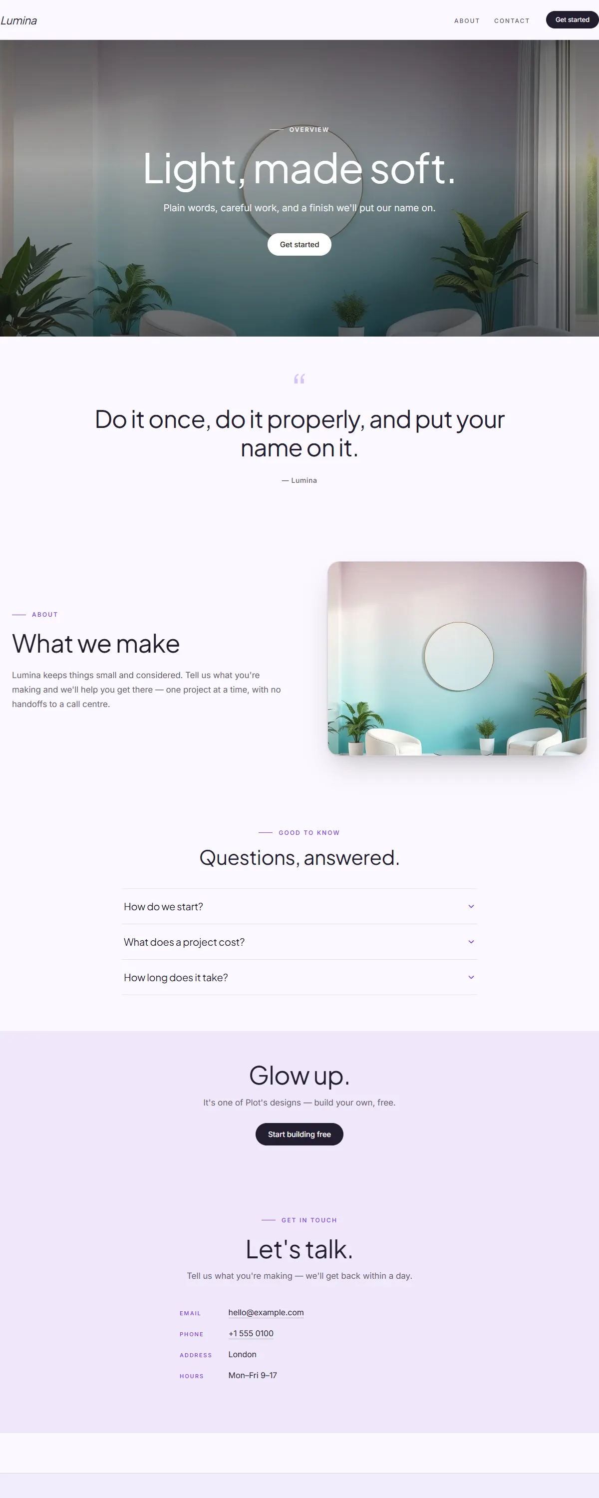
A soft pearl-grey to ice-blue gradient with a slate accent and an airy Jost. Quiet, modern, calm.
Sea-glass and warm sand with a deep ocean accent — relaxed coastal craft for makers near the water.
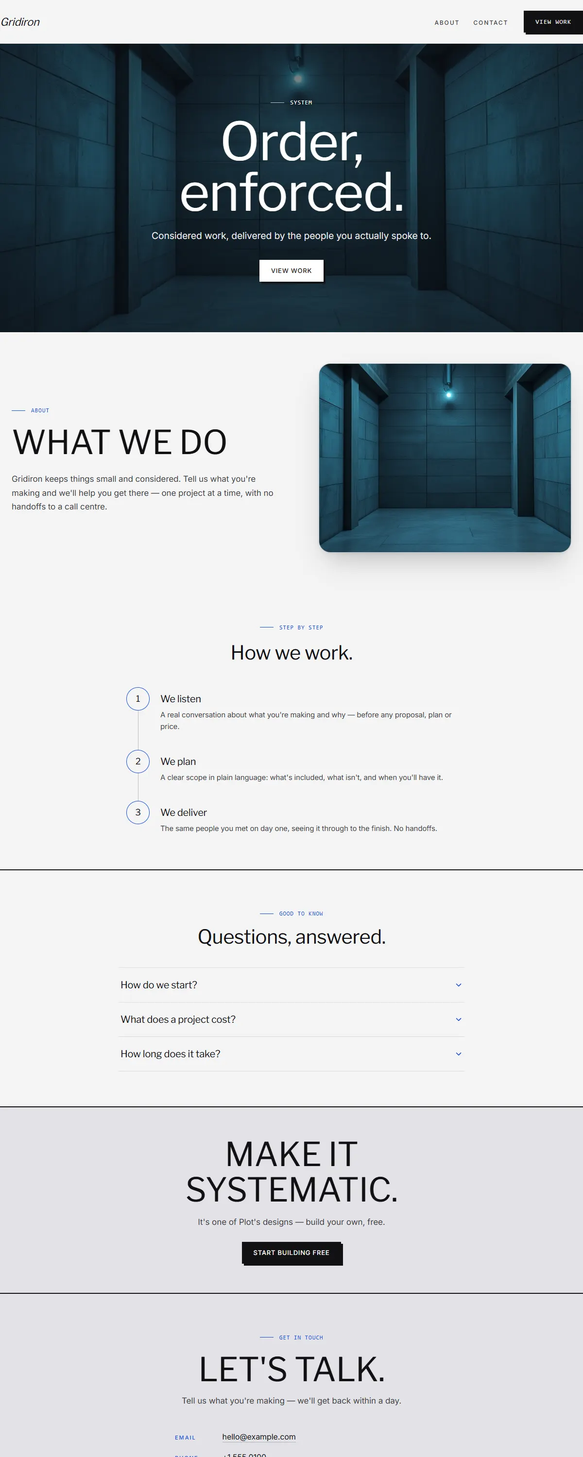
Architectural precision — hard edges, light type, single azure accent.
Monochromatic workwear utility with a single vivid blue accent for clear CTAs.
Concrete grey and burnt orange with Space Grotesk. Architectural and exact.
Deep blue with a bright azure accent and geometric Outfit. Modern and confident.
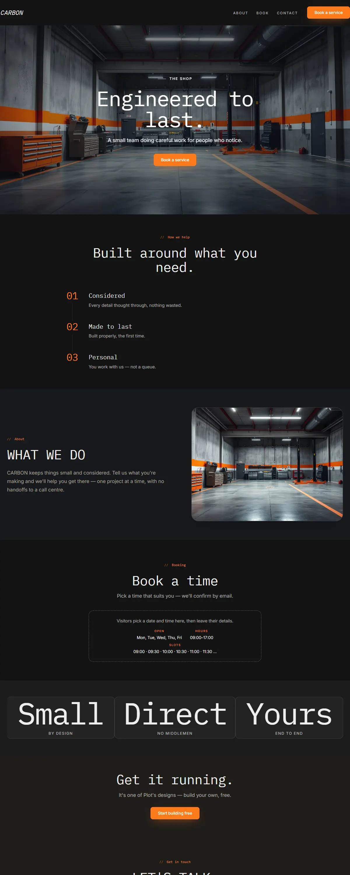
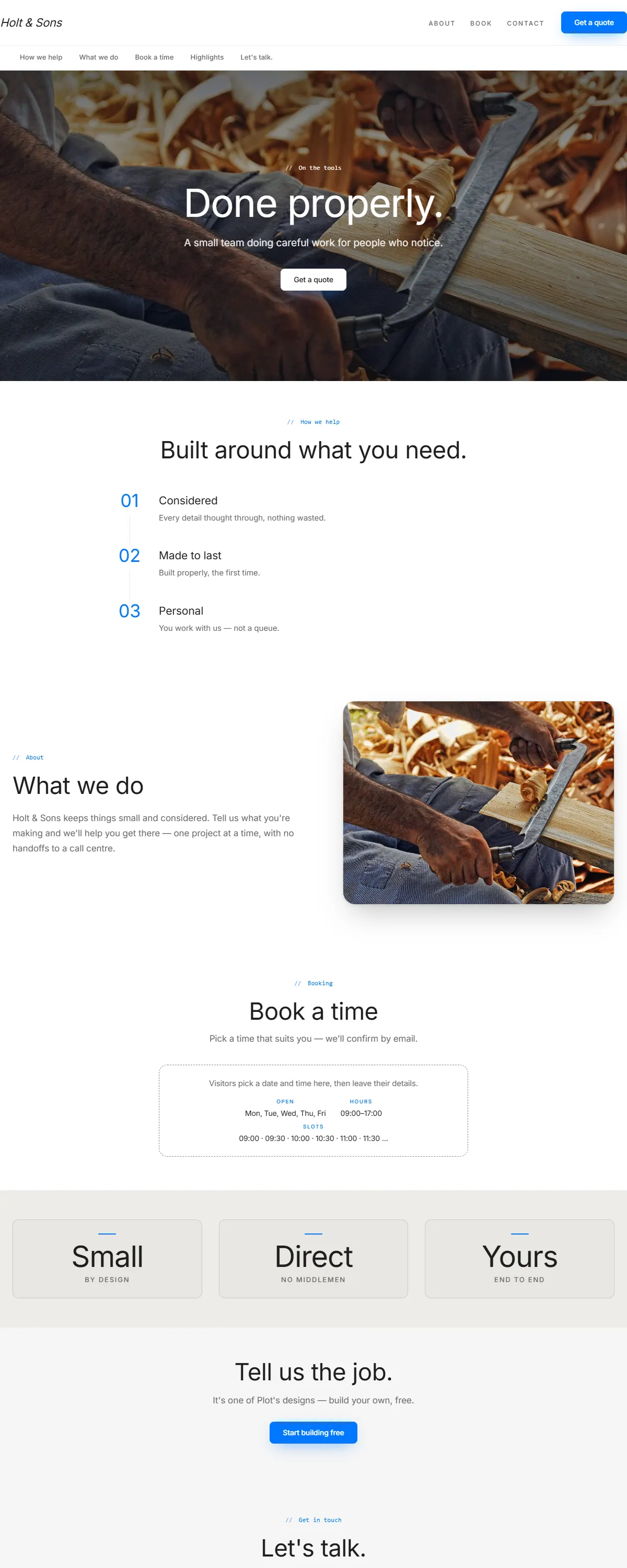
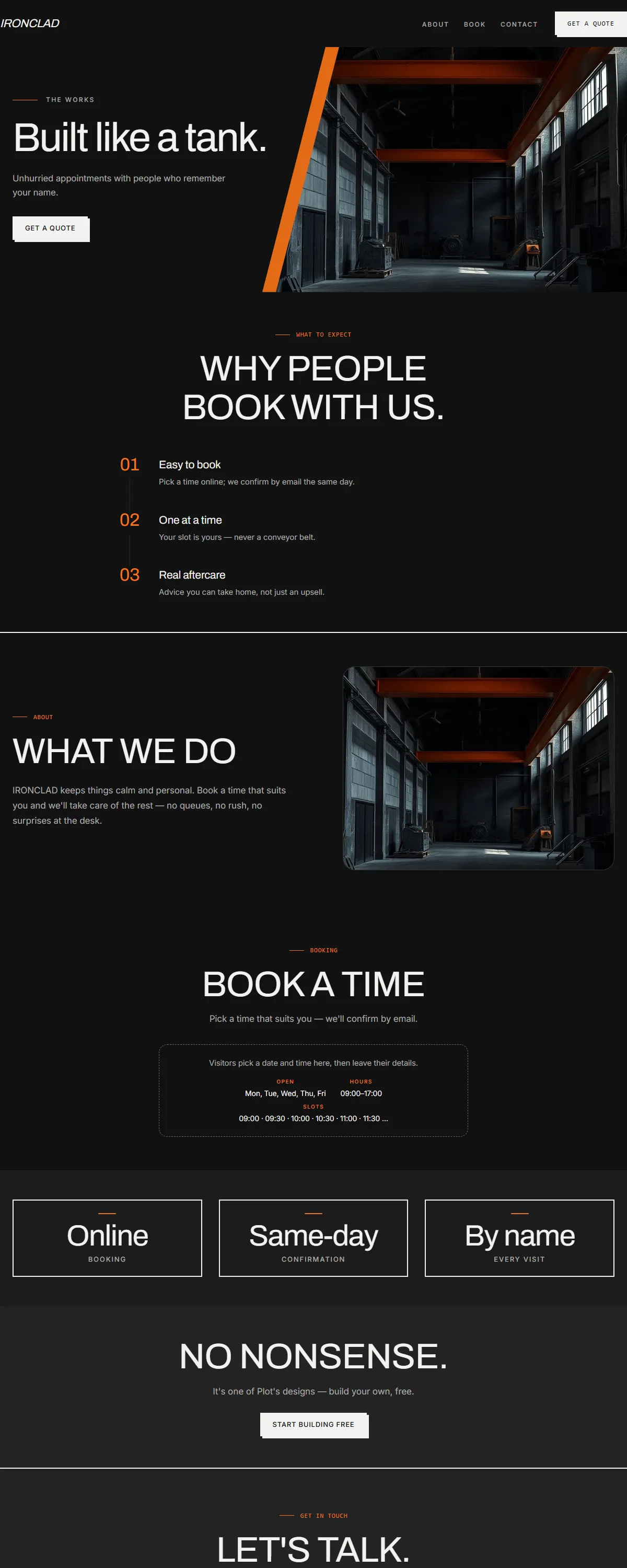
Graphite and safety orange with monospaced type. Industrial and built to work.
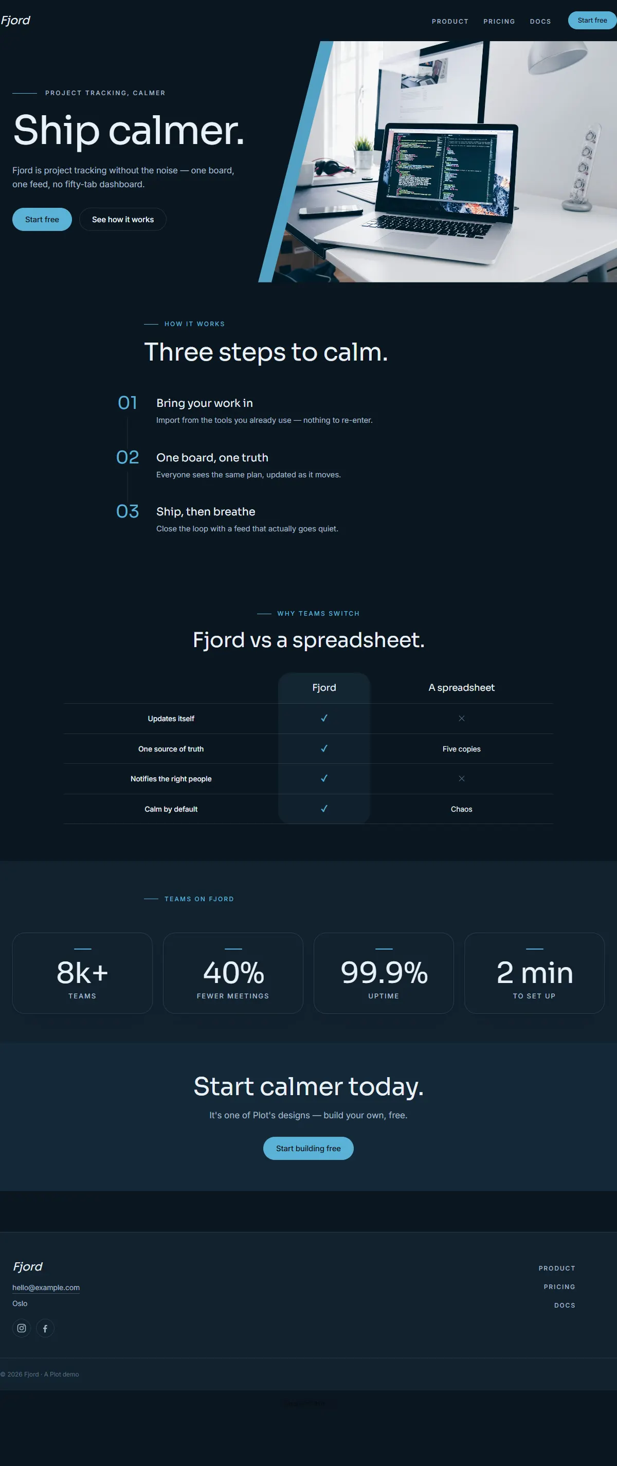
Deep slate-blue with an ice-cyan accent and clean Sora. Cool, precise, modern.
Clean white with a signal-blue accent and big, tight type. Fluid, product-led — Apple-style.
Clean, bright product look — crisp white with an indigo accent and tight Inter Tight.
Crisp product-led white with an electric-blue accent and big, clean type. Made to feel effortless.
Deep navy with a bright cyan accent and clean Sora. Modern, confident, product-first.
Graphite and electric lime with condensed Saira. Industrial, high-energy, built to work.
Deep teal-black with a luminous aqua accent and clean Sora. Calm, modern, product-led.
Concrete grey with an electric-blue line and precise Libre Franklin. Brutalist, systematic, exact.
Cool grey with an indigo accent and even Hanken grotesk. Minimal, modern, product-first.
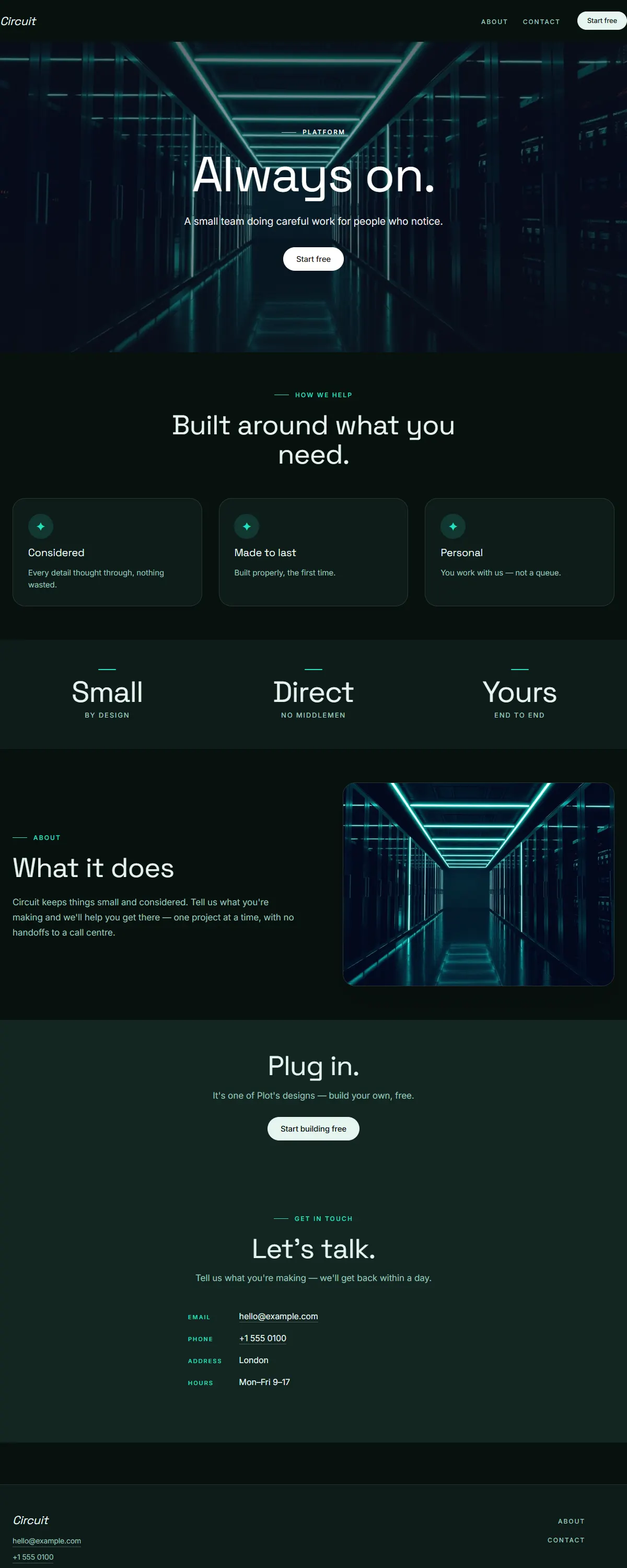
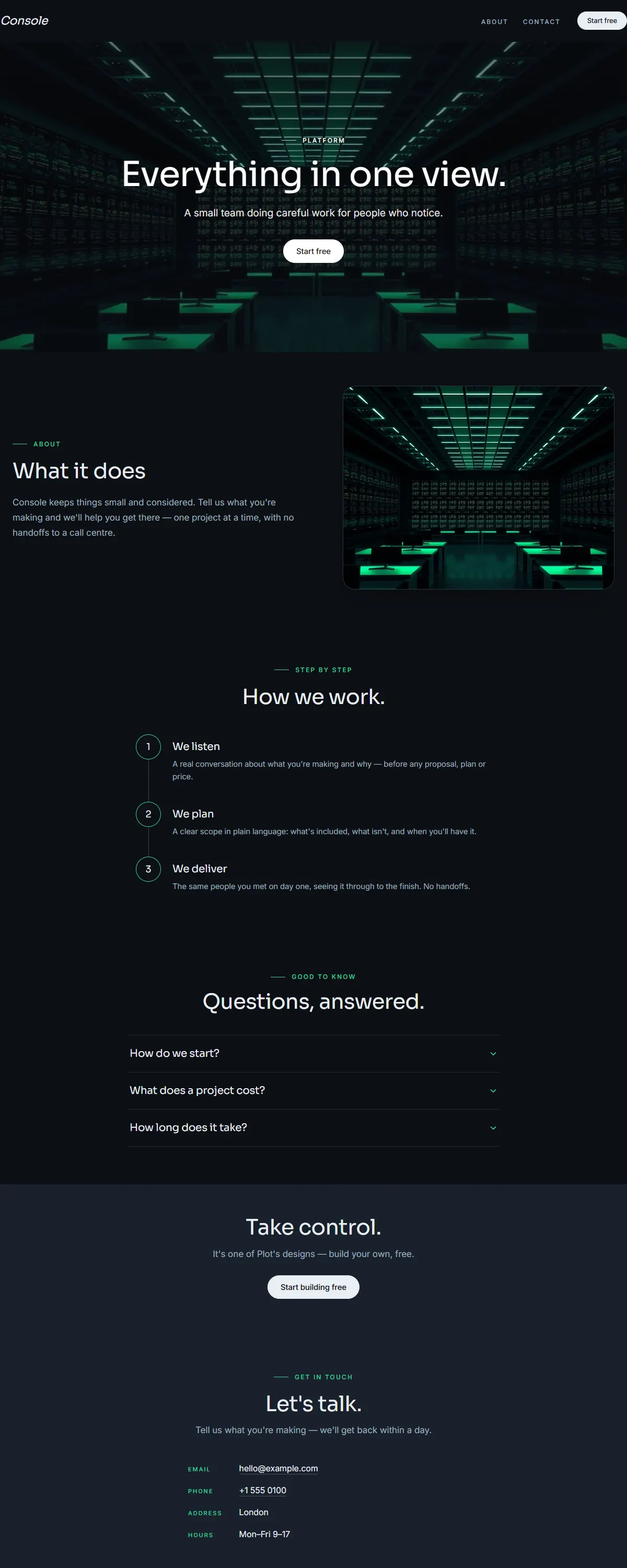
Near-black with an electric spring-teal accent and Space Grotesk. Built for always-on infrastructure.
Pure black with an ice-blue accent and a heavy Anton poster face. Loud, modern launch energy.
Graphite dark with a single warm amber accent and an even Hanken grotesk. Minimal, modern, focused.
Cool white with a clean blue accent and a serif Spectral. Considered, technical, made to be read.
Near-black with an emerald accent and a clean Sora. Built for dashboards and always-on tools.
Deep navy with a soft aurora-aqua gradient and bold Space Grotesk. Futuristic and far-reaching.
Bright white and golden yellow with bold Jakarta Sans. Fresh and energetic.
Bright white with a vivid violet accent and rounded type. Playful, fluid, modern.
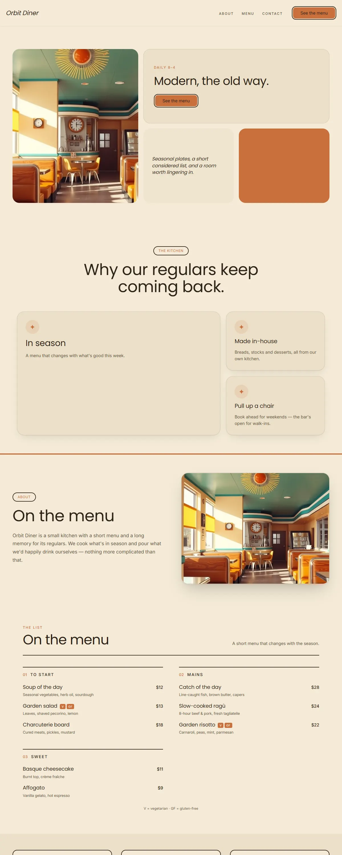
Warm 1970s retro with a groovy display face. Burnt orange, mustard and cream.
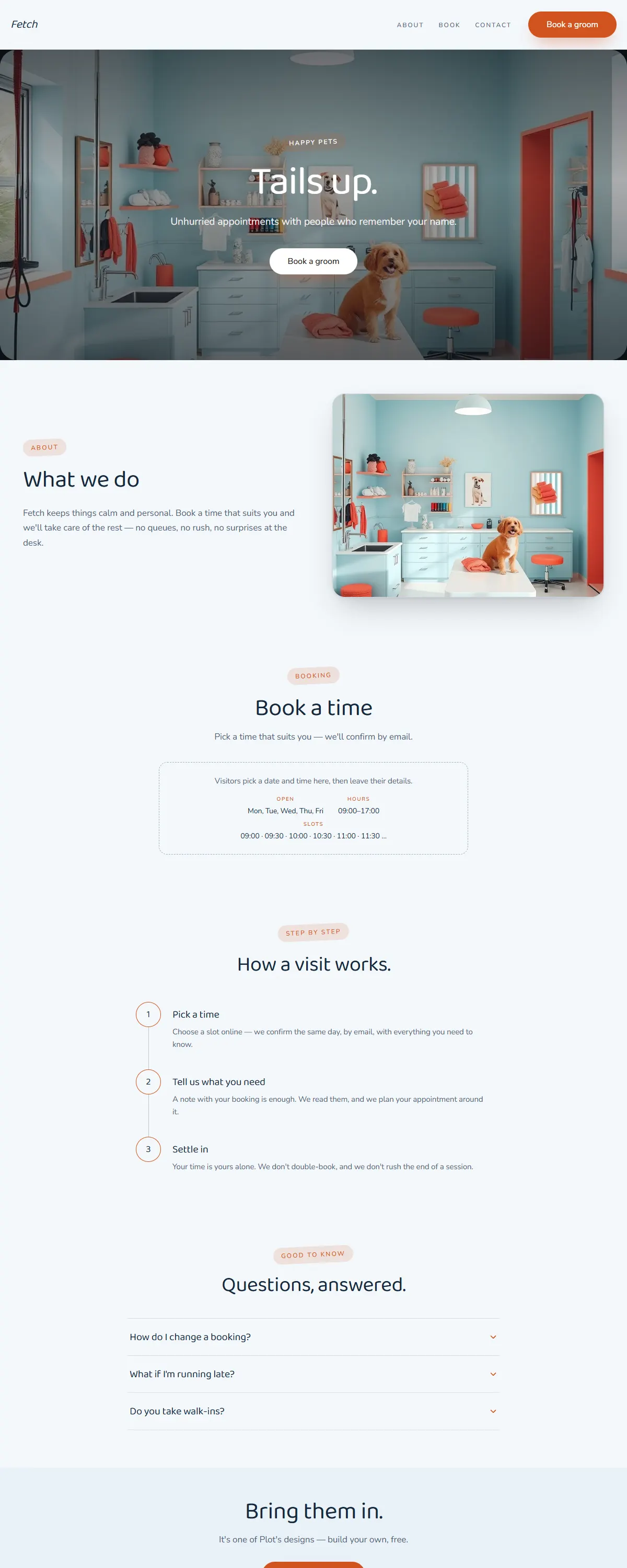
Friendly sky-blue and coral with a rounded, cheerful type. Built for pet care.
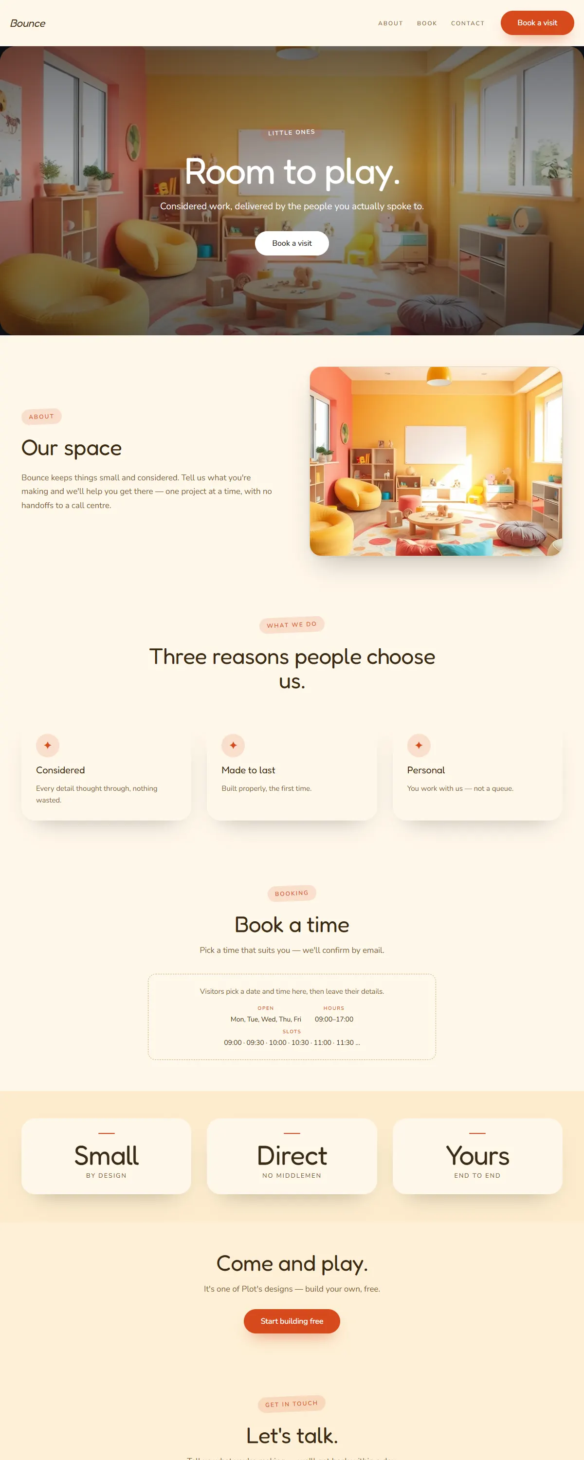
Sunny, playful and rounded — cheerful yellow and coral for little ones.
Raw brutalist black-on-white with a heavy poster face and one electric-blue accent.
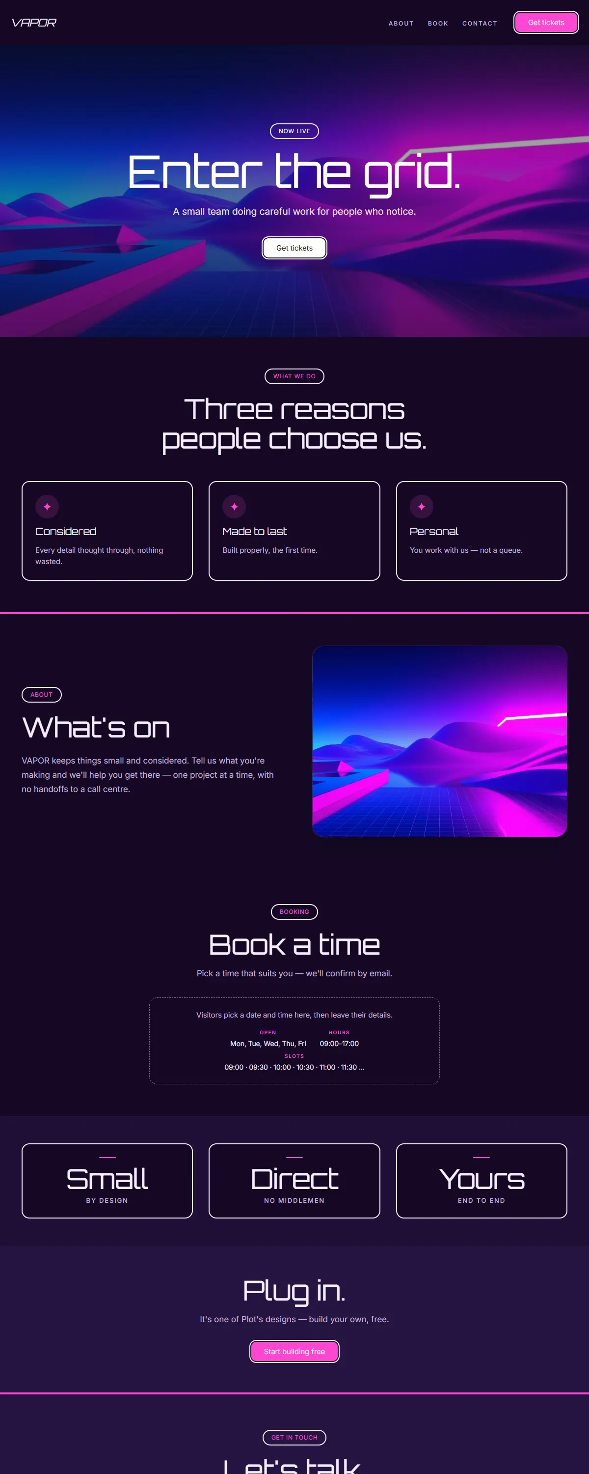
Y2K vaporwave — deep indigo with hot magenta and a retro-futuristic display.
Art-deco glamour — cream and black with brass and a geometric Poiret display.
Mid-century modern — warm cream, teal and mustard with friendly geometric Poppins.
Friendly, optimistic and modern — warm white with a bright coral accent and Epilogue.
Warm, optimistic and human — cream with a hopeful orange accent and friendly Lexend.
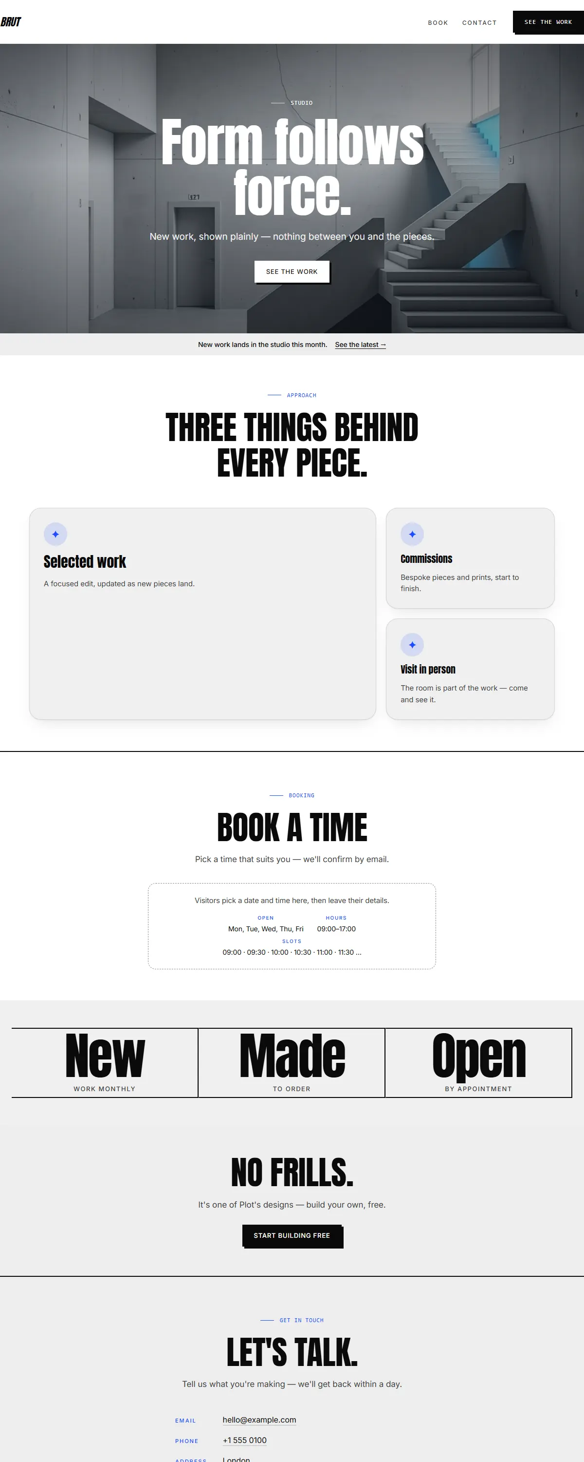
Raw concrete grey with one blunt red-orange accent and heavy Archivo. Brutalist and structural.
Fresh leaf-green on soft cream with a rounded, friendly Fredoka. Bright and playful.
Indigo-to-magenta gradient on near-black with bold Space Grotesk. Y2K-leaning and luminous.
Soft peach-to-lilac gradient with a friendly Jakarta sans. Bright, lovely, playful.
Crisp white with coral and teal and a rounded Poppins. Fresh, energetic, good-for-you.
Warm 1970s mustard and brown with a groovy display face. Vintage soul, still spinning.
Black concrete and safety orange with heavy Archivo. Raw, industrial, built to last.
Soft aqua-to-lavender gradient with a violet accent and rounded Jakarta sans. Bright and contemporary.
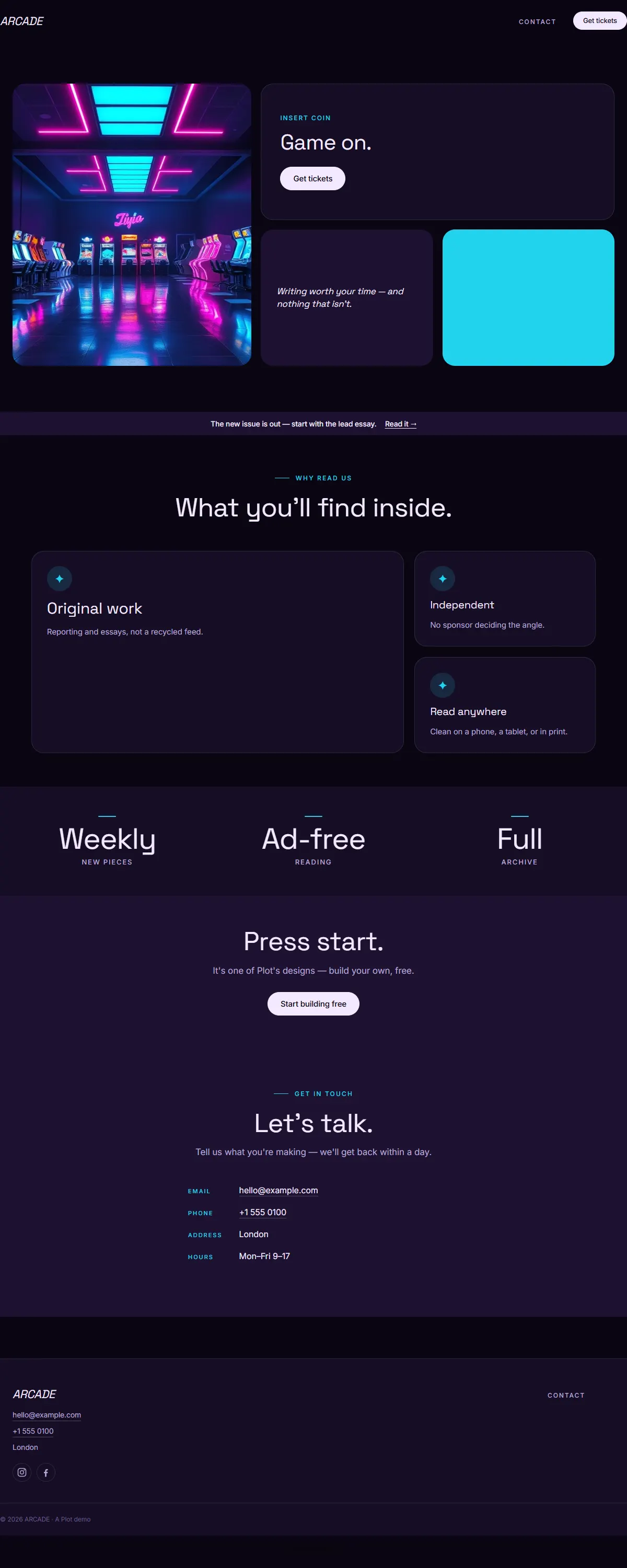
Near-black with cyan-and-magenta Y2K neon and bold Space Grotesk. Retro-futuristic arcade energy.
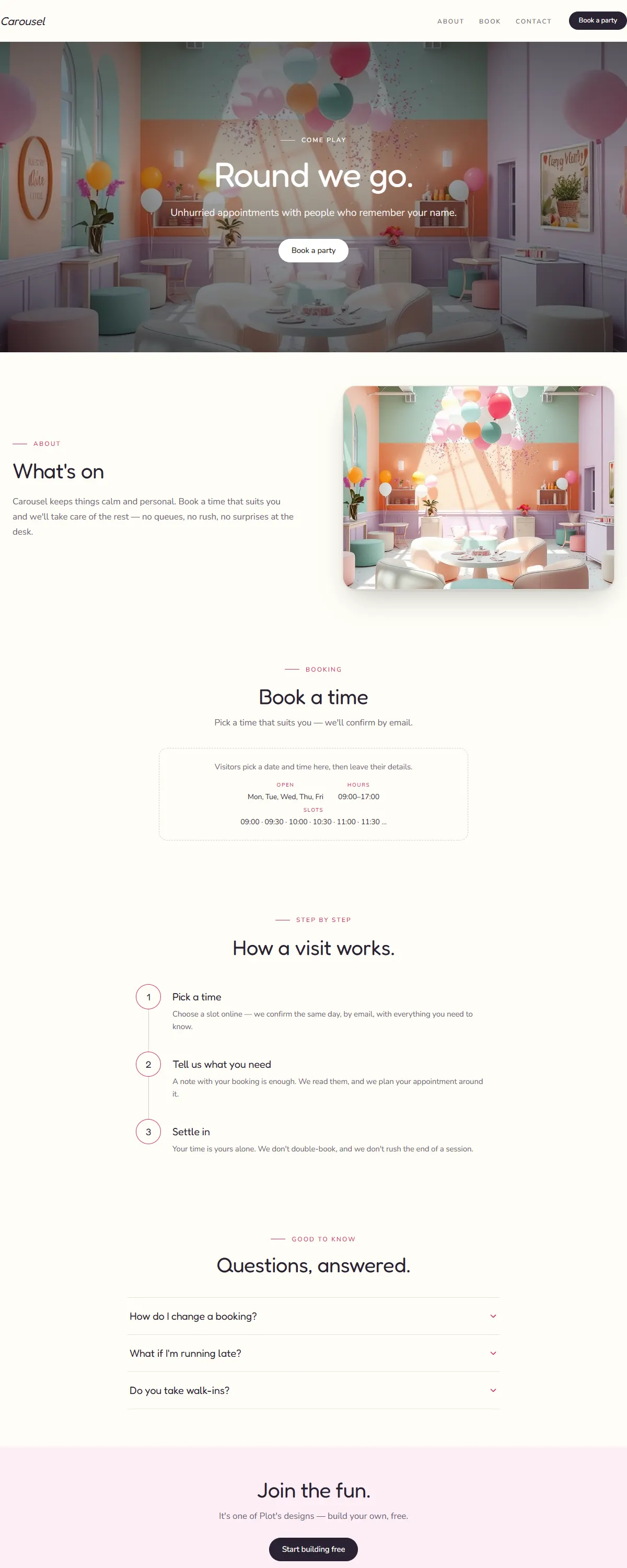
Bright multi-pastel with a punchy pink and rounded Fredoka. Playful, made for celebrations.
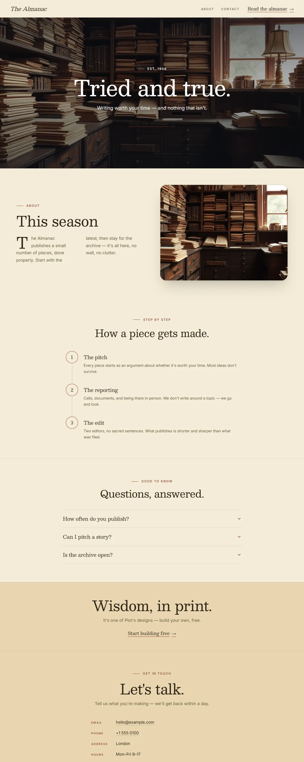
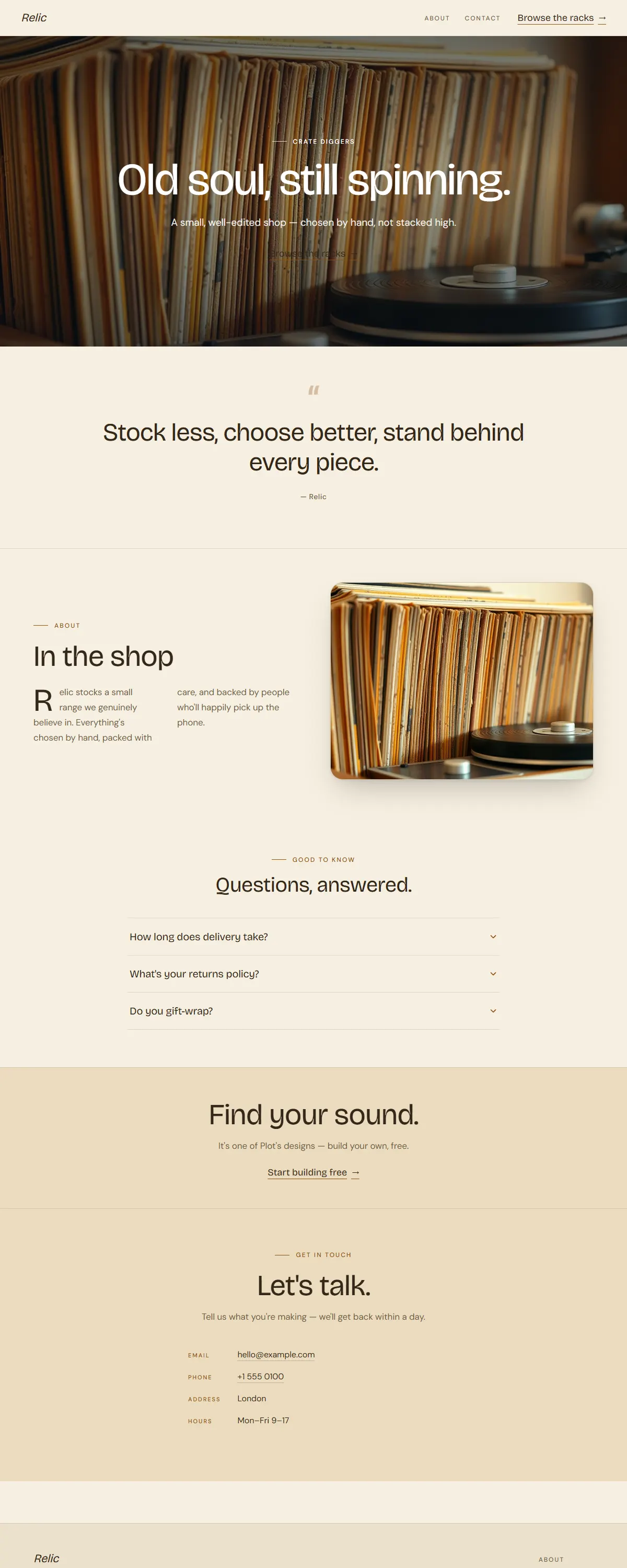
Sepia and oxblood with a sturdy Besley slab. Vintage almanac, tried-and-true.
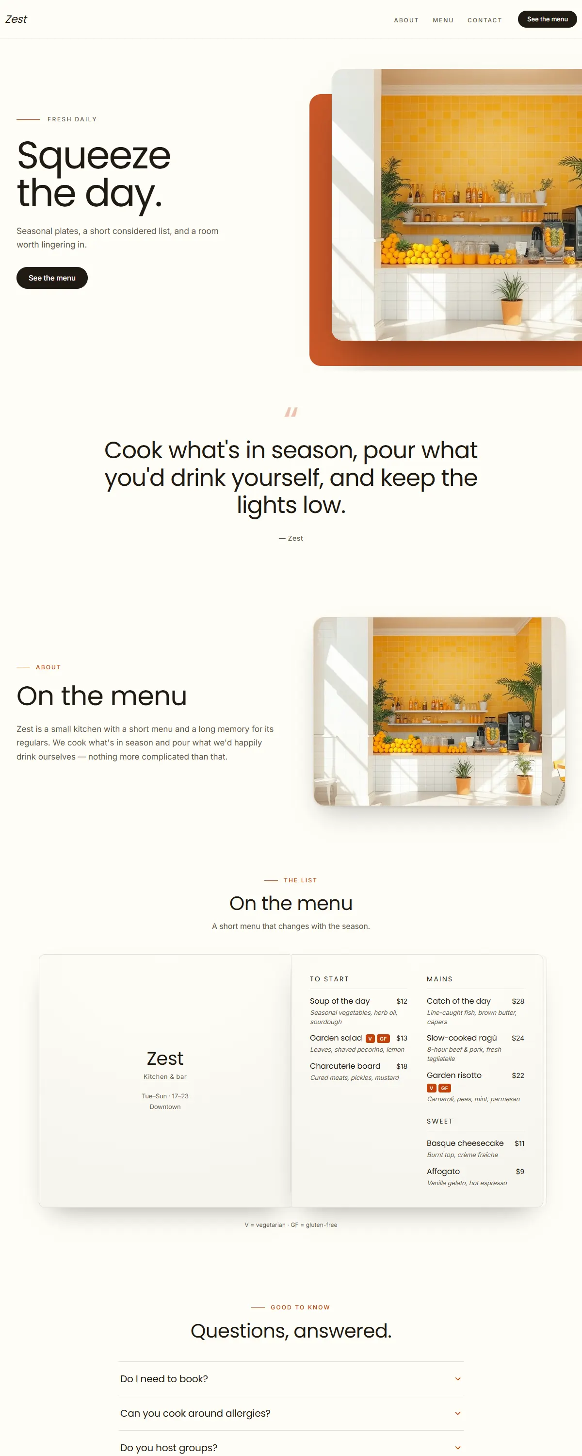
Crisp white and zesty orange with a rounded Poppins. Bright, fresh, good-for-you.
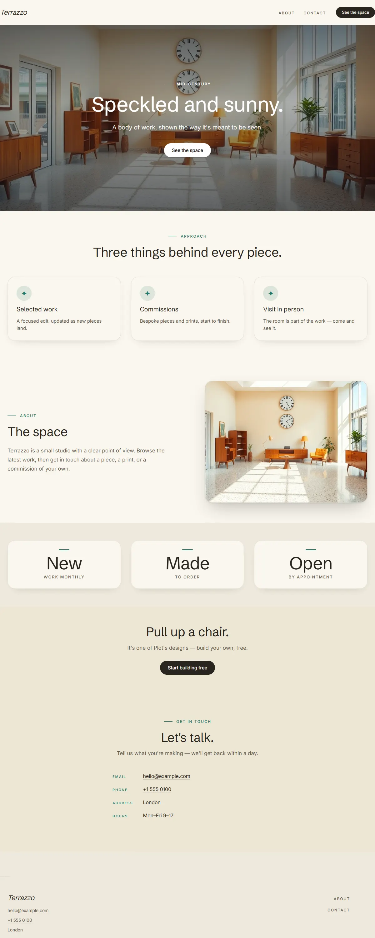
Cream and teal over a speckled terrazzo mood with Schibsted grotesk. Mid-century, sunny, retro.
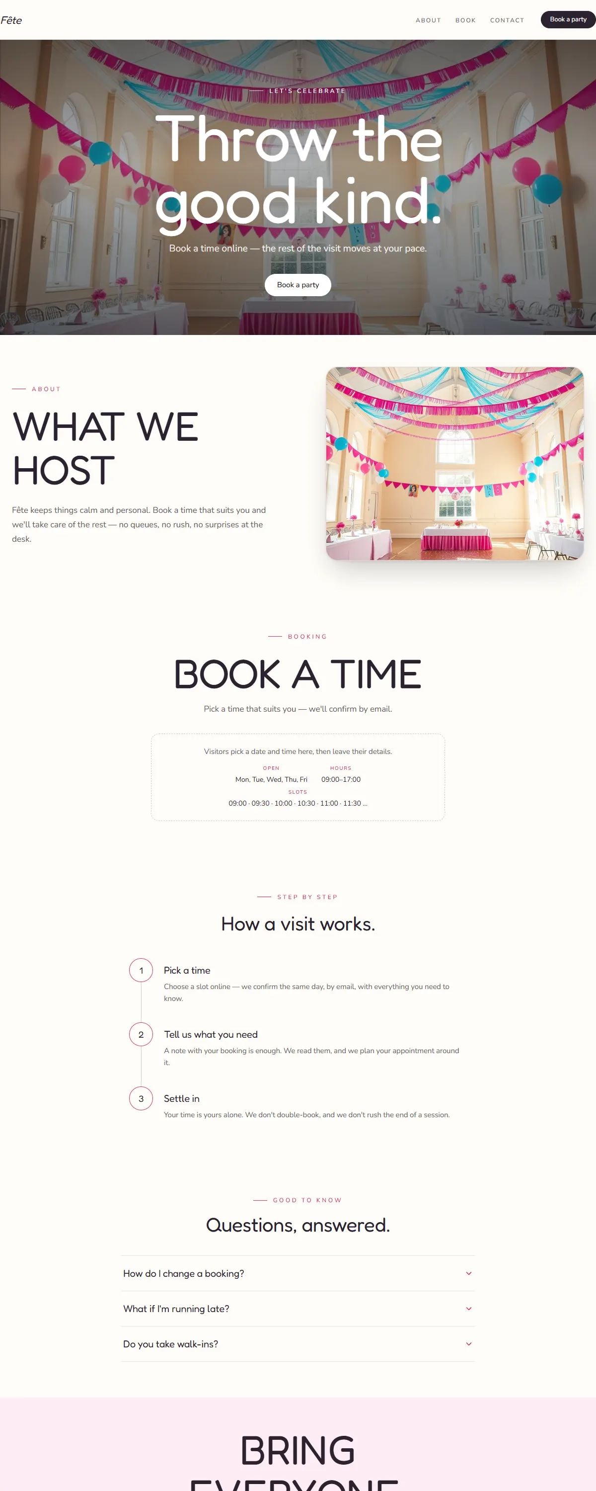
Cream with hot pink and sky blue and a rounded Fredoka. Bright, festive, made for celebrations.
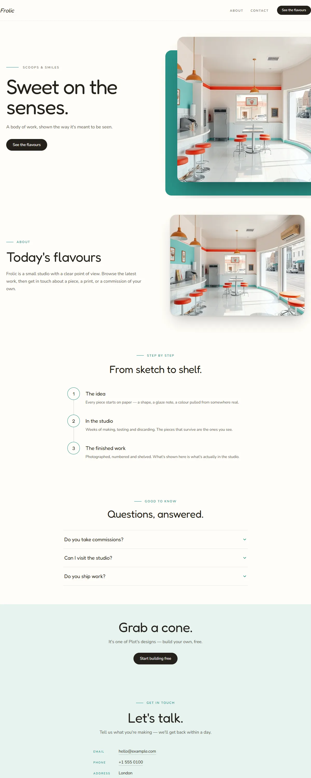
Sunny cream with a turquoise accent and a rounded Fredoka. Bright, sweet, and full of play.
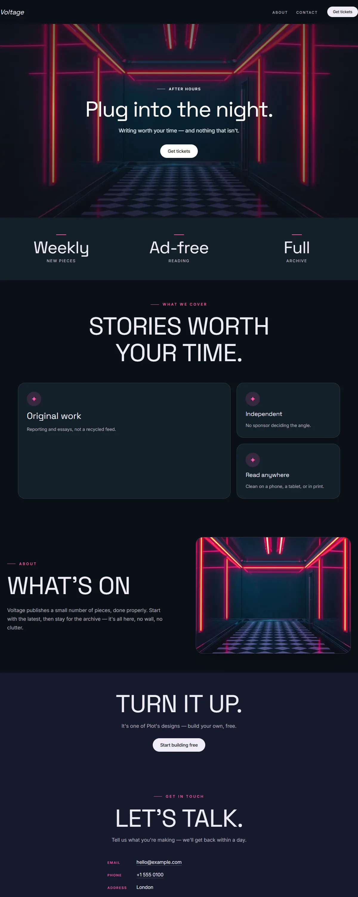
Teal-black with hot-magenta neon and bold Space Grotesk. Retro-synthwave after-hours.
Bright cream with primary-blue blocks and a chunky Libre Franklin. Playful neo-brutalism.
Bright white with a fresh-green pop and a rounded Poppins. Airy, friendly, made for little ones.
No designs match those filters yet — try clearing one.
Like what you see? Build a site on any of these — free.
Start building free